WhatsApp PFP (Profile Pictures)
Dark and Mysterious PFPs
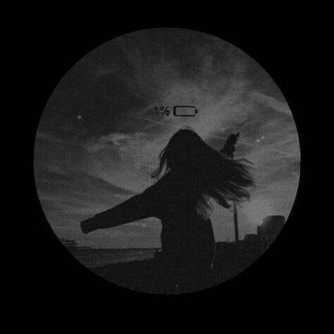
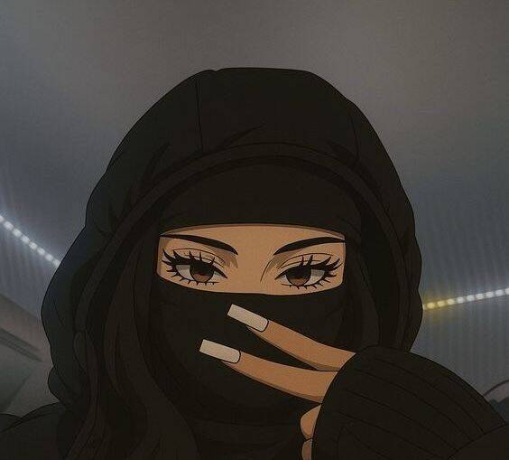
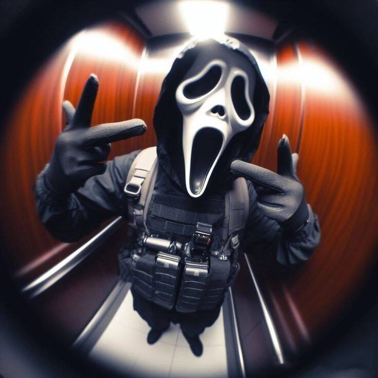
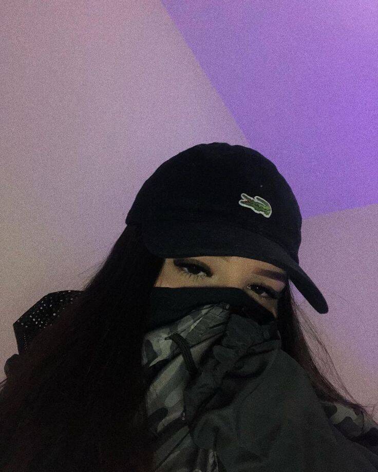
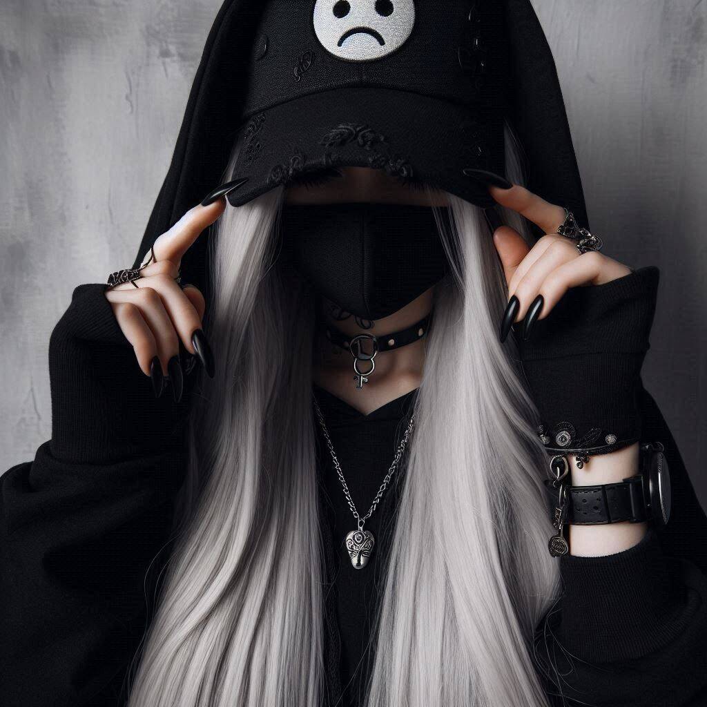
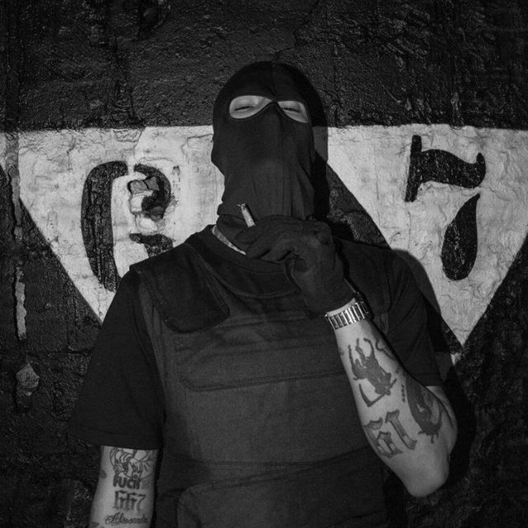
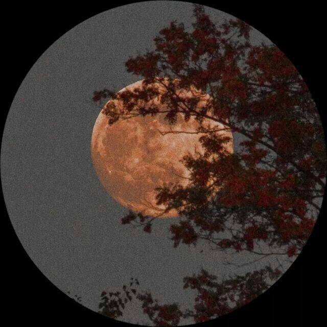
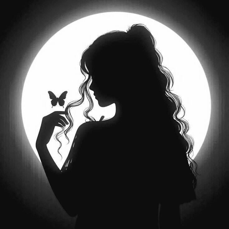
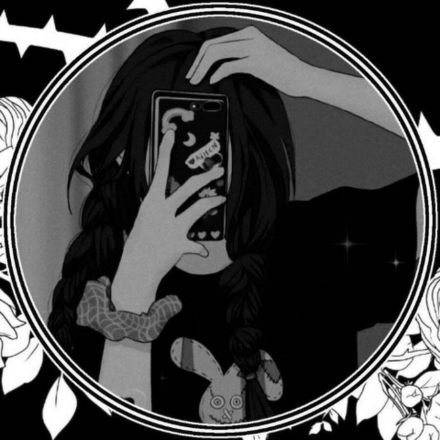
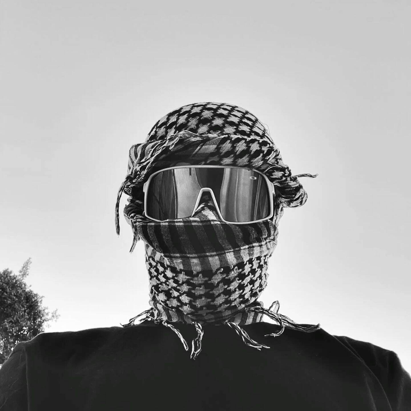
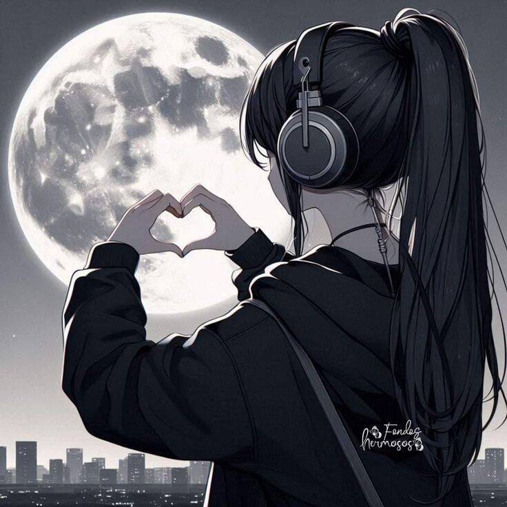
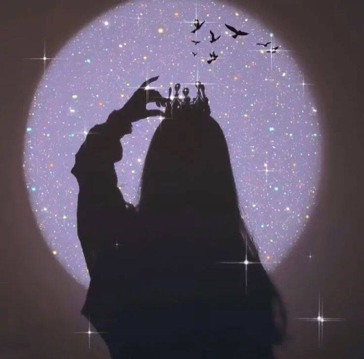
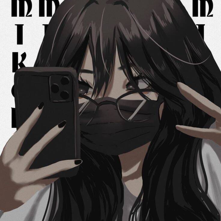
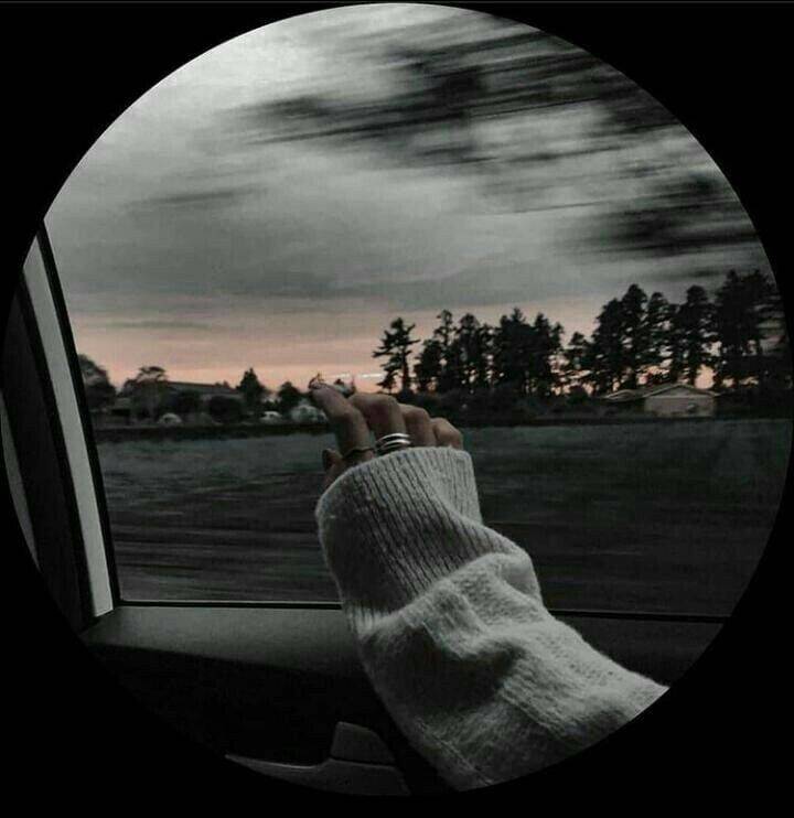
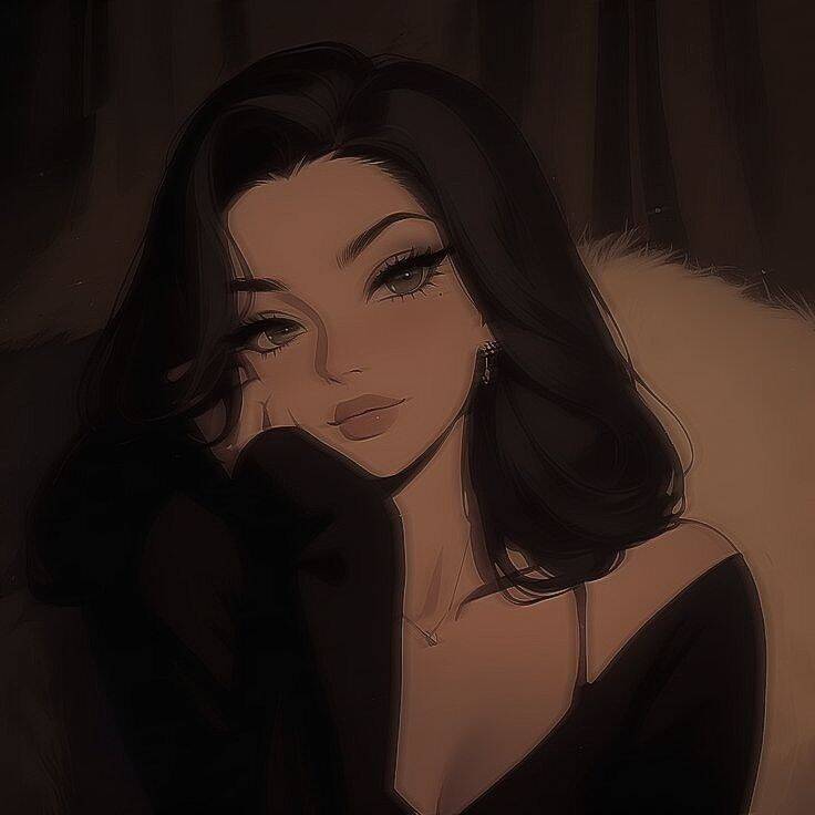
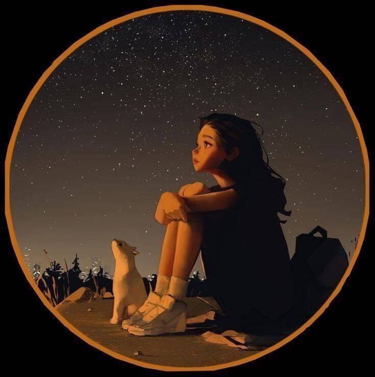
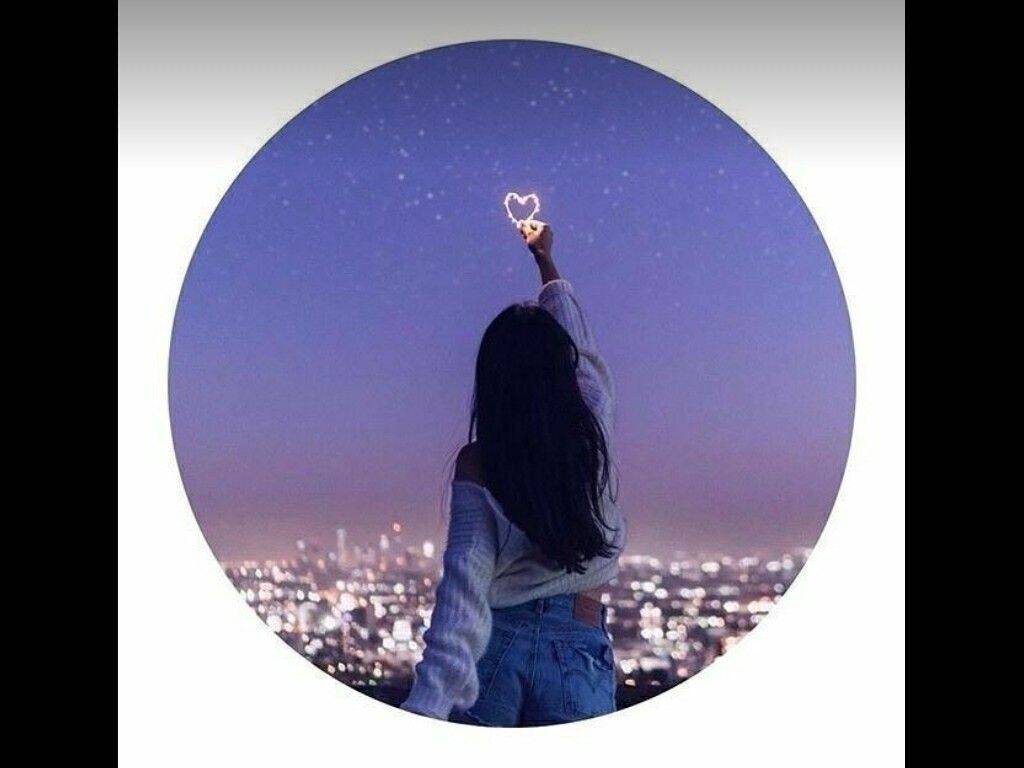
Full moons, silhouettes, and urban night scenes make up this category for a straightforward reason: darker tones and low-contrast lighting read as more guarded and less "open" than a bright, smiling photo, which some people specifically want for a personal chat app where near-constant visibility to contacts feels like a lot. It's less about looking unfriendly and more about not oversharing mood or personality by default. Because these images already run dark, WhatsApp's compression can crush shadow detail even further and turn a moody photo into a mostly-black blob at small size. Leaving a bit of extra brightness or highlight in the original image — a visible moon, a lit window, a hint of skyline — gives the compression something to preserve, rather than starting from an already near-black frame.
Floral and Soft Aesthetic
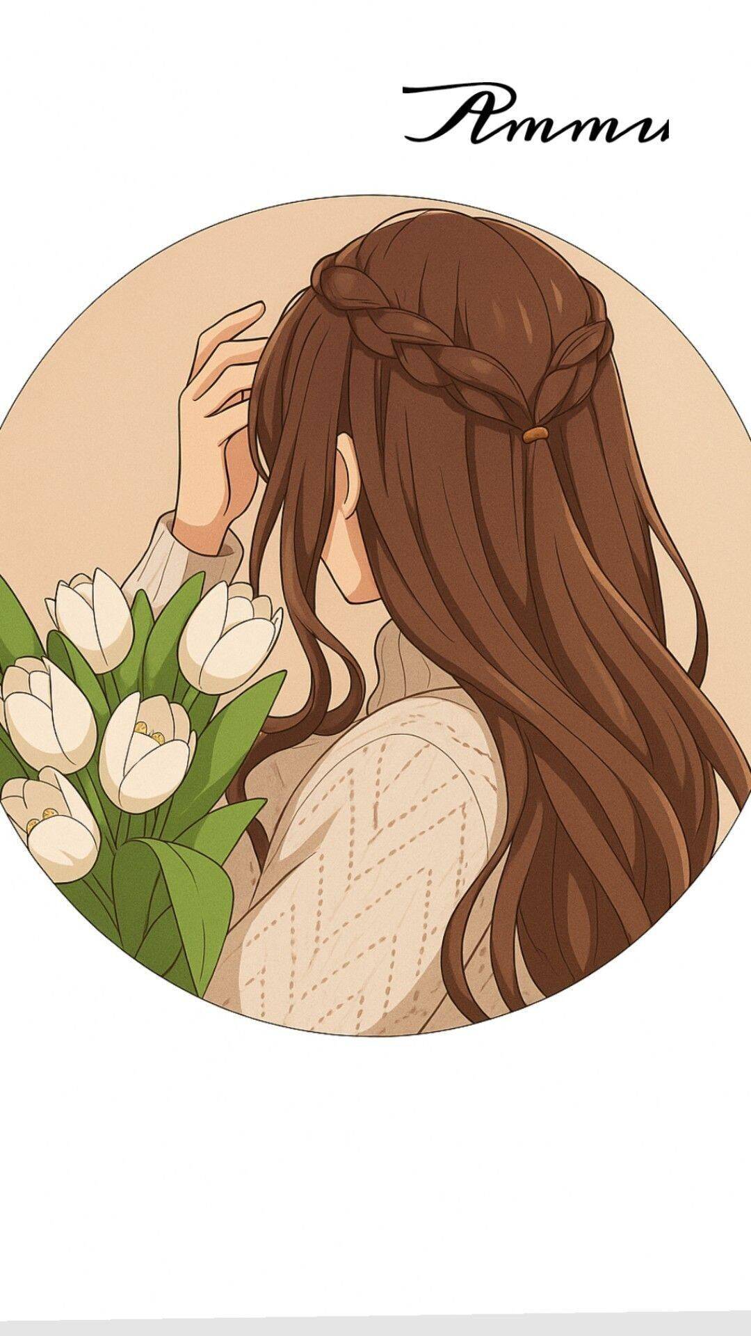
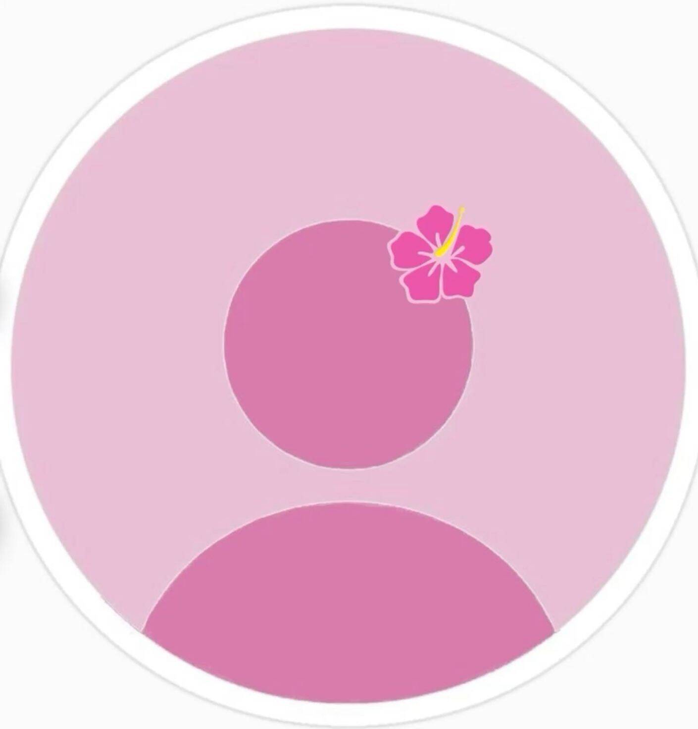
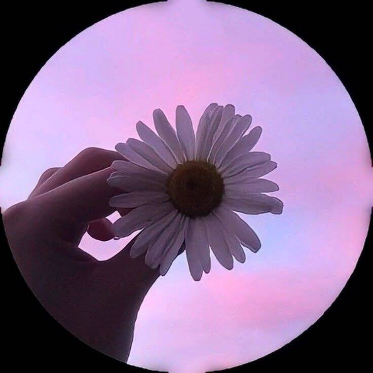
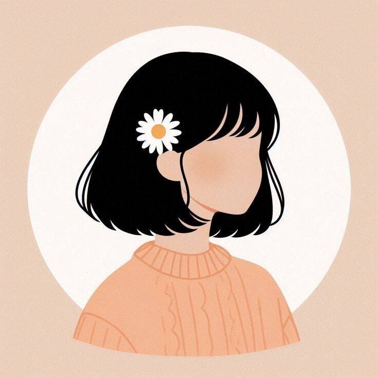
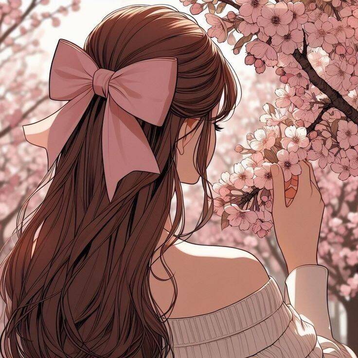
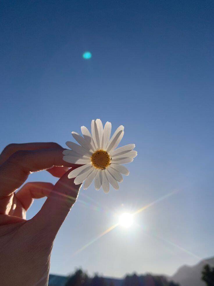
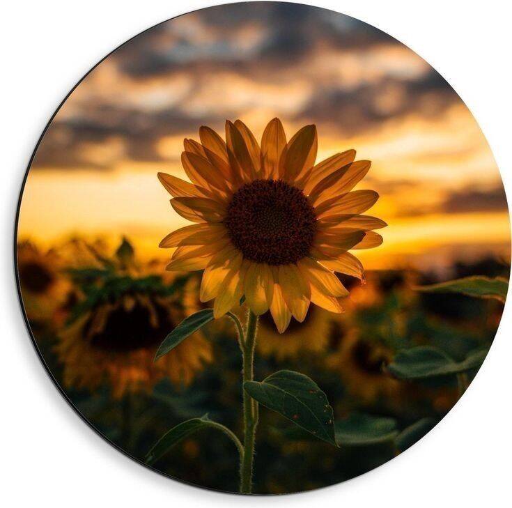
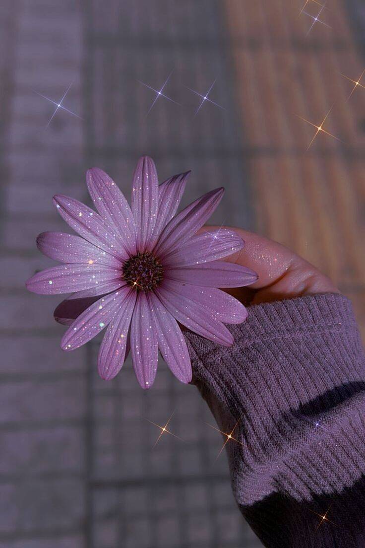
Flowers, soft color palettes, and delicate details define this section, and the appeal is fairly simple — florals photograph well even in low resolution, since petals and leaves have natural, forgiving shapes that don't need fine detail to still look like what they are. That makes this a fairly safe pick for anyone worried about how their pfp will hold up after WhatsApp's compression. White or pastel flowers specifically need a bit of background contrast to avoid disappearing — a white flower against a light or overexposed background can blend into nothing once compressed. A darker or more saturated background behind pale flowers keeps the shape and color distinct instead of washing out.
Dreamy and Delicate
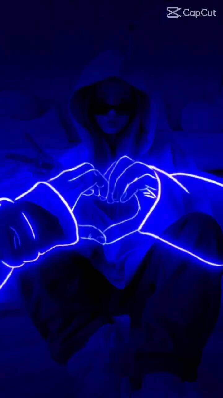
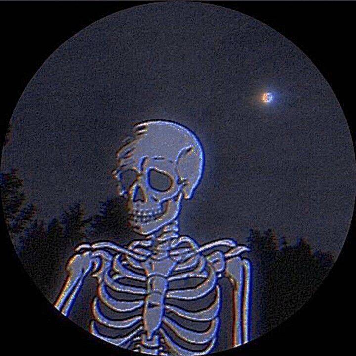
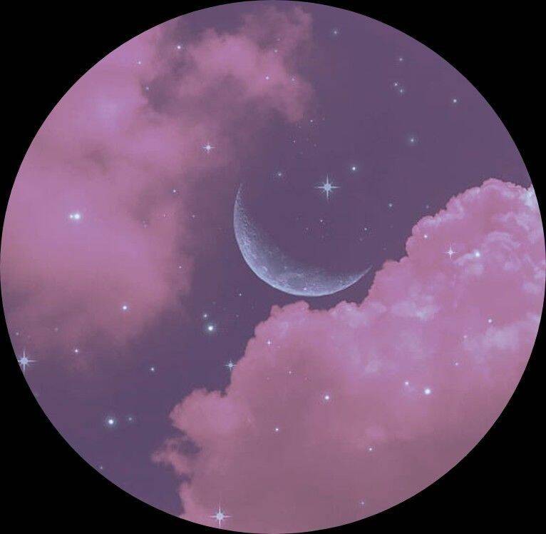
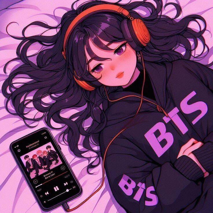
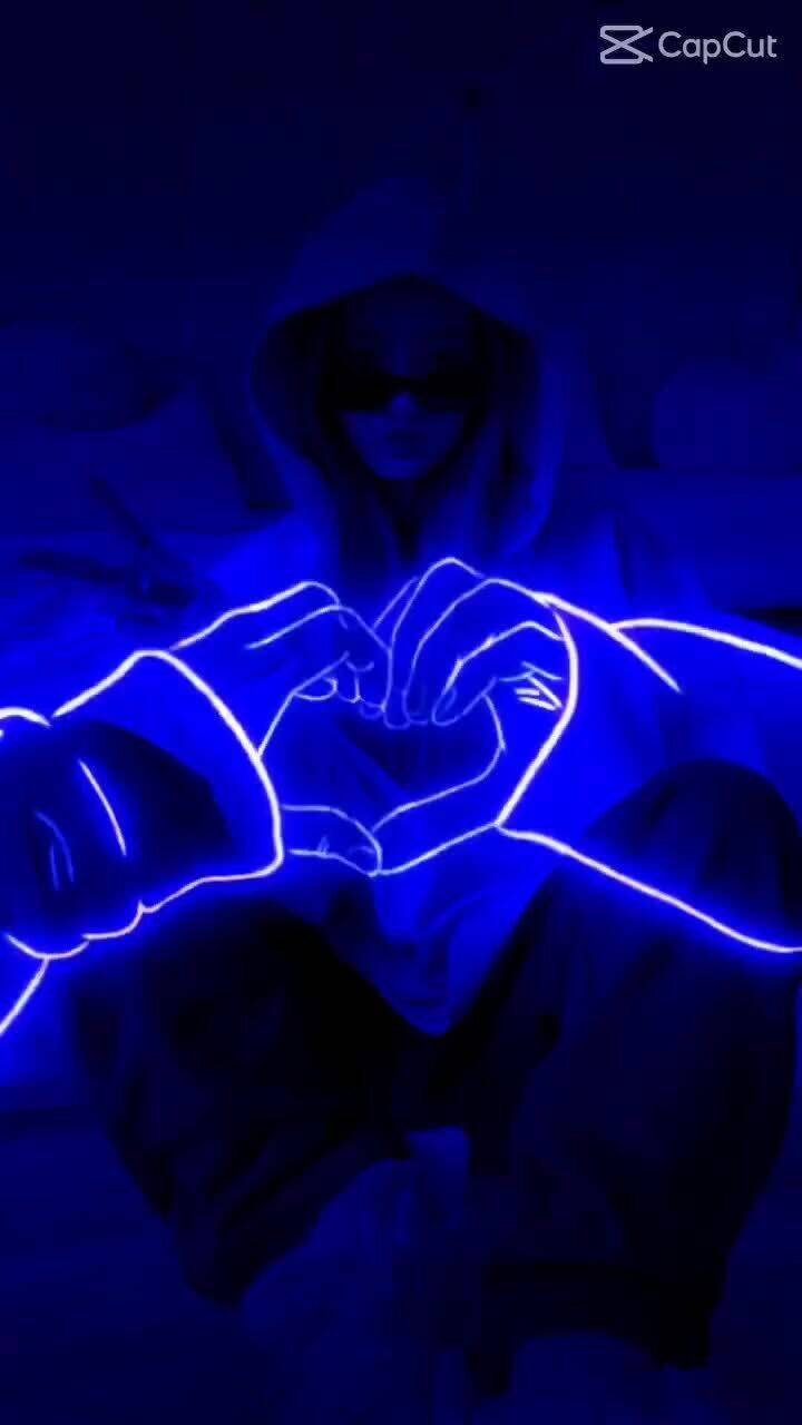
Neon effects, quiet window shots, and soft K-pop-inspired aesthetics all live here because they lean into a slower, more contemplative mood rather than anything bold or attention-grabbing. This suits people who want their pfp to feel personal and specific to their own taste rather than aiming for broad, universal appeal. Blue neon effects in particular are one of the trickier looks to get right at small size — the glow needs a genuinely dark background to read as neon at all, and without enough contrast it just looks like a slightly blue-tinted photo rather than the intended lighting effect. Worth zooming out to actual pfp size before deciding if the neon effect is actually reading the way it's supposed to.
Cute, Sweet and Playful
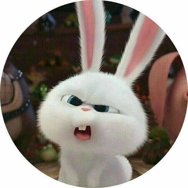
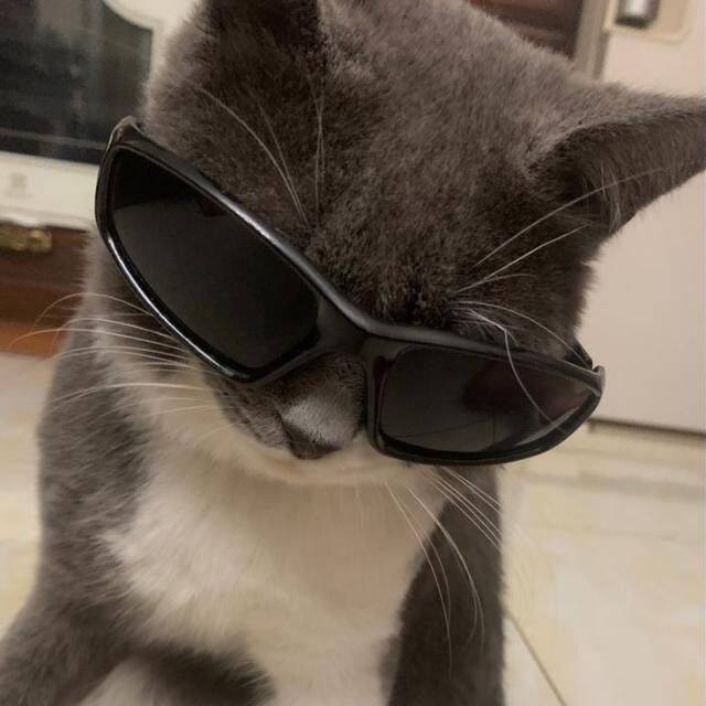
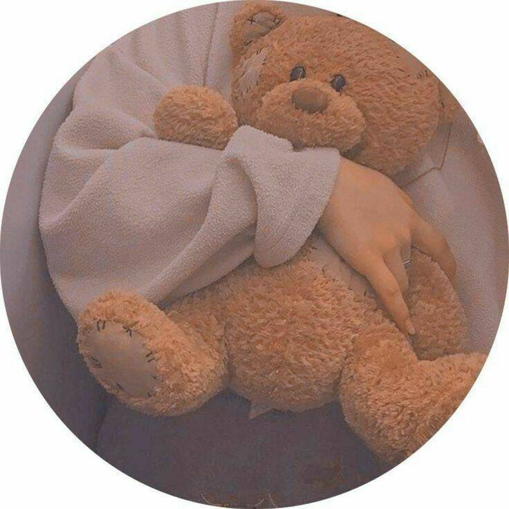
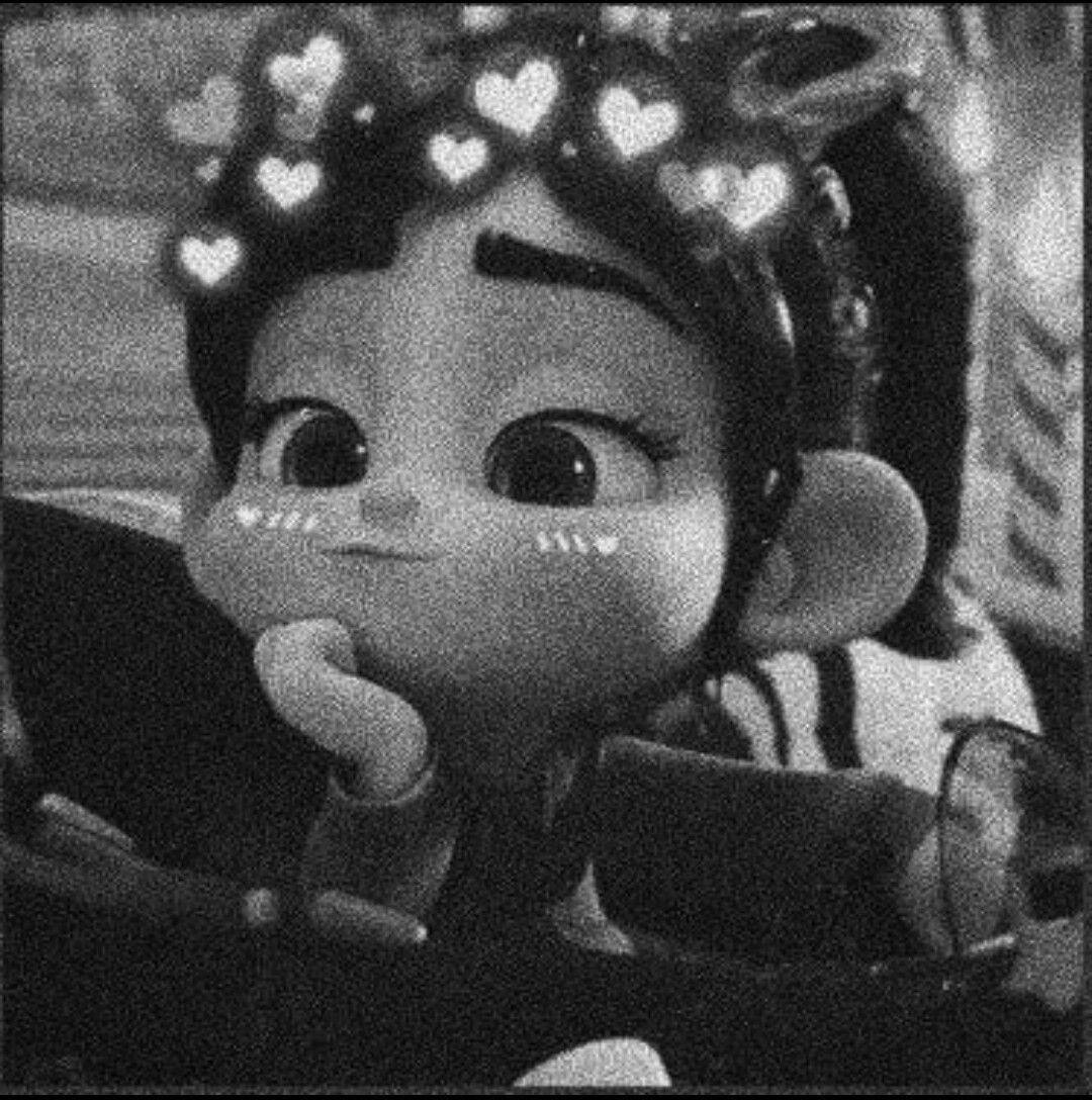
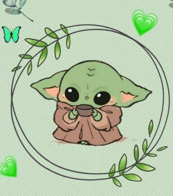
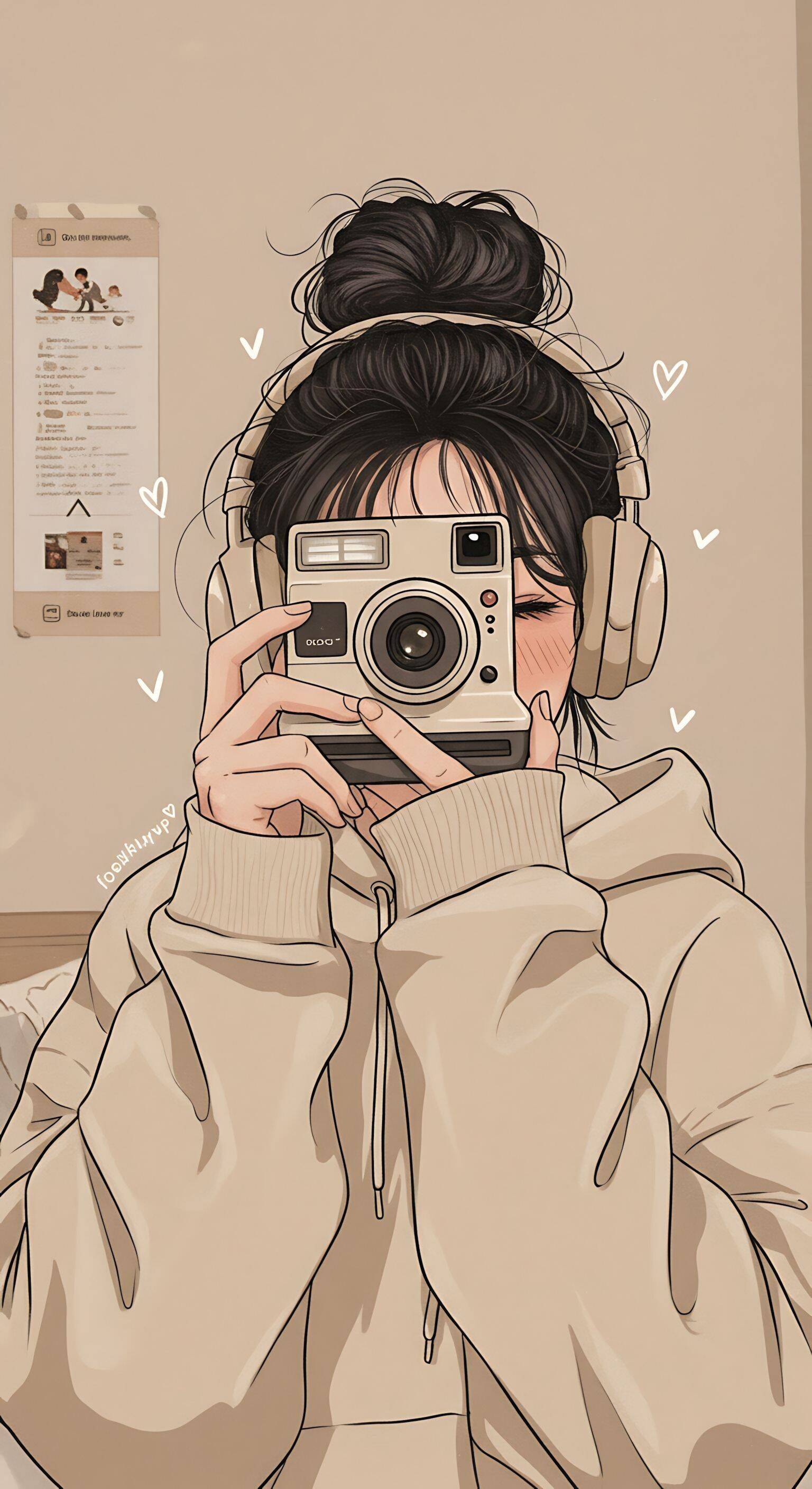
Baby Yoda, teddy bears, bunnies with glasses, and hearts round out this last section, and much like the funny-character group earlier, the common thread is a picture that's easy to like without needing any context or backstory. This is a solid default for anyone who wants a pfp that works across every chat — family, friends, work — without needing to think too hard about tone. Camera and neon-effect entries near the end of this set stand out from the rest, since they lean more stylized than cute — worth deciding upfront whether you want the soft, plush-toy feel most of this section leans toward, or one of the few bolder, more graphic options mixed in, since they read very differently sitting next to a contact's name.