TikTok PFP (Profile Pictures)
Drawing Style Girl PFPs
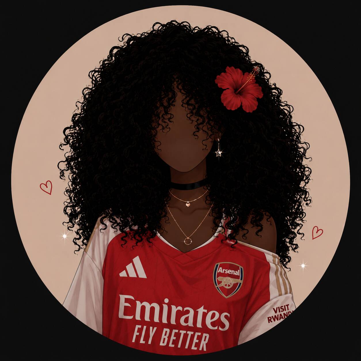
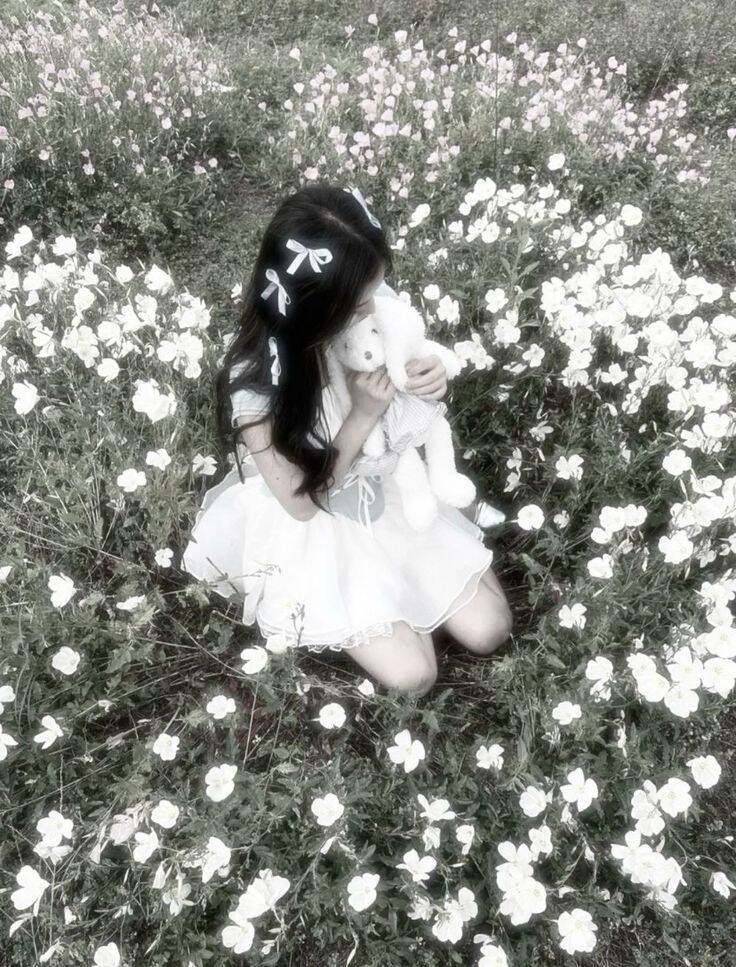
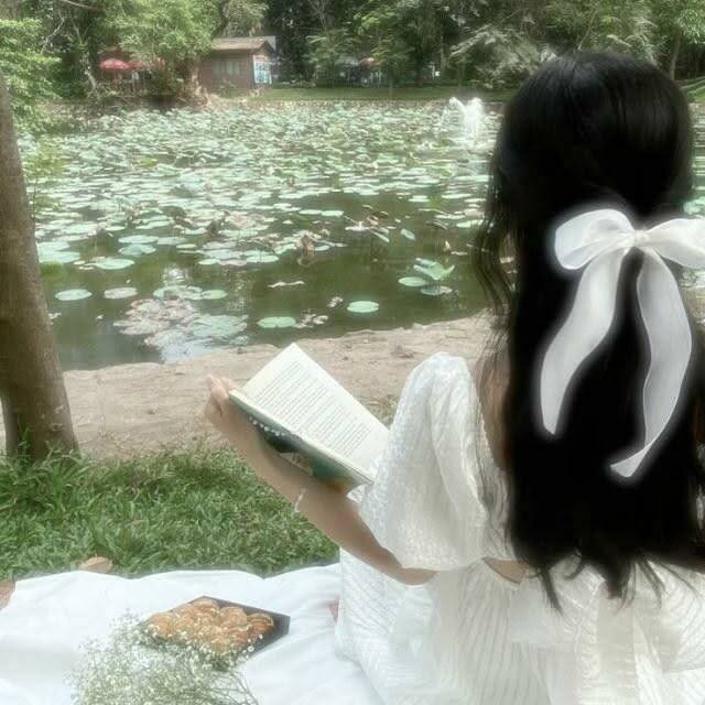
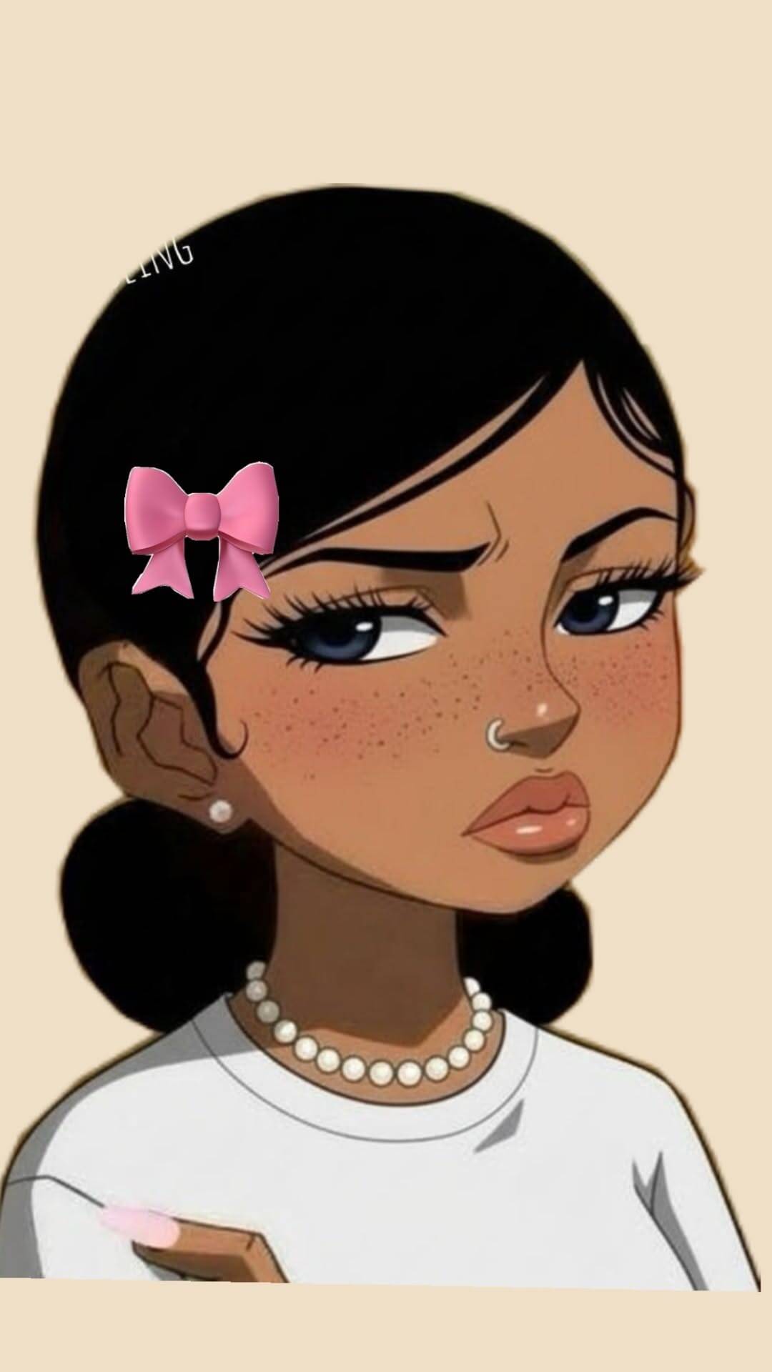
Illustrated pfps solve a problem photo-based ones can't: they let you signal a personality — reading in the woods, holding a plush toy, wearing glasses with a specific vibe — without needing an actual photo that captures all of it convincingly. The drawing does the emotional work a candid shot would need perfect timing to pull off. Because this style relies on line work and flat color rather than photographic detail, the pfp holds up better at small sizes than a busy photo would — which is part of why drawn characters reading in a park or holding a teddy bear tend to stay legible even shrunk down to a thumbnail, when an equivalent photo would blur into mush.








Anime & Mysterious Style PFPs
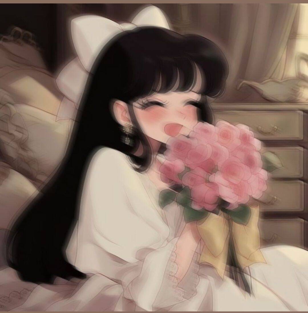
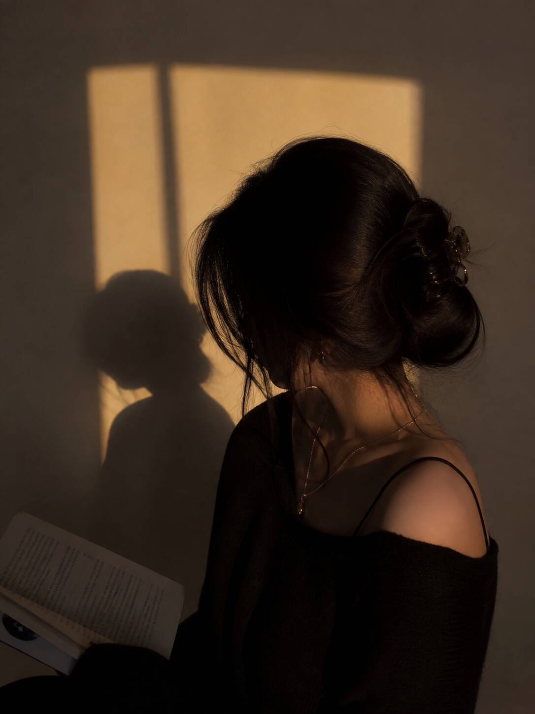
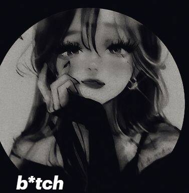
This section actually covers two different moods that get grouped together because they share a similar visual weight: bright, expressive anime art on one side, and darker, shadowed or masked imagery on the other. A smiling anime girl with flowers and a dark sunset silhouette with a scary mask are both here, but they signal almost opposite things about the account behind them. If mysterious is more your goal than anime specifically, look for pieces that use negative space rather than just dark color — a mostly-black background with one lit detail (an eye, a mask edge) reads as intentional and moody, while an image that's just uniformly dark can look like a bad photo instead of a stylistic choice.









Glam & Cool Style for TikTok
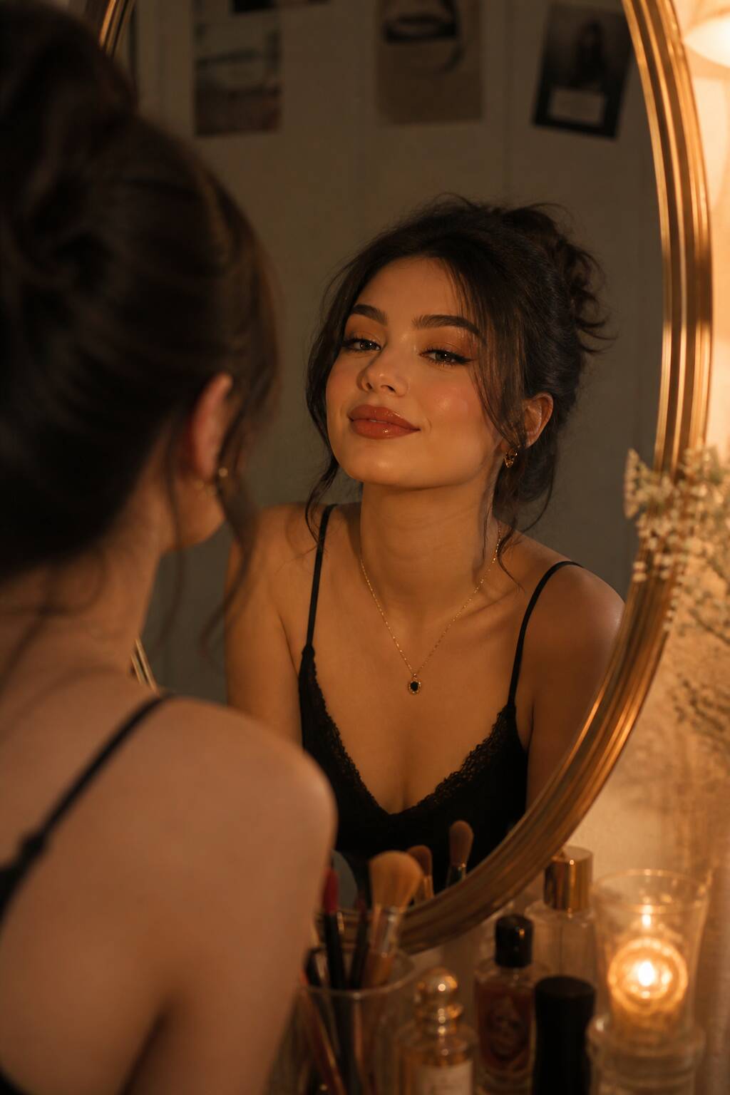
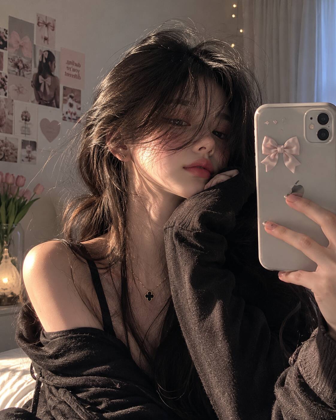
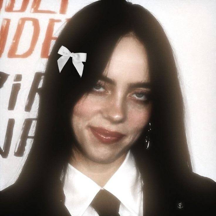
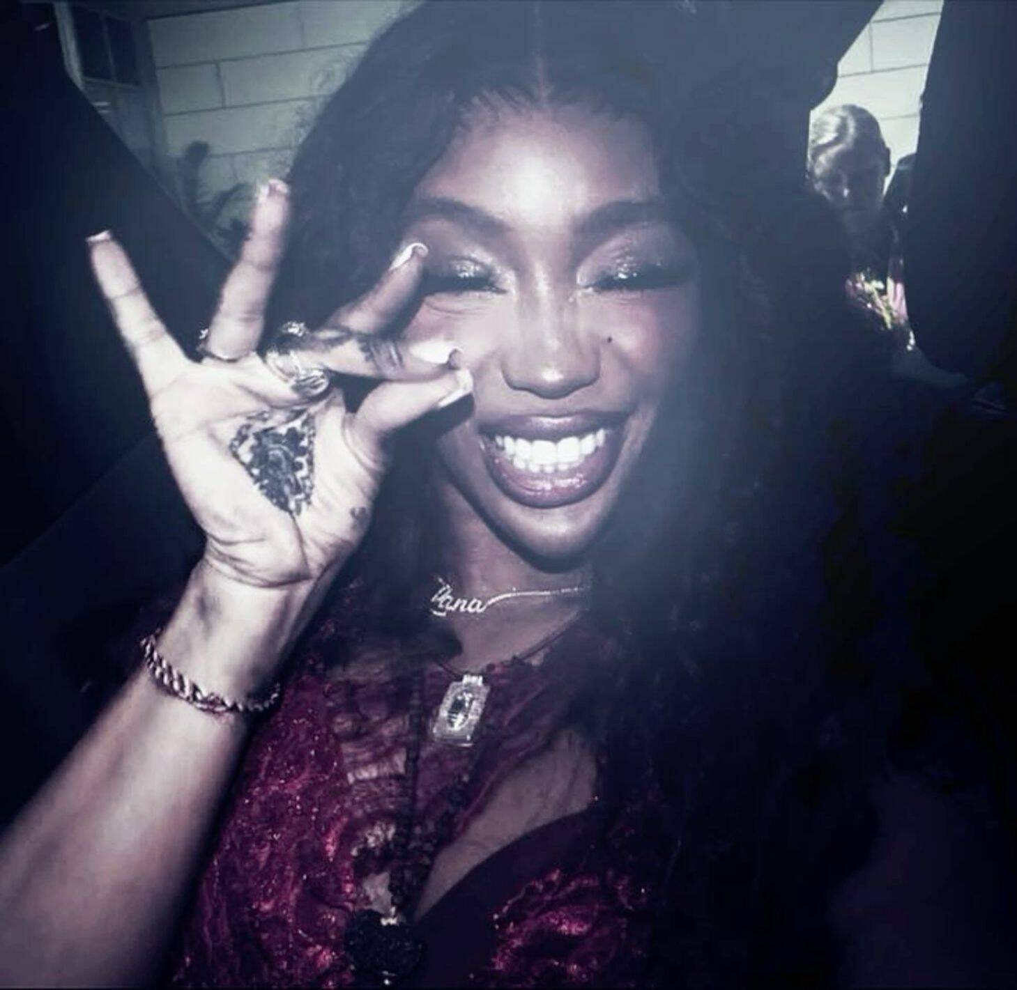
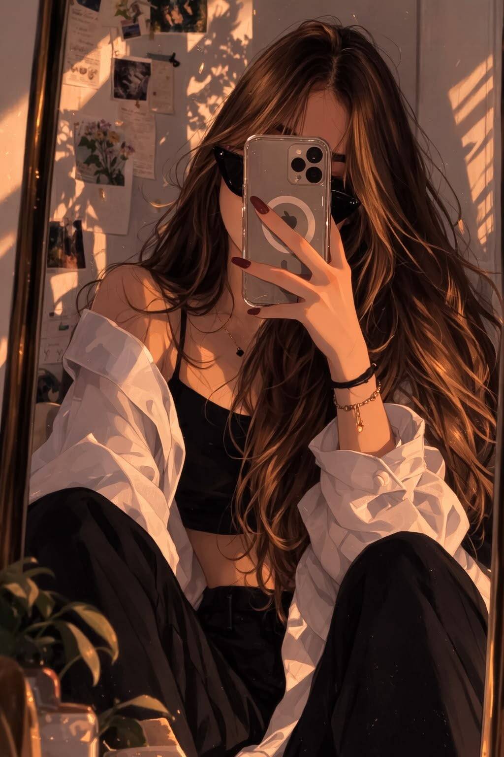
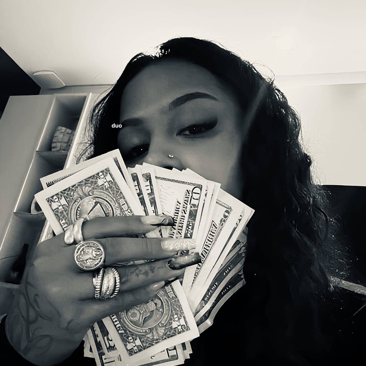
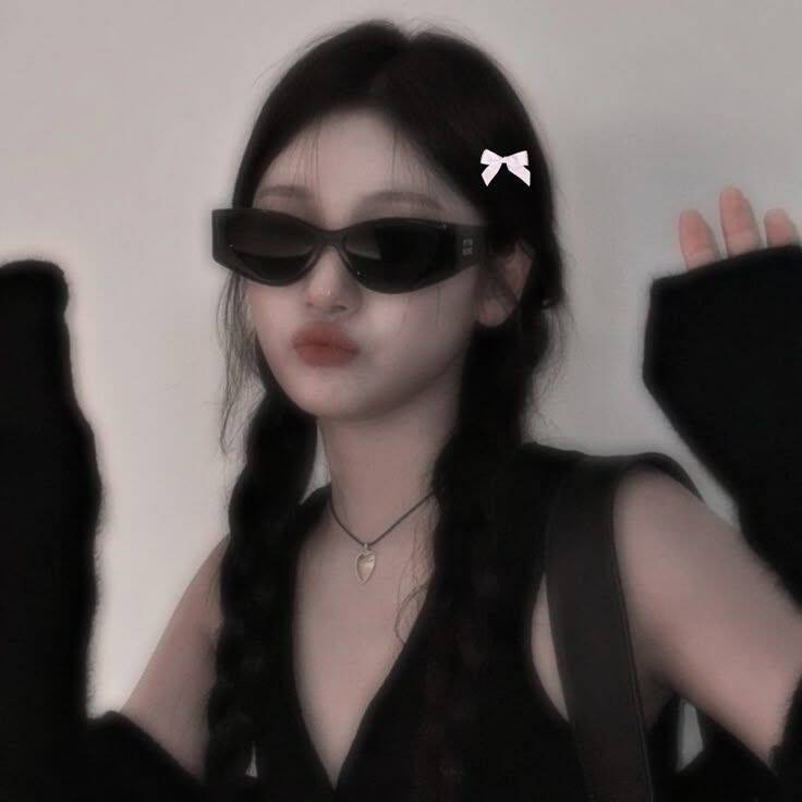
Glam-style pfps are built around confidence rather than approachability — mirror selfies, sunglasses, red dresses, the "it girl" look that leans polished and a little unbothered. This is a different lane from the bow or drawing-style aesthetics further up; it's less about being cute and more about looking like you have somewhere to be. A mirror-selfie pfp specifically lives or dies on what's visible in the reflection — a cluttered background behind the subject undercuts the whole glam effect, so the shots that actually read as aspirational tend to have a clean, uncluttered mirror frame even if the rest of the room isn't.





Cute Cartoon Character PFPs
This group mixes recognizable characters — Spider-Man, a cartoon princess, a soccer player in a numbered jersey — with straightforwardly funny picks like a dog in glasses or a duck mid-expression. What ties them together isn't the subject matter so much as the intent: instant recognizability over subtlety, which suits an account that wants to look playful rather than curated. Sports-related picks (a jersey number, a specific player) work a little differently than the rest of this group — they signal a specific interest or fandom rather than a general mood, so they tend to land better on accounts already built around that interest than as a standalone aesthetic choice.












Black & White Minimalist
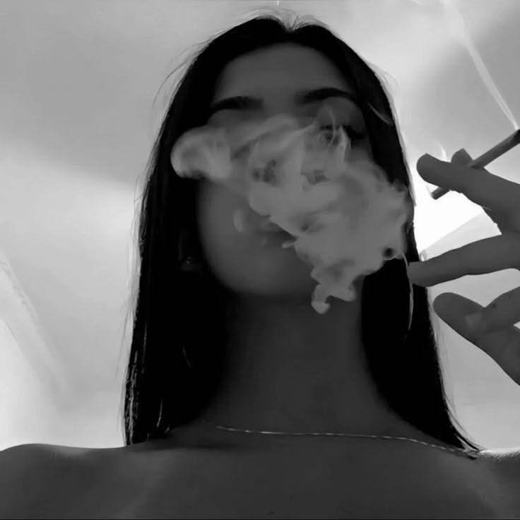
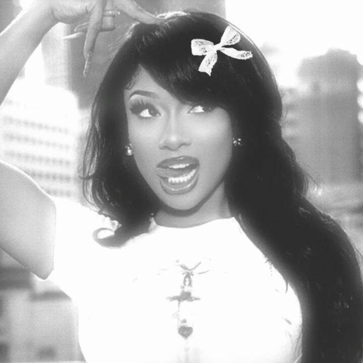
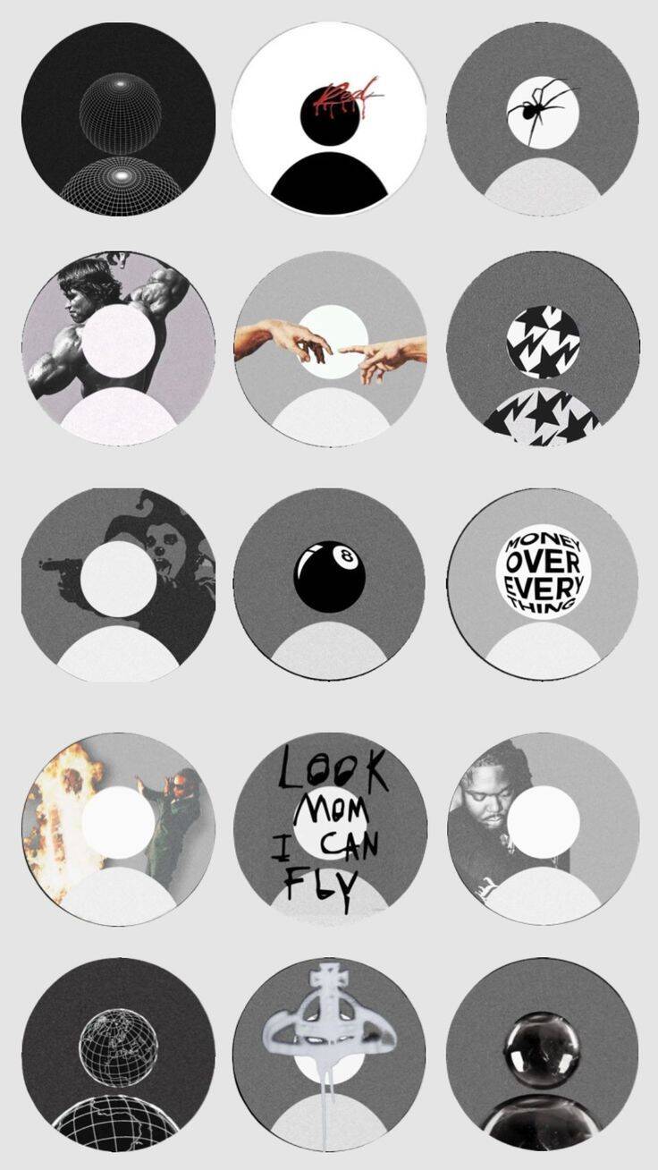
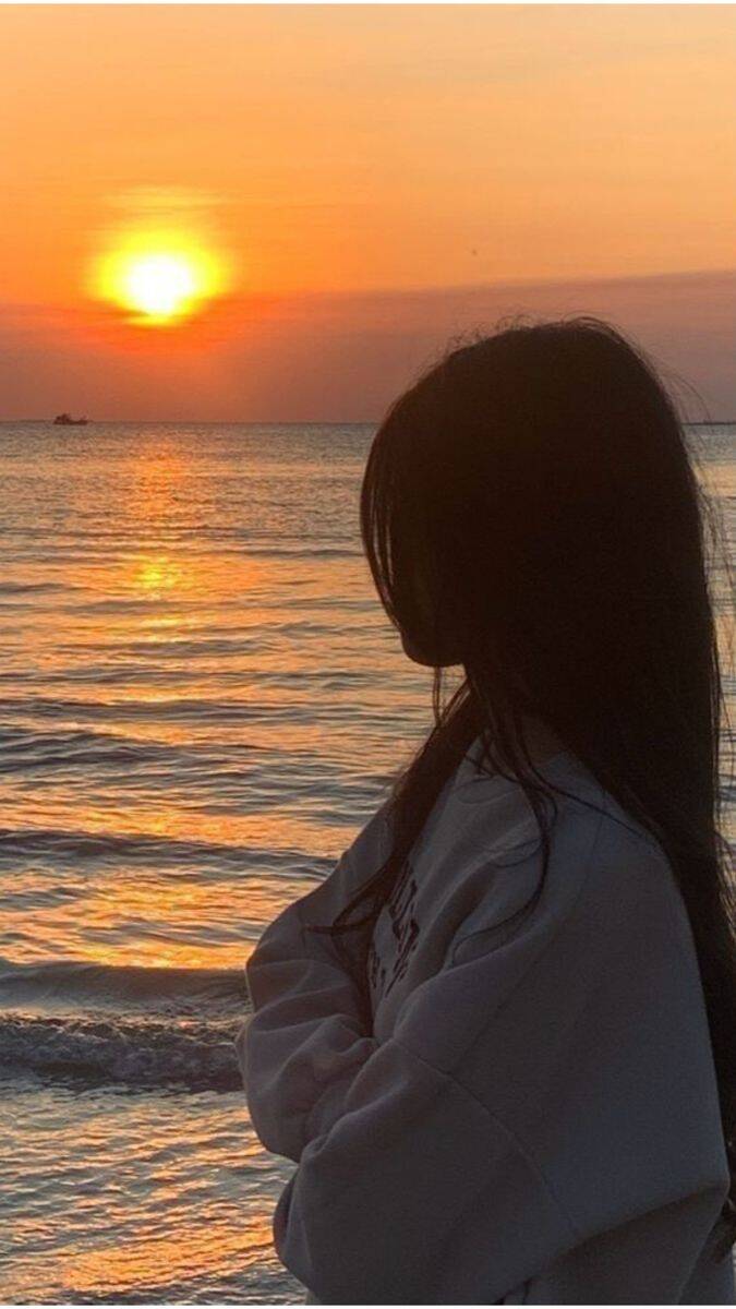
Stripping color out does something specific: it flattens a busy photo into something that reads as intentional rather than snapshot-like, which is why black-and-white treatments show up so often paired with silhouettes, crowns, or simple props like glasses. The absence of color forces attention onto shape and contrast instead of detail. Silhouette-based pfps (a crown outline, a heart at sunset, a figure against the sky) depend entirely on a clean edge between subject and background — a silhouette shot against a busy or gradient-heavy sky tends to blur into the background at profile-picture size, while one against a flat, simple sky stays crisp even shrunk down small.







Romantic & Vintage for TikTok
This section leans softer and more nostalgic than the glam or urban categories elsewhere in the collection — a flower tucked into hair, sunset lighting, a plush toy, vintage color grading that mutes everything down a shade. It's the closest thing here to a "storybook" mood, and it tends to suit accounts built around a gentler, slower aesthetic rather than anything loud. Vintage grading is easy to overdo: a light warm filter with slightly muted colors reads as intentional and era-appropriate, but pushing the same filter too far tips into looking like a damaged or low-quality photo instead of a deliberate style choice — the goal is warmth, not degradation.