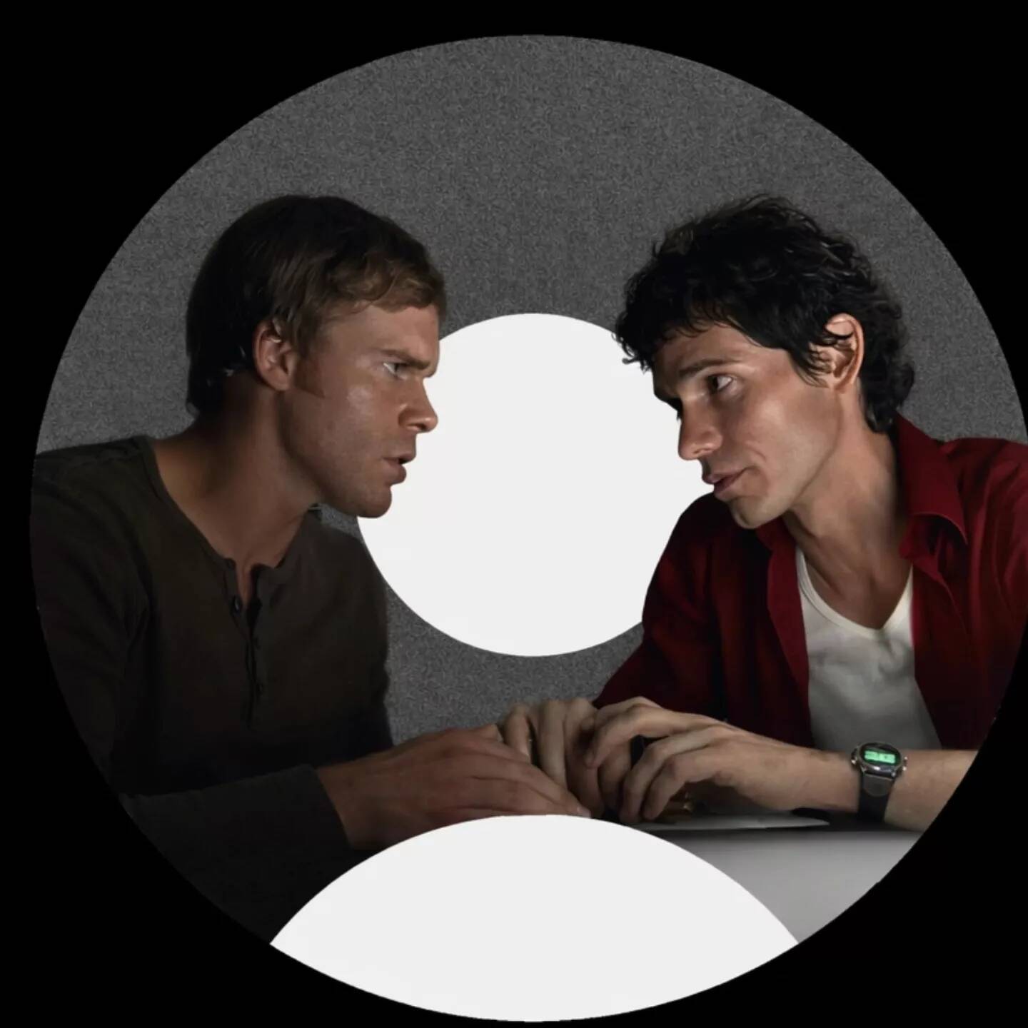
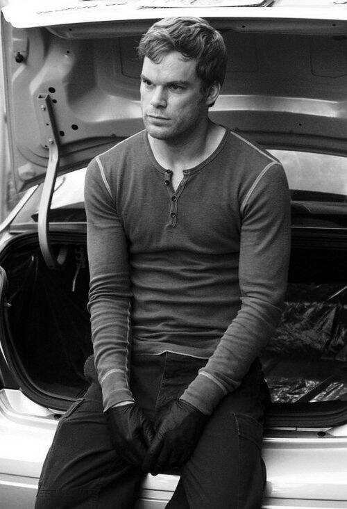
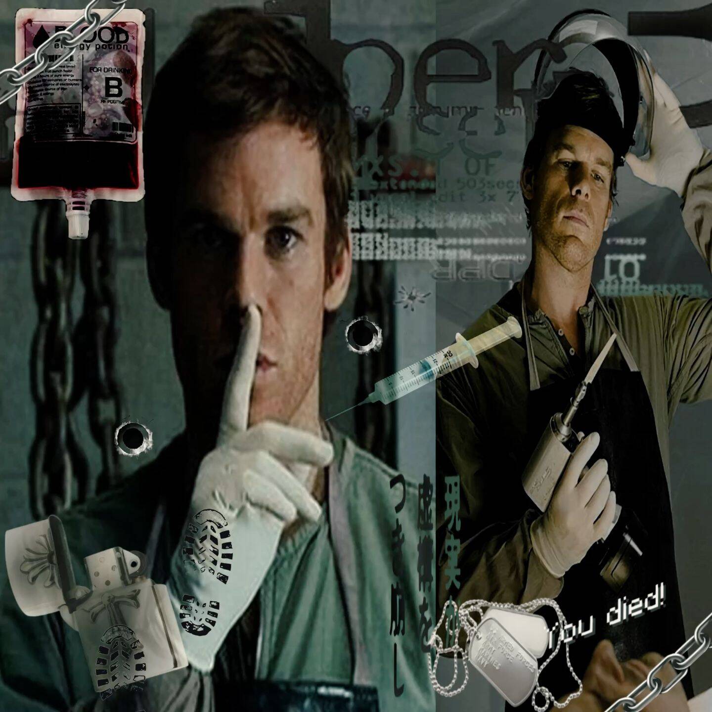
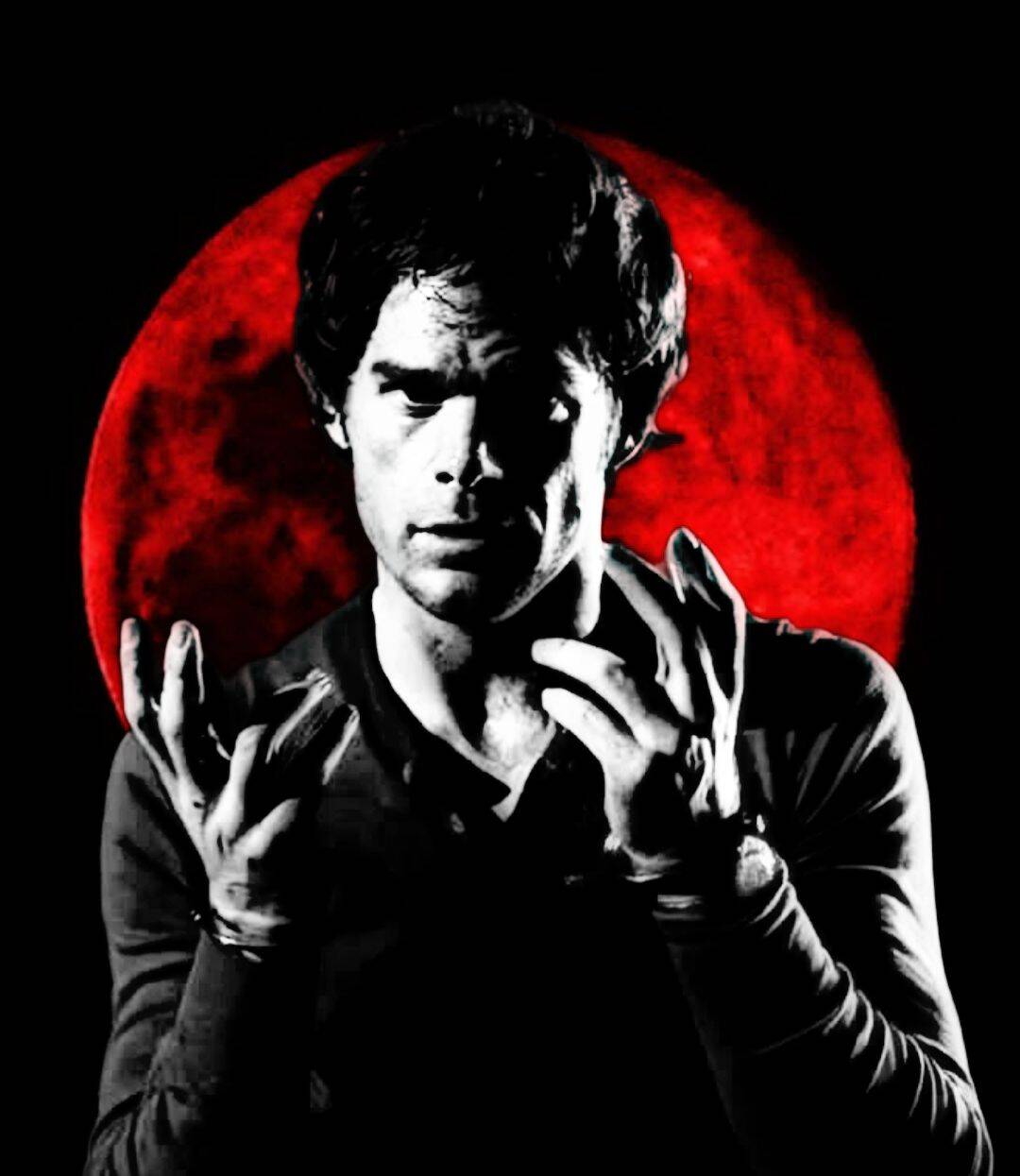
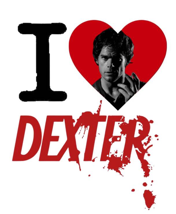
Dexter PFP (Profile Pictures)
Confident & Cool Poses
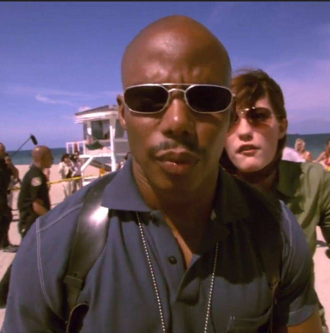
Not every version of this character needs to feel threatening, and this section is the answer for anyone who wants the recognizability without the intensity — sunglasses, a relaxed grin, a beach backdrop, the kind of energy that reads as "unbothered" rather than "calculated." It's a solid pick for casual servers or group chats where a darker expression would feel out of place. One thing worth checking before you settle on one: sunglasses can hide too much of the face if the rest of the picture doesn't give you another identifying detail, like a distinctive outfit or a signature gesture — otherwise it just reads as a generic guy in shades rather than a specific character.










Cute Cat & Blushing Style
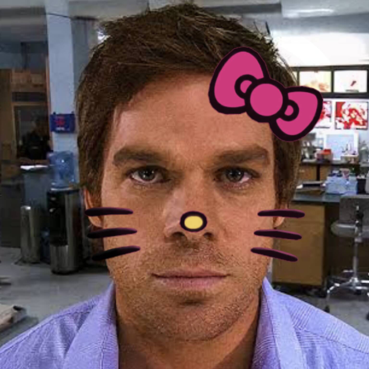
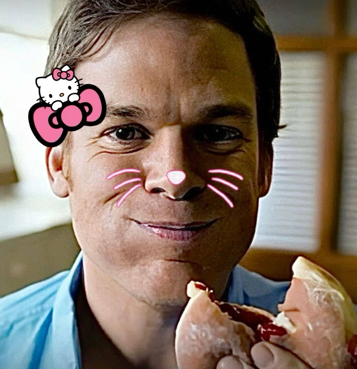
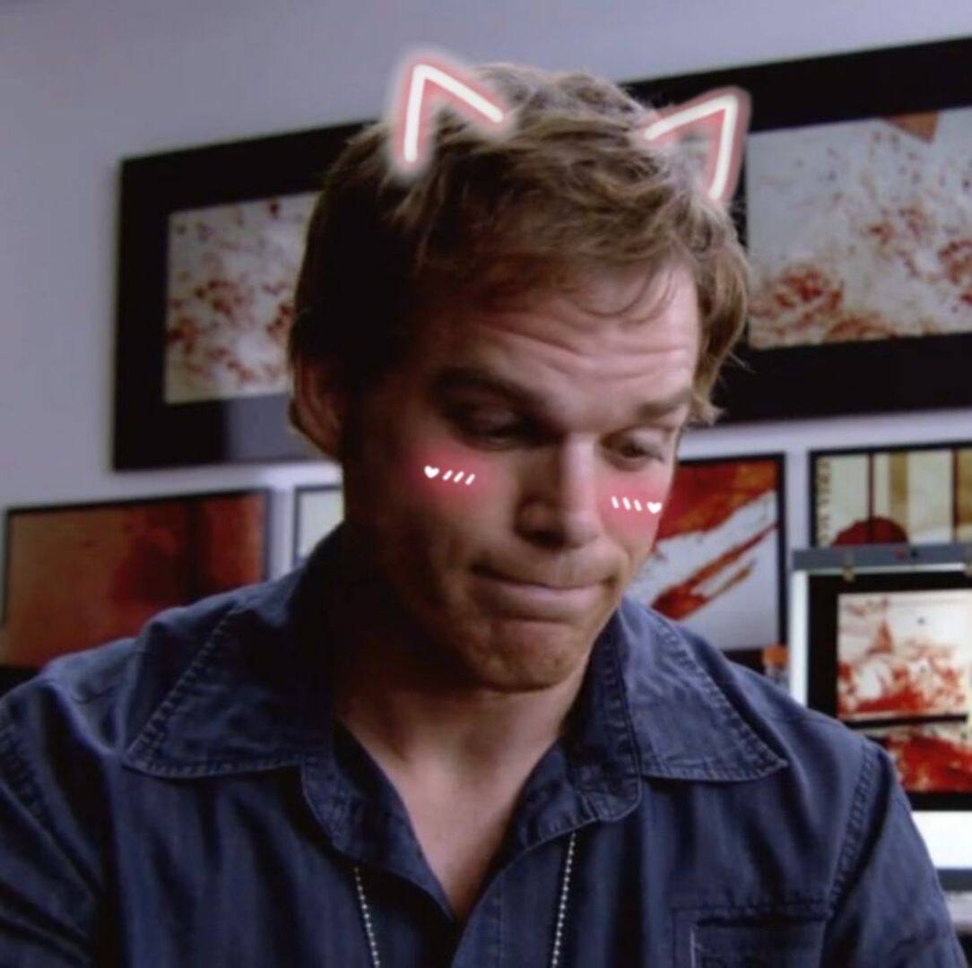
This category runs the same joke as the Hello Kitty crossover but pushes it further — cat ears, blushing cheeks, sometimes still holding onto a small dark detail like a knife tucked in the corner, which is usually what keeps it funny instead of just cute. The mix of "adorable" and "vaguely unsettling" is the actual appeal, not either half on its own. If the goal is humor rather than just cuteness, look for versions that keep one incongruous element from the character's darker side visible somewhere in frame — remove that entirely and it just becomes a generic cute-cat picture that happens to share a name with the show.







Fun Crossovers & Quirky Themes
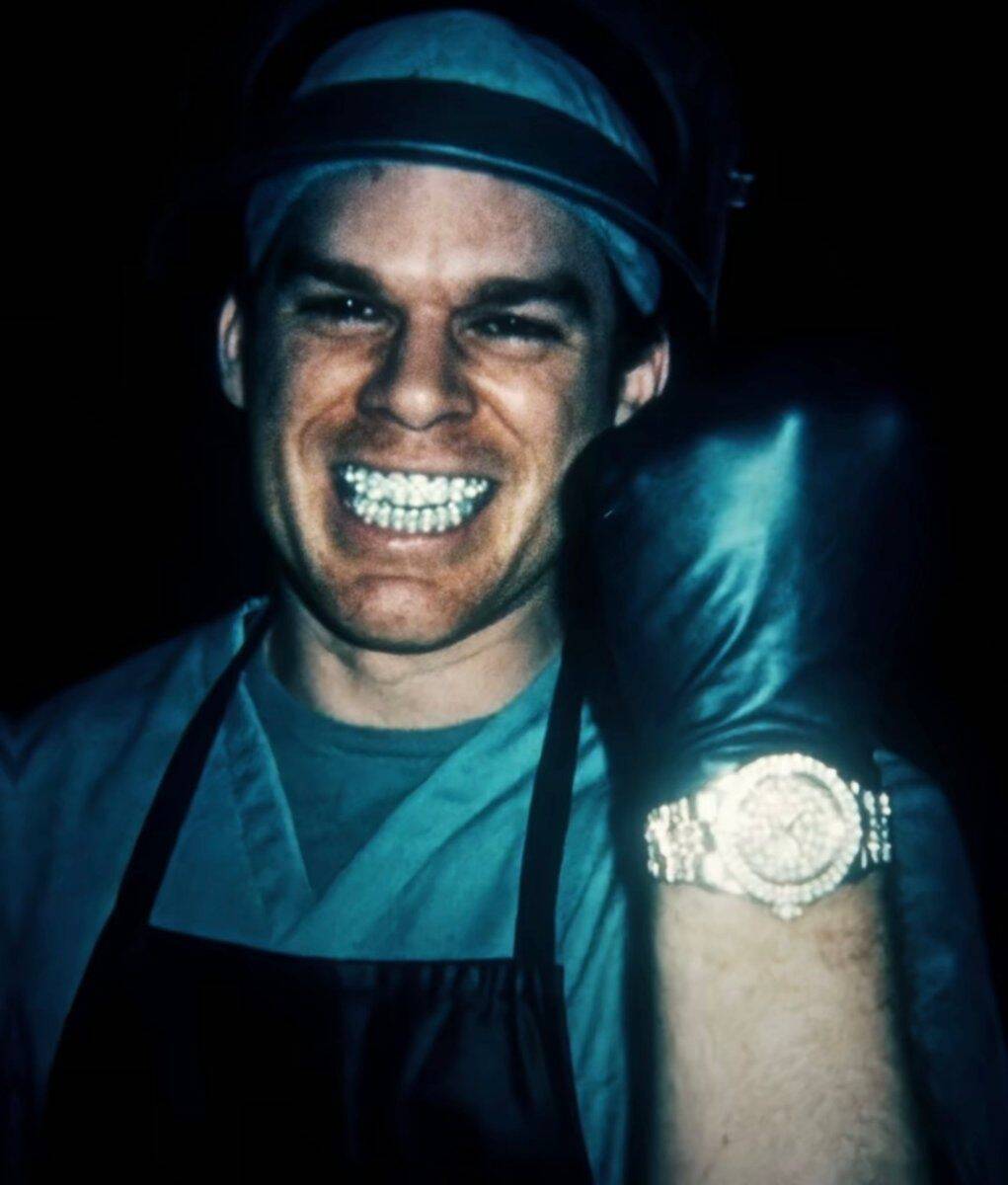
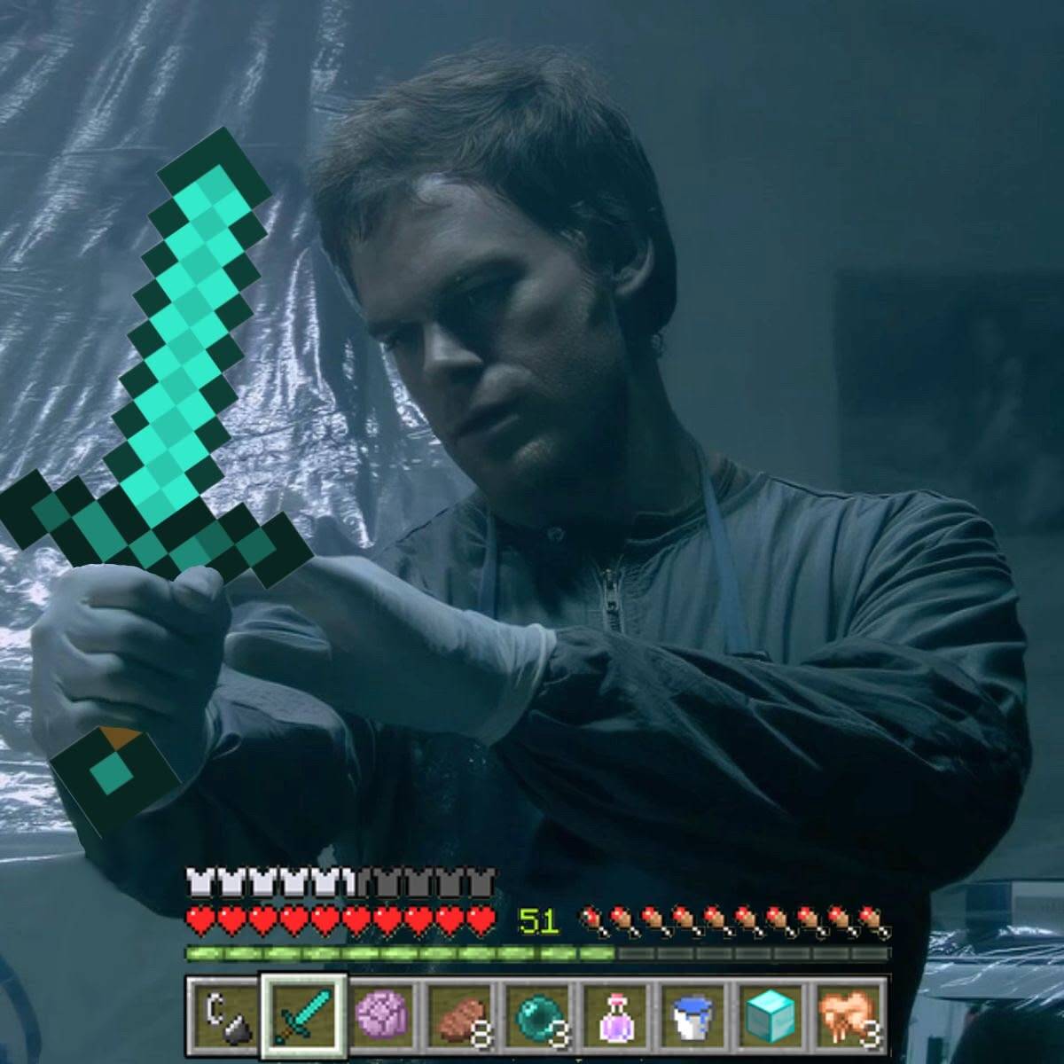
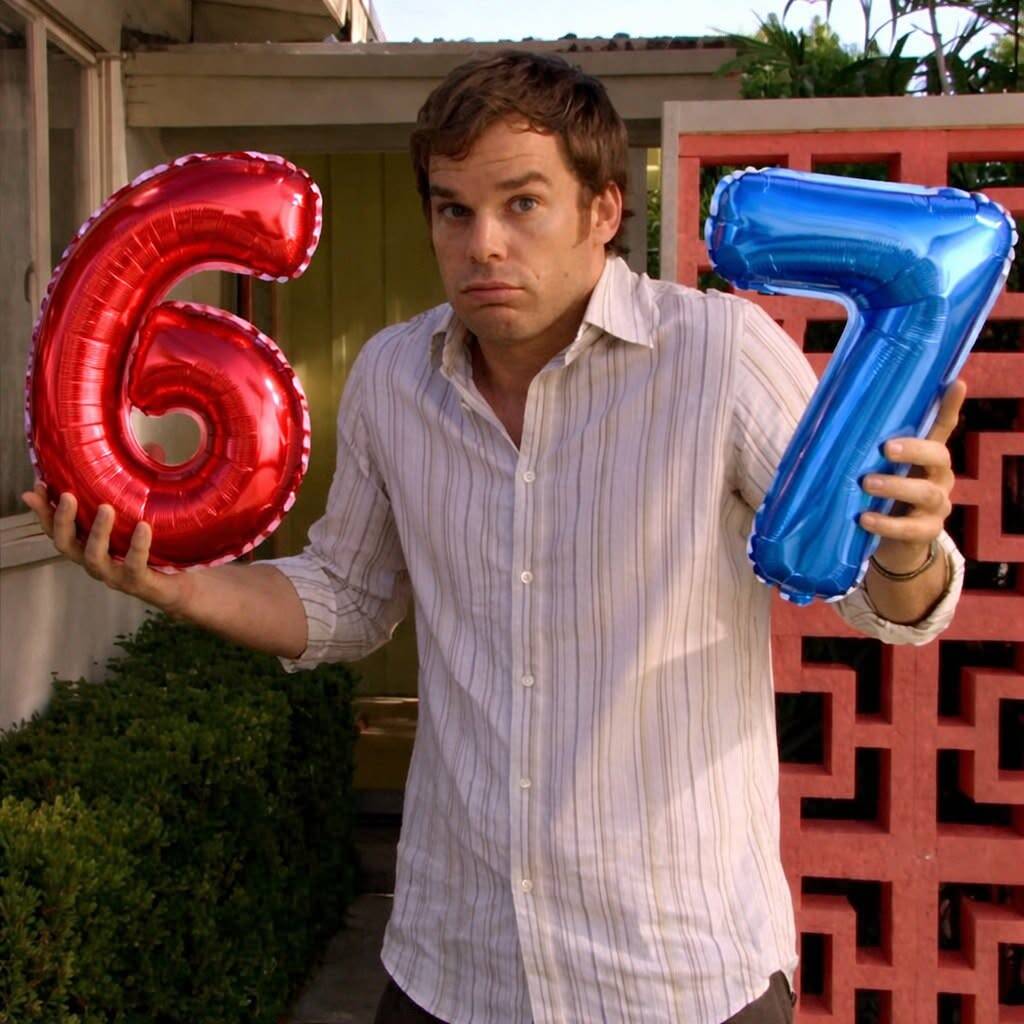
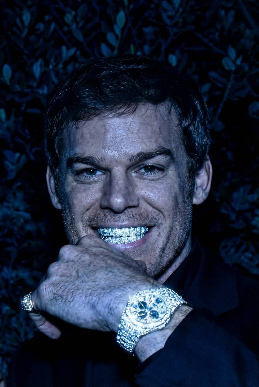
This is the catch-all for anyone who wants a picture that gets a reaction rather than one that fits a mood — a Minecraft backdrop, Mickey Mouse ears, gold grills, a hamburger face swap. None of it takes itself seriously, and that's the point; it's built for group chats and Discord servers where the goal is making someone laugh at first glance rather than setting a tone. Because this section is the most varied on the page, it's worth picking based on the specific joke landing with whoever's actually going to see it — a reference-heavy option (like the Minecraft crossover) only works if your friends get the reference, while something more visually absurd on its own doesn't need any context to land.






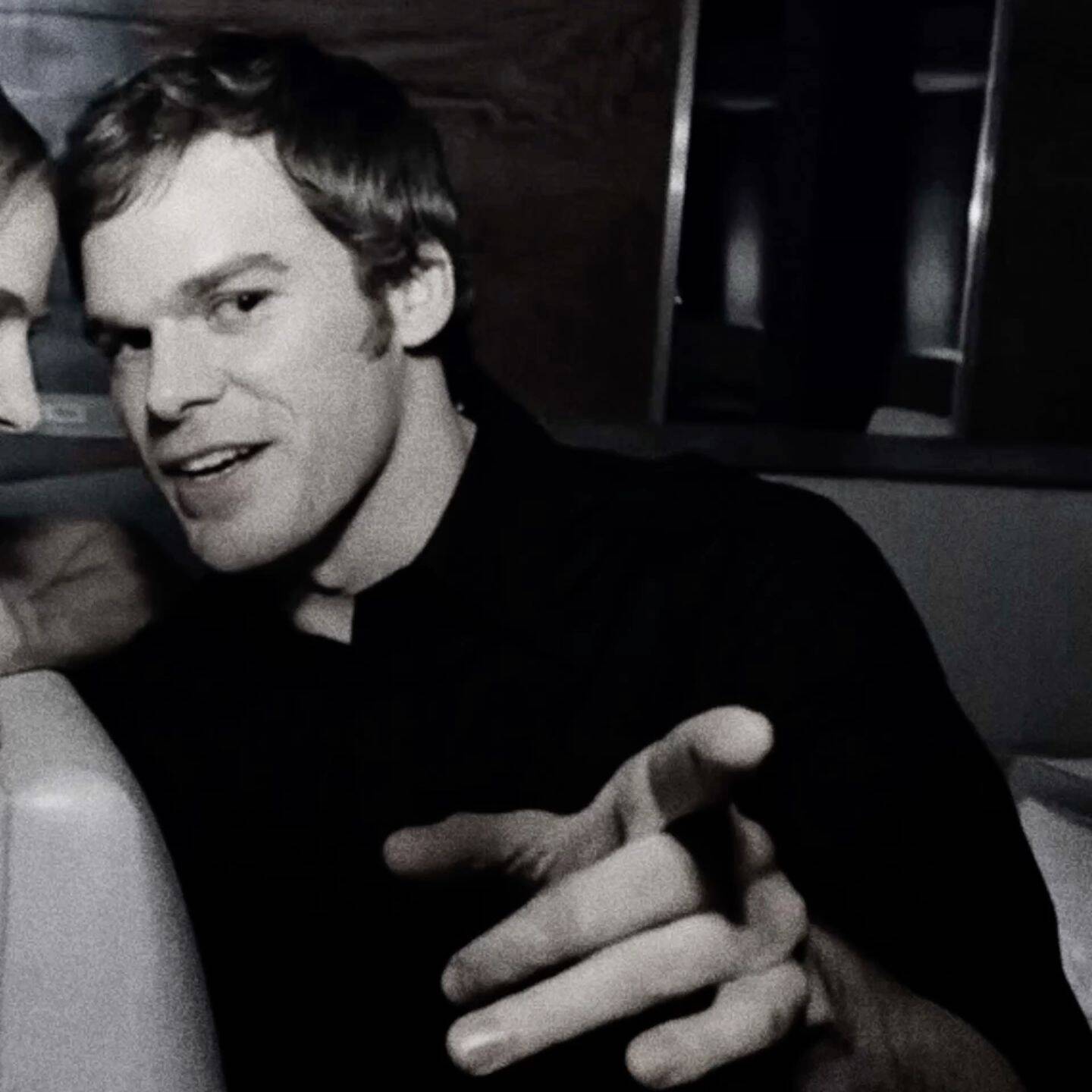
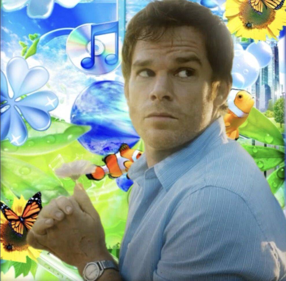
Dark, Intense & Beach Vibes
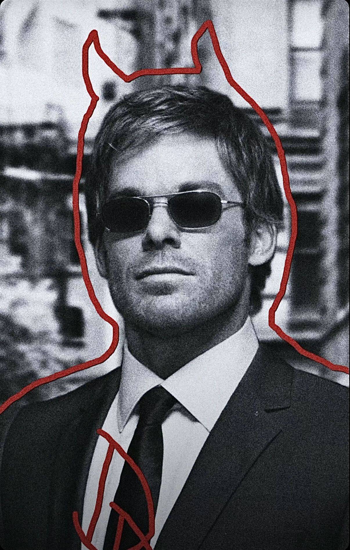
This section is deliberately mixed rather than narrow — the same character shifting between a genuinely dark, blood-and-surgical-tools moment and a relaxed sunglasses-on-the-beach shot a few pictures later. That range is actually useful if you're someone who swaps your profile picture based on mood rather than sticking with one fixed persona. If you do plan to rotate between a few, pick options that share something visually consistent — the same color grading, or a recurring prop like the watch — so switching between them still reads as "the same person's account" rather than a completely different picture each time someone visits your profile.