Default PFP (Profile Pictures)
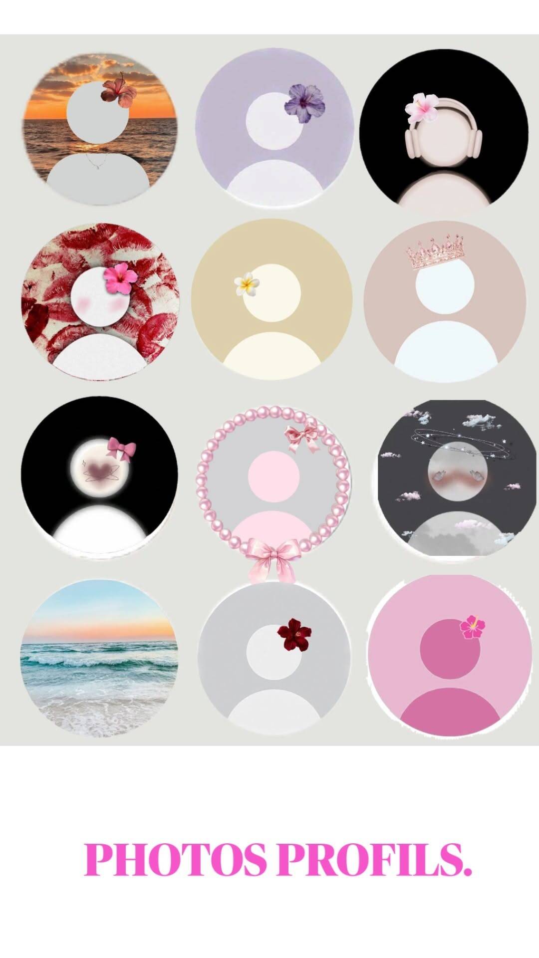
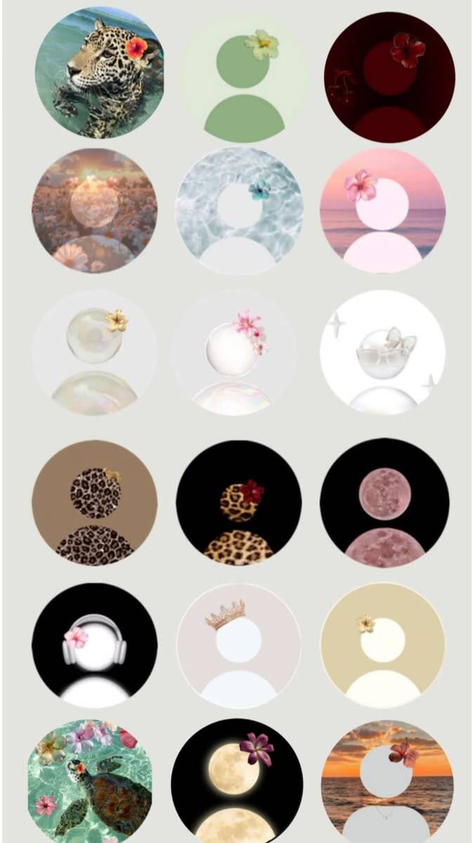
Default profile picture options here run far beyond a single generic style — this collection spans soft floral and pink aesthetics, open tropical and beach-inspired designs, stripped-back minimalist patterns, cute cartoon characters, original anime-style art, elegant royal touches, abstract and cosmic backgrounds, and a wide set of quirky one-off extras. Whether you want a default pfp that feels calm and neutral, a bit more expressive, or simply cute, there's a distinct direction here to fit rather than a single one-size-fits-all image.
Floral Aesthetic pfp
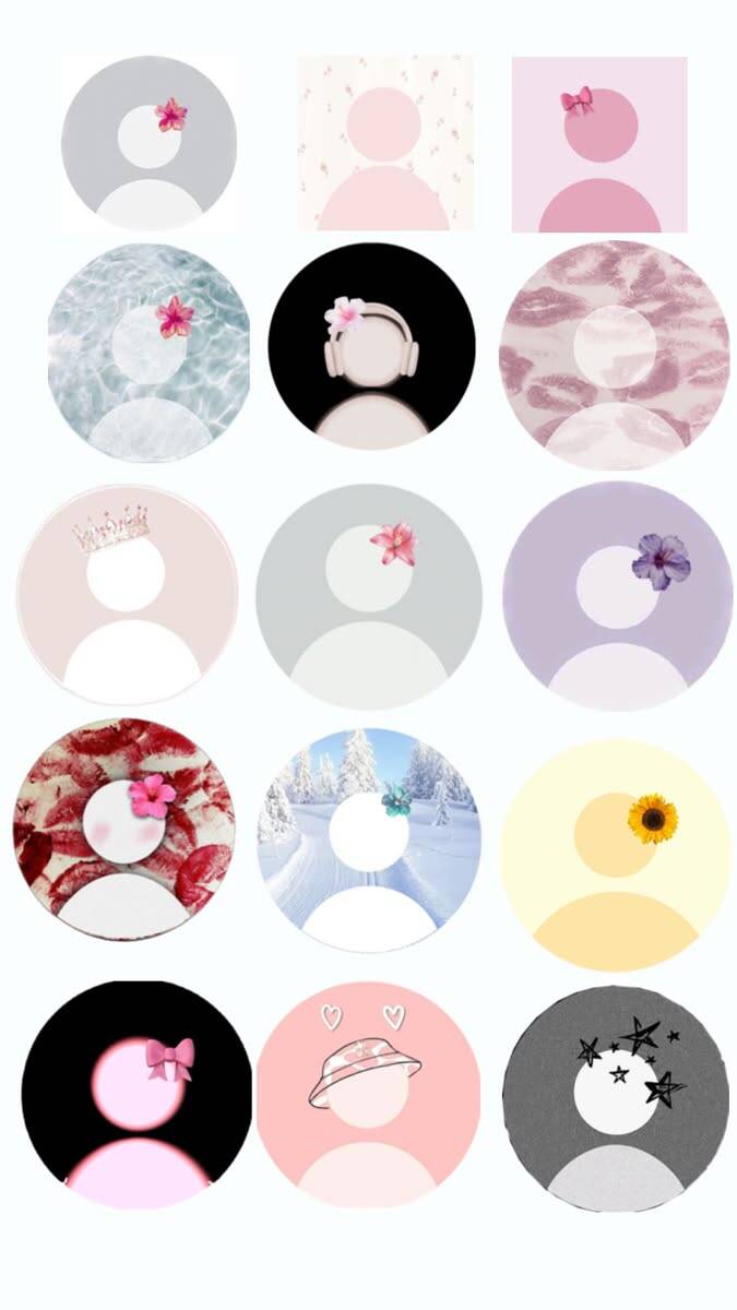
Floral designs are one of the safest defaults for a profile picture precisely because they don't attach to any specific fandom, meme, or identity claim — they just signal "someone put a little visual care into this" without inviting questions about what it means. That's exactly why this angle works so well as a genuine default rather than a placeholder. If you're picking one, look at how densely packed the flowers are rather than just the color — a scattered, negative-space-heavy layout tends to hold up better at small circular sizes than a full-bleed pattern, which can turn into a blur of color once it's shrunk down to app icon size.
Pink & Soft Aesthetic
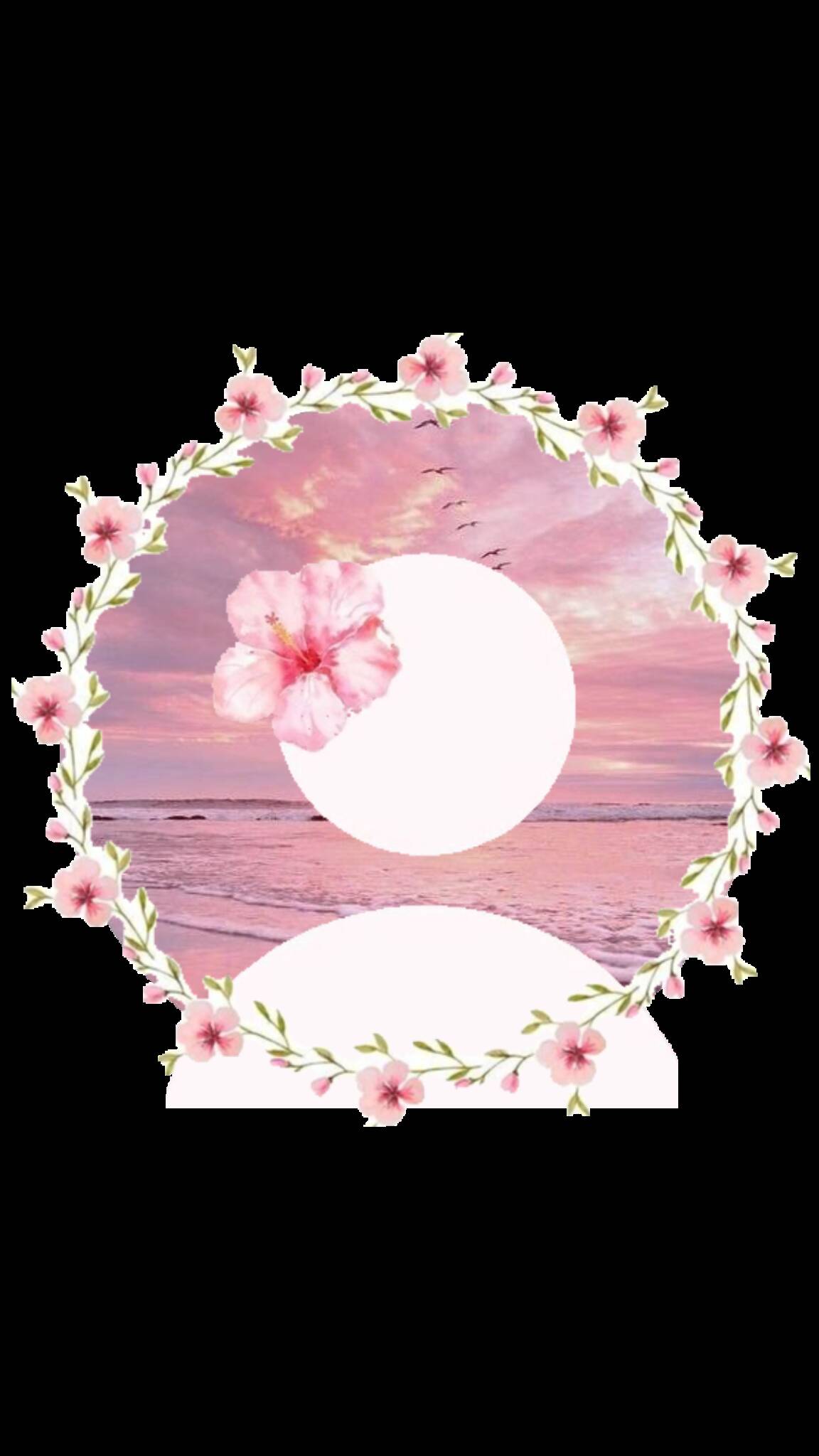
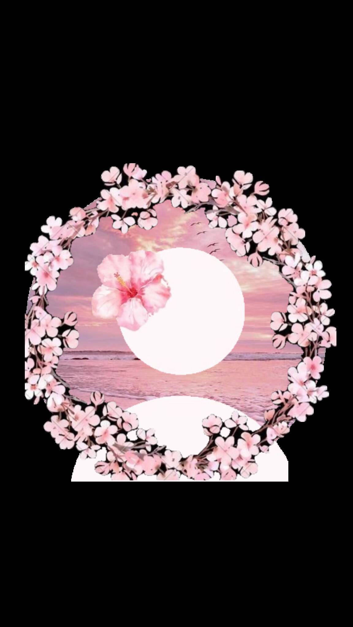
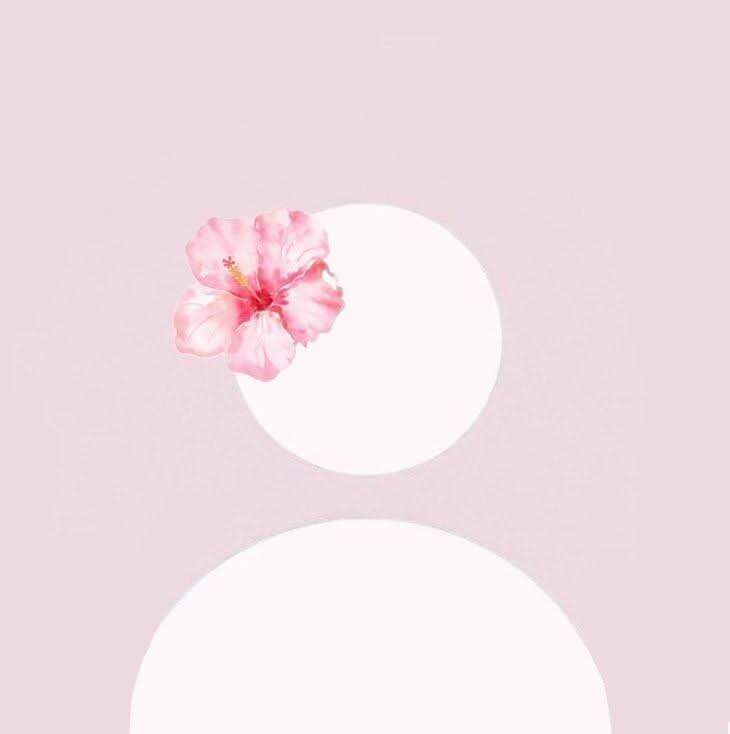
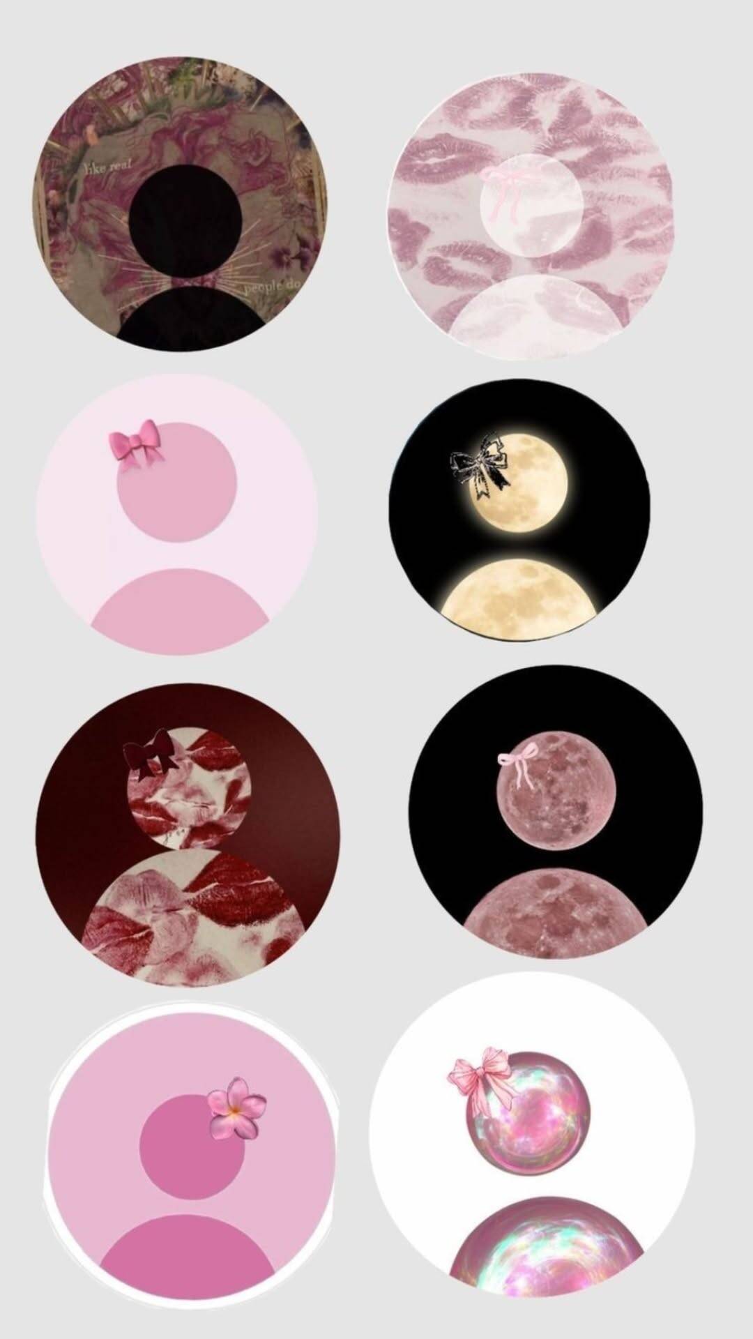
This category narrows the floral idea down to a specific mood — soft pink tones, minimalist layouts, the occasional butterfly or sunset accent. It reads as gentler and more restrained than the broader floral section, which makes it a better fit for someone who wants "aesthetic" without much visual noise competing for attention. Because pink covers such a wide range, decide whether you want a warm, blush-toned pink or a cooler, almost lavender-leaning pink before comparing options — the two read as noticeably different moods (cozy versus cool-and-composed) even though both technically qualify as "pink."


Tropical & Beach Vibes
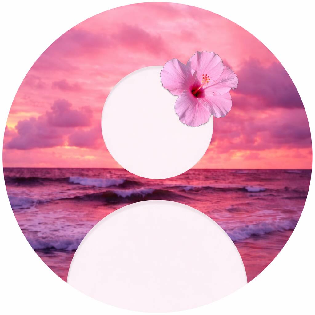
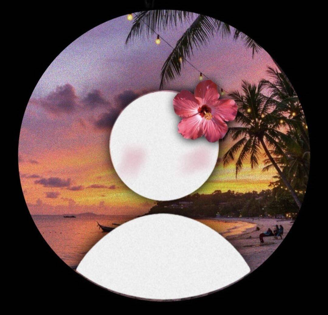
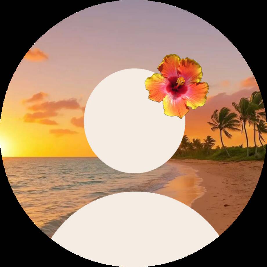
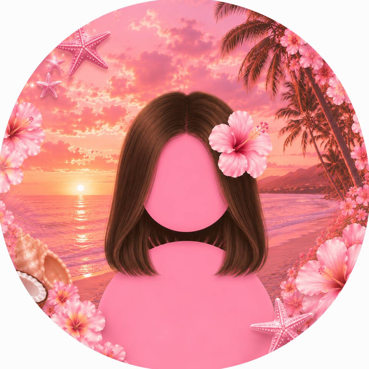
Where the floral sections lean soft and contained, this one opens things up — ocean water, sunset gradients, marine life, tropical foliage. It suits an account that wants to feel warm and open rather than delicate, and it works especially well as a seasonal pick for spring or summer without needing anything more specific than "vacation mood." Sunset gradients in particular can shift dramatically depending on where the light source sits in the frame, so compare a few side by side rather than picking the first one that looks good in isolation — a sunset that's centered reads calmer, while one pushed to a corner tends to feel more dynamic and photo-like.
Minimalist Design
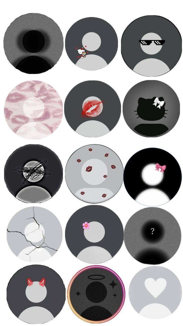
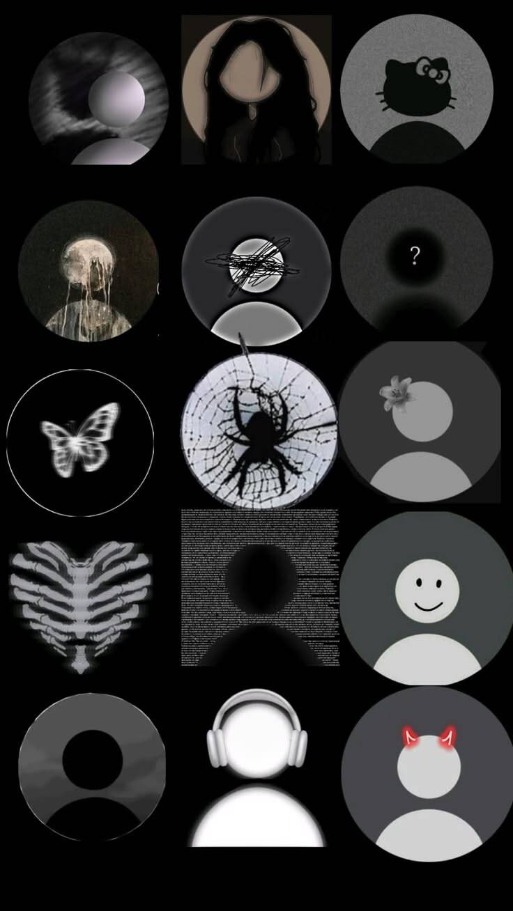
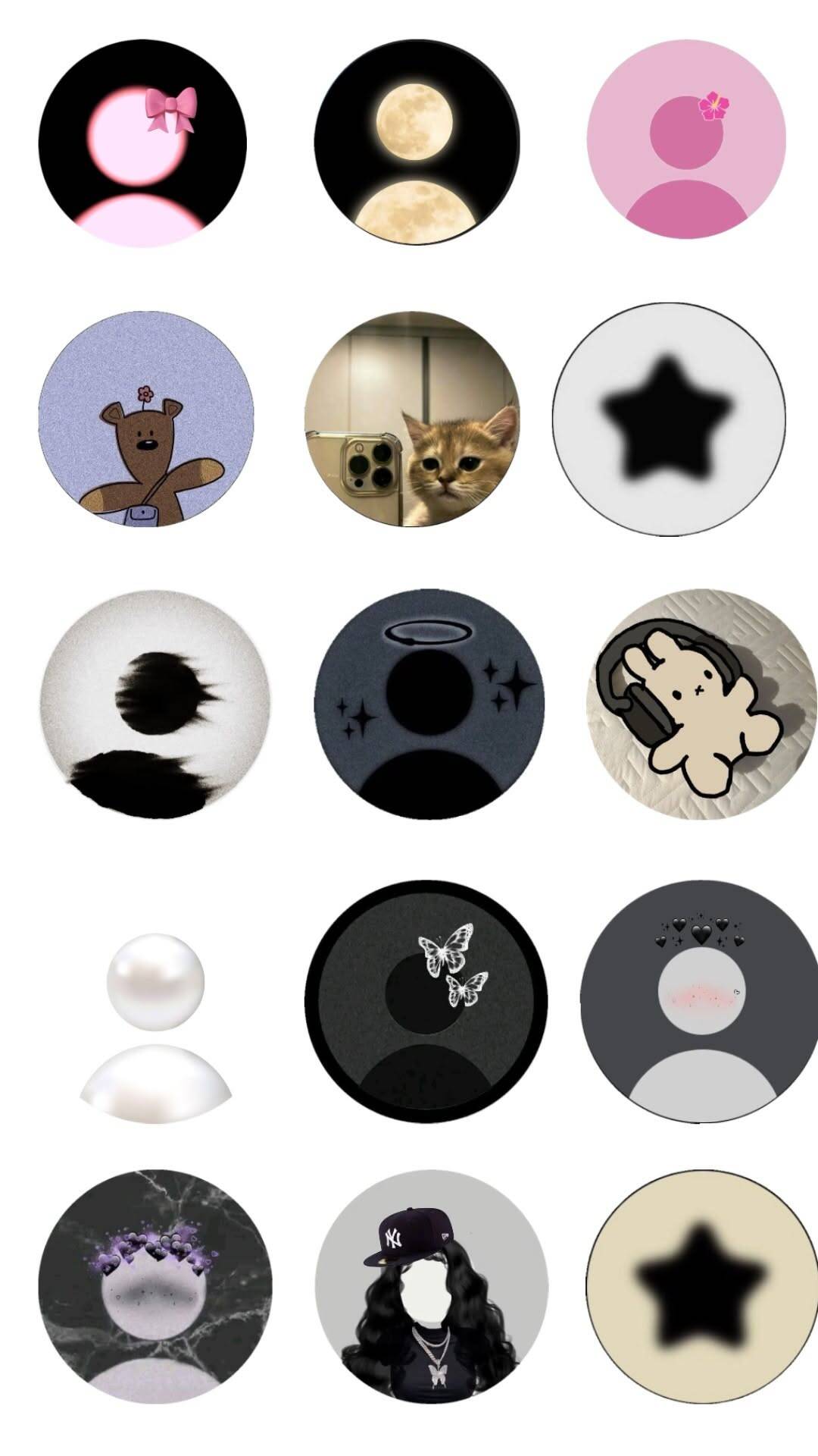
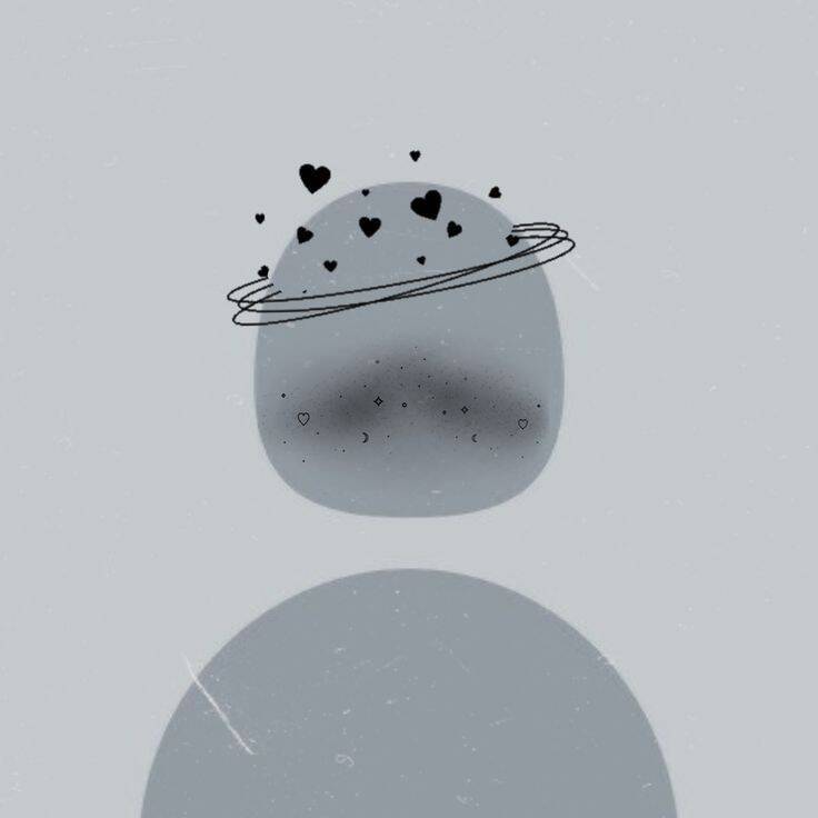
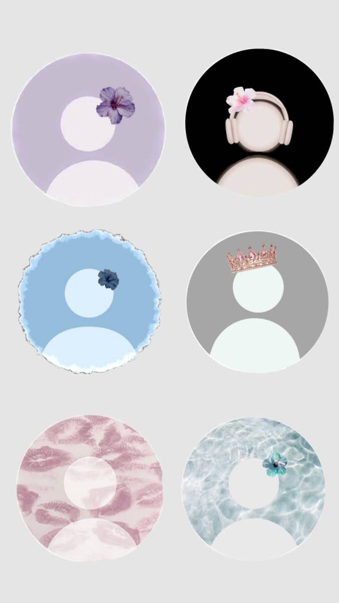
Minimalist options strip away almost everything the other sections lean on — no scenery, no character, sometimes just a shape, a circle, or a single small accent like a heart. This is the pick for someone who wants a default that genuinely disappears into the background of their profile rather than one that's trying to say something about their taste or interests. The simpler the design, the more the exact shade matters, since there's nothing else in the frame to distract from it — a grey or muted tone tends to read as neutral and professional, while the same minimalist layout in a bright color reads as playful, so match the tone to what you actually want the picture to communicate.