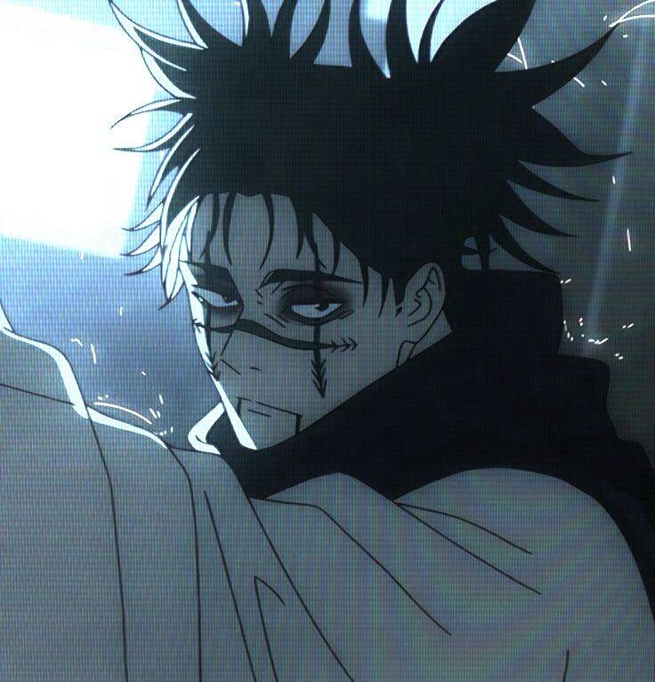
Choso PFP (Profile Pictures)
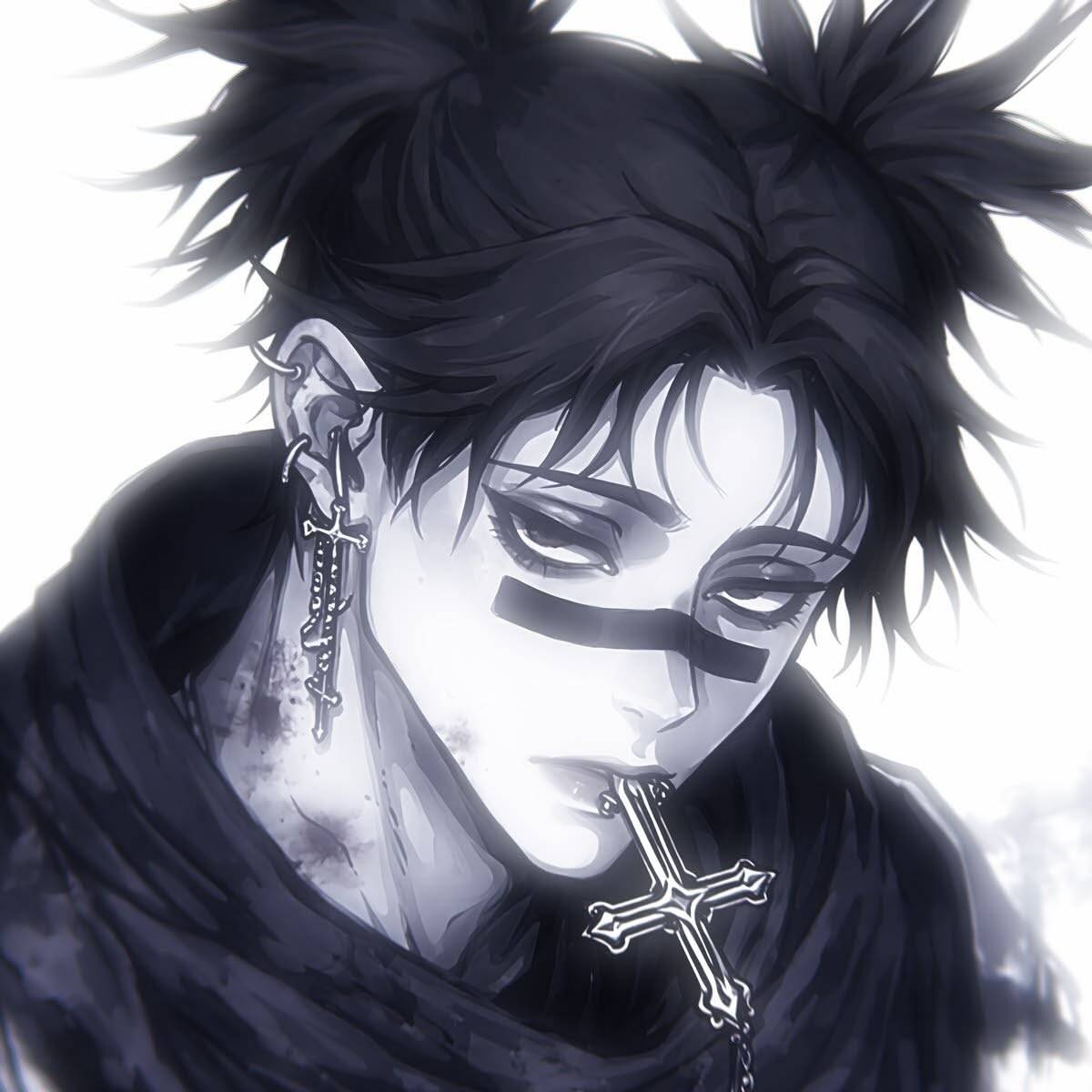
This collection of Choso pfp options spans a pretty wide range — moody, high-contrast shots that lean into the darker Jujutsu Kaisen tone, softer chibi and pastel takes for a friendlier profile, monochrome versions built for matching a themed feed, and a few picks tied directly to his combat abilities for anyone who wants their profile picture to signal real familiarity with the character. Whatever mood you're going for, there's a Choso profile picture here that fits it.
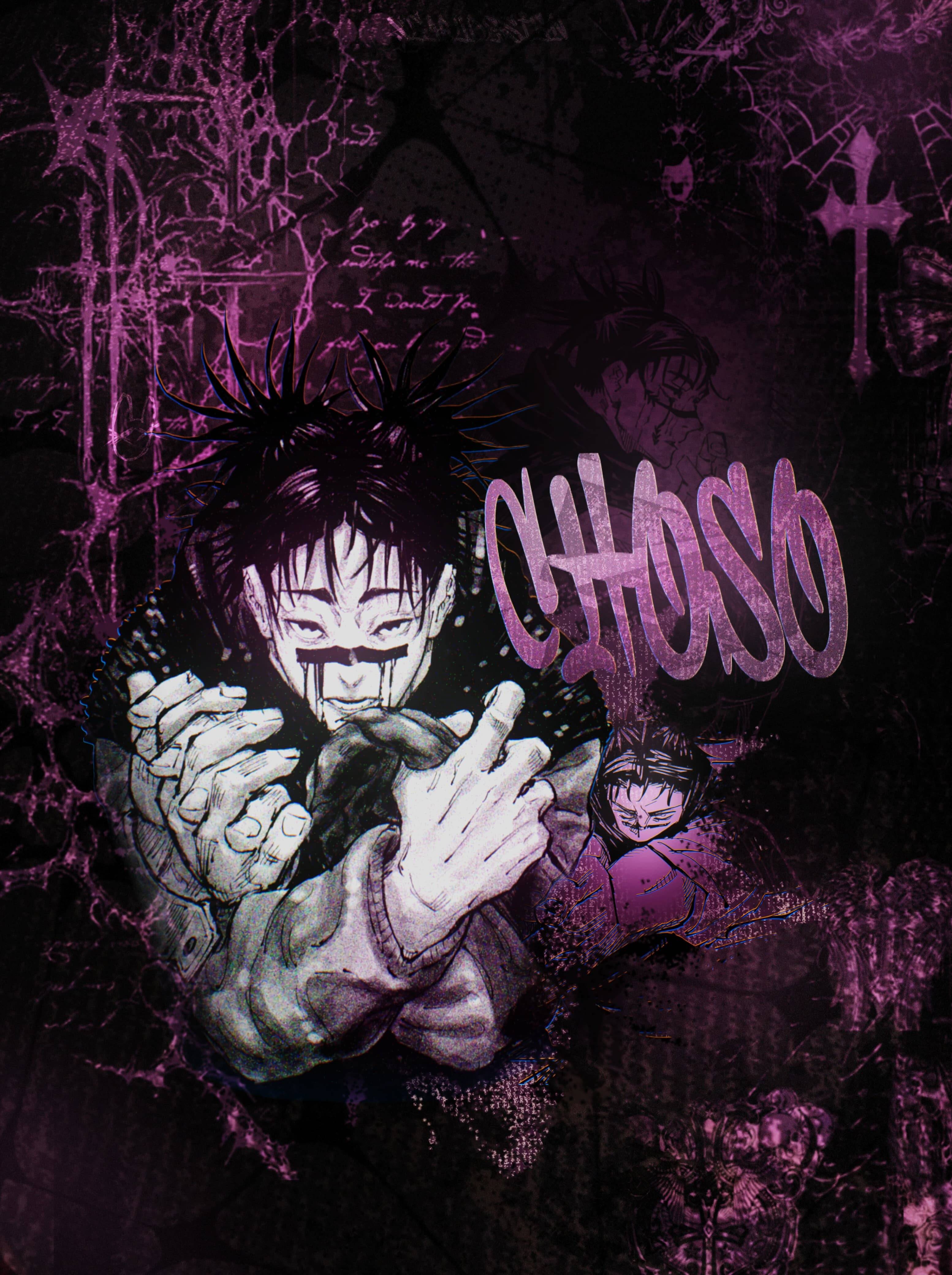
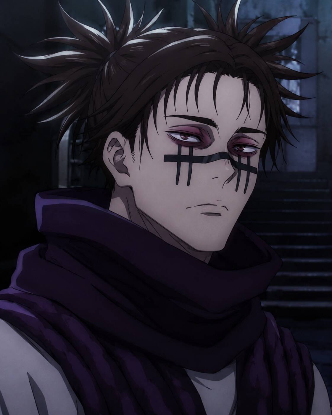
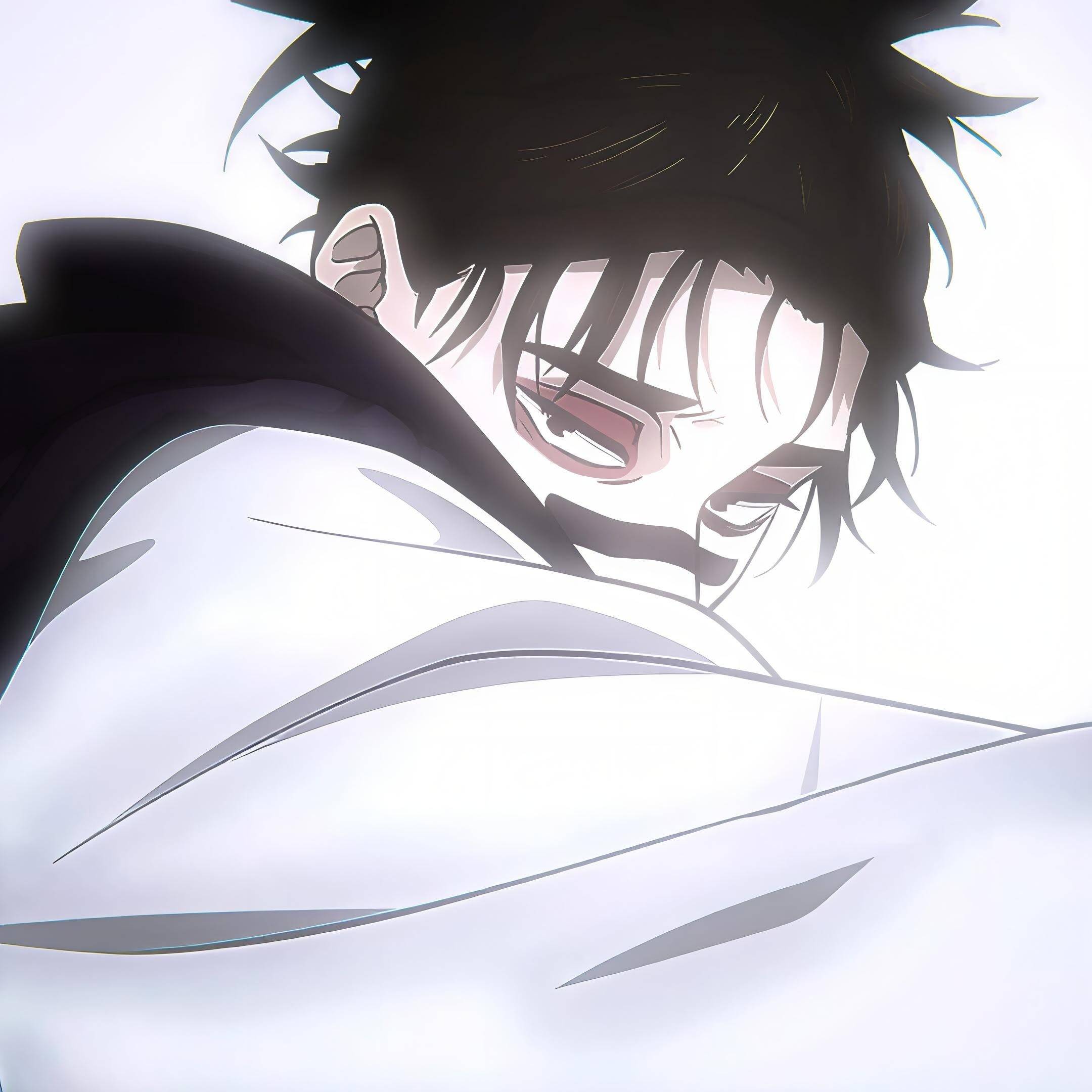
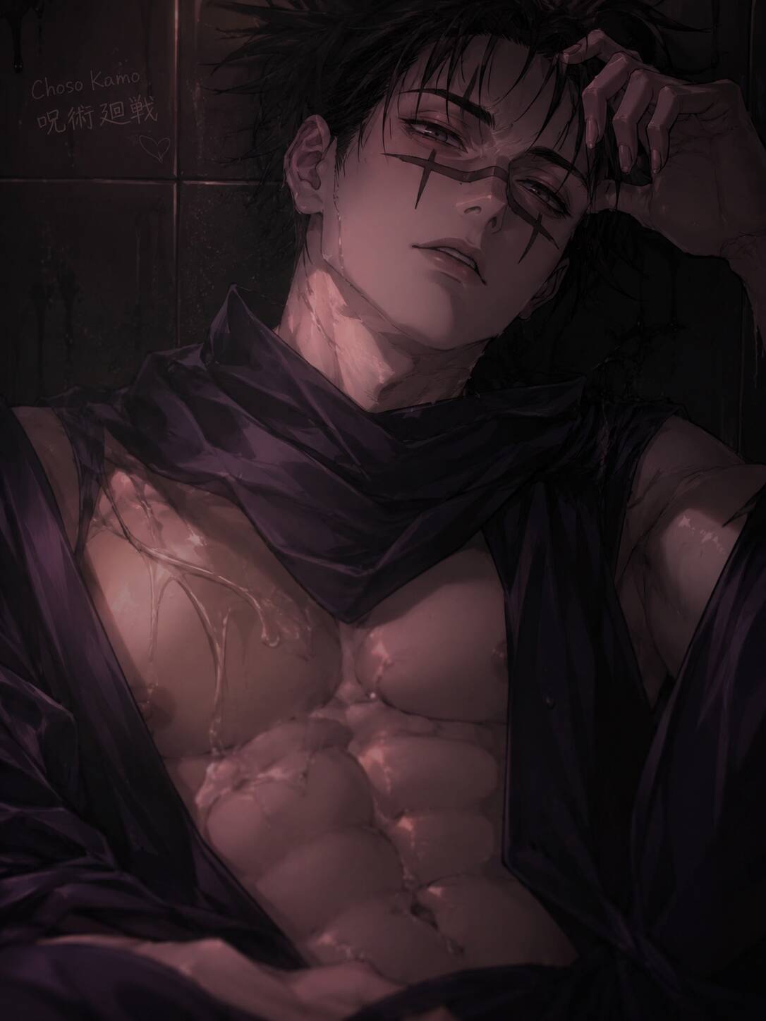
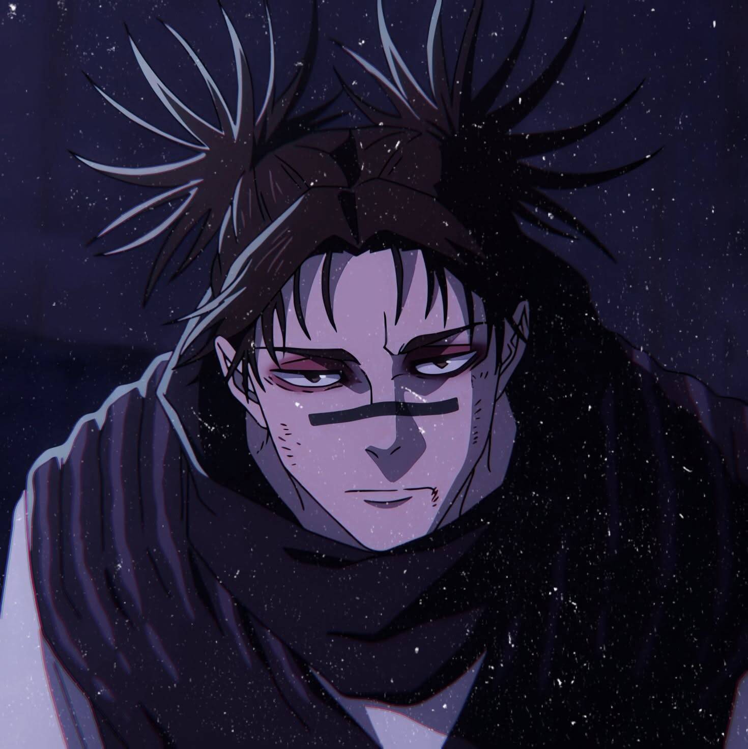
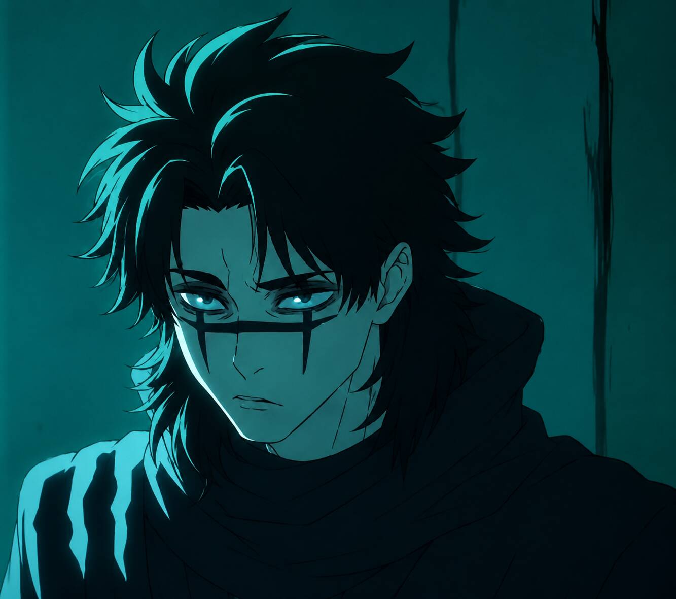
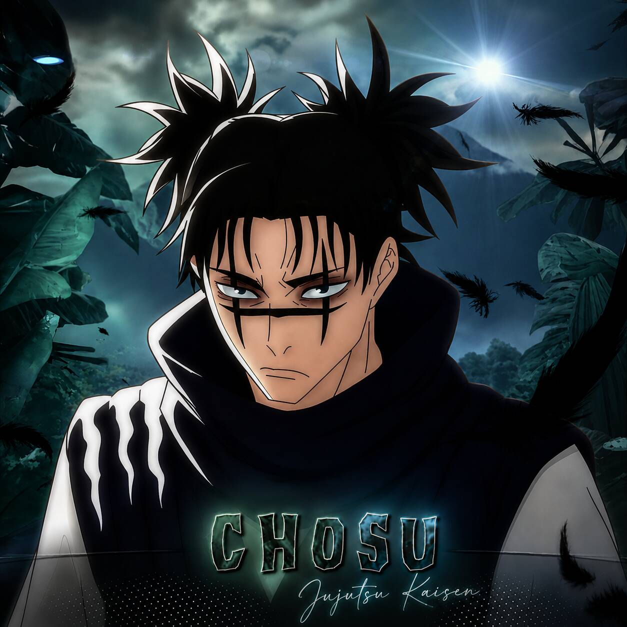
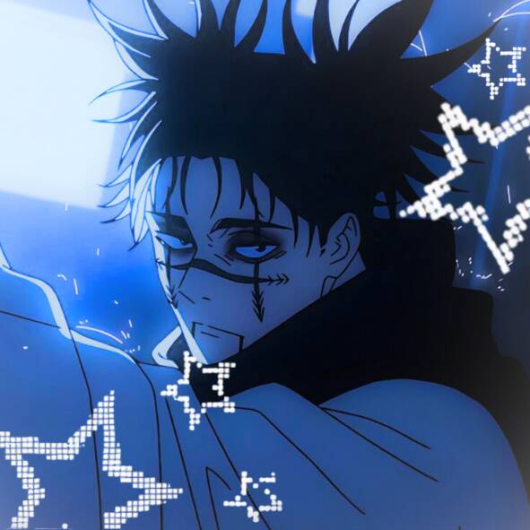
Dark Jujutsu Kaisen Aesthetic
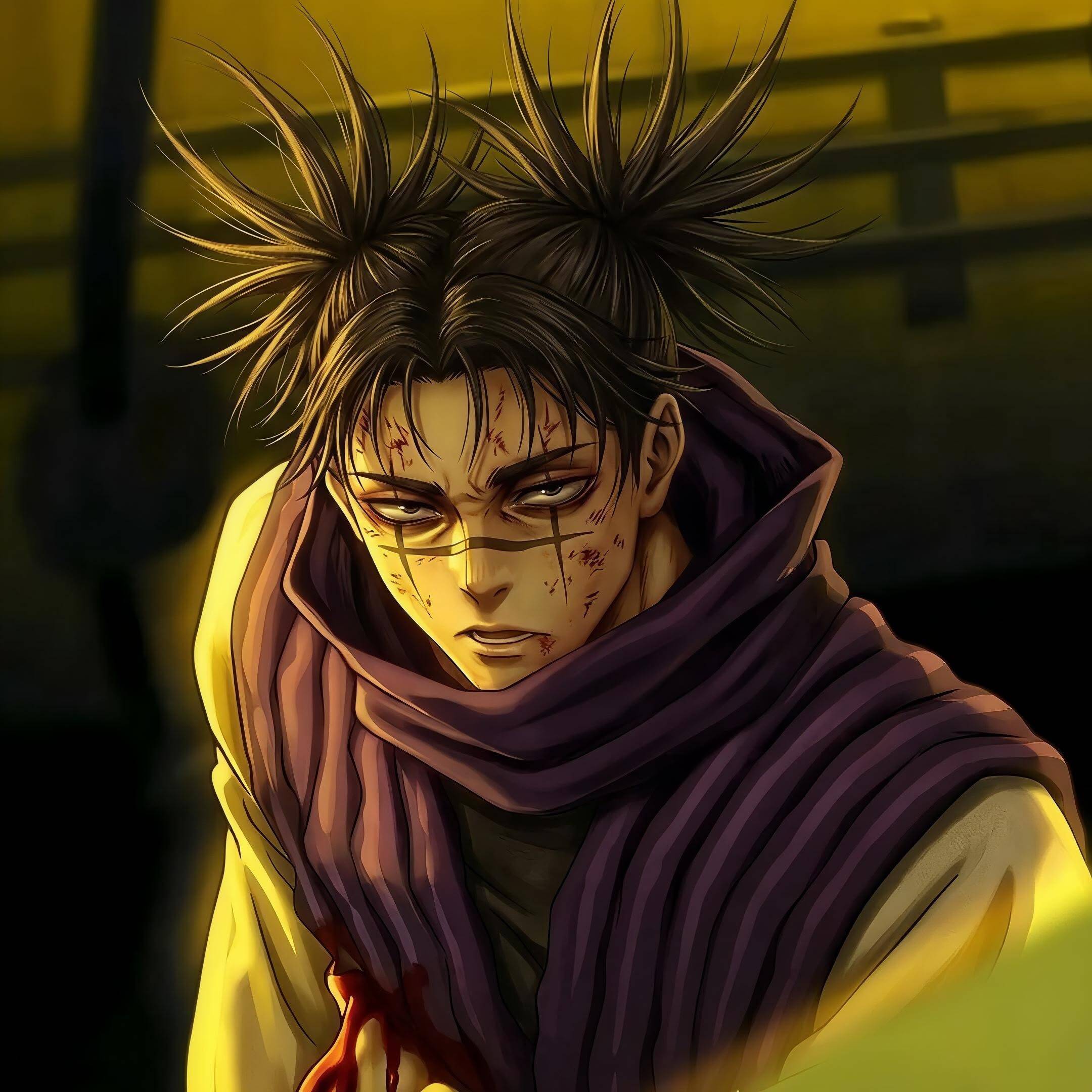
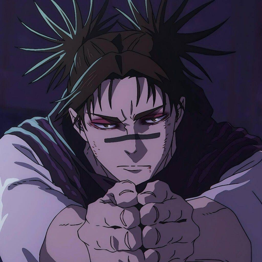
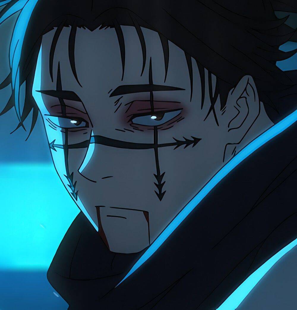
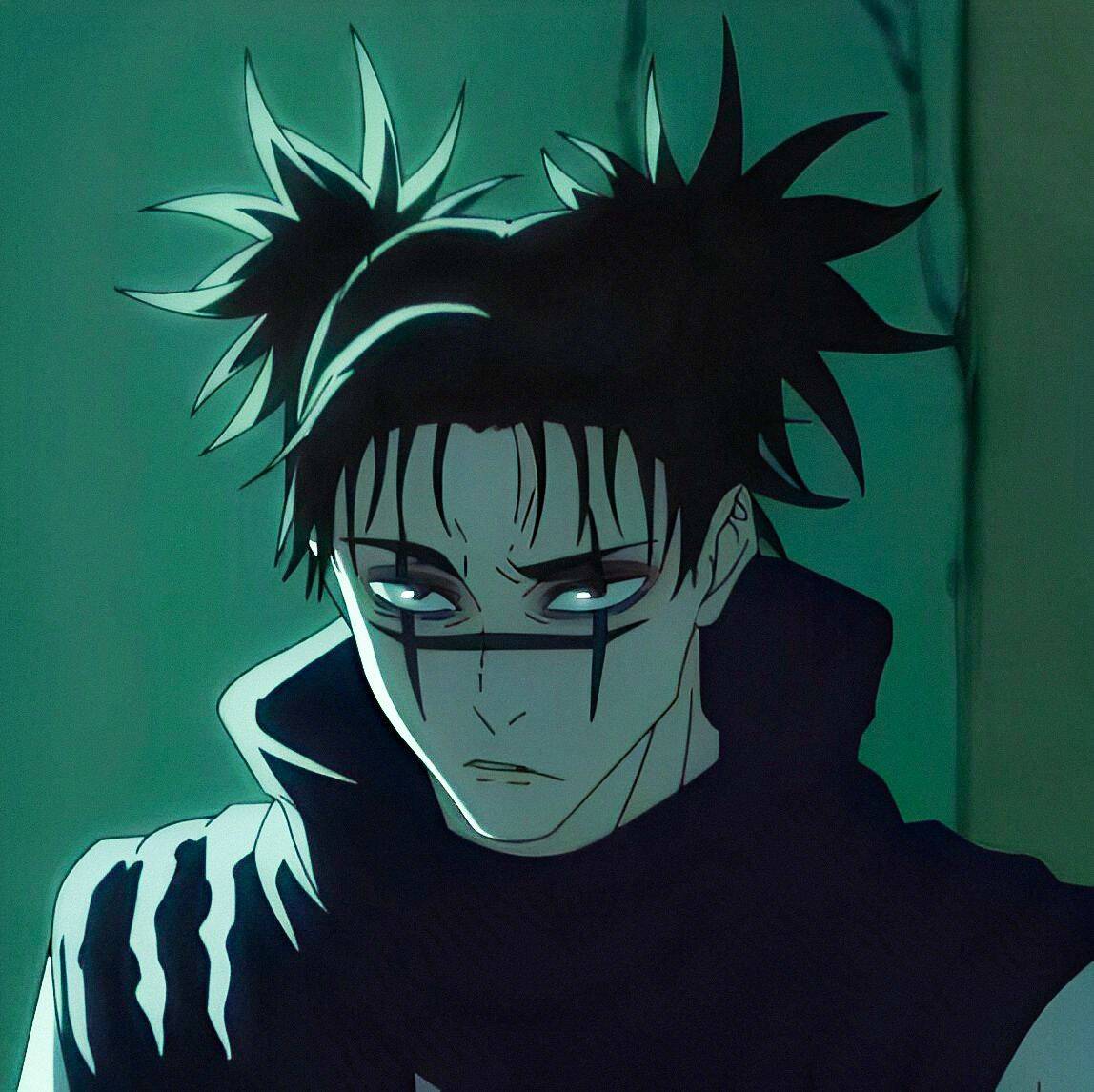
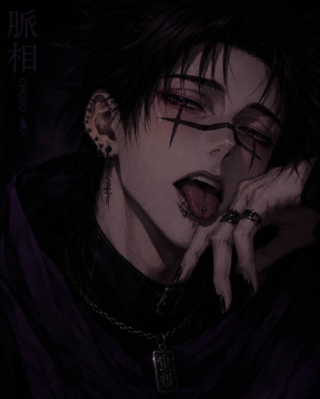
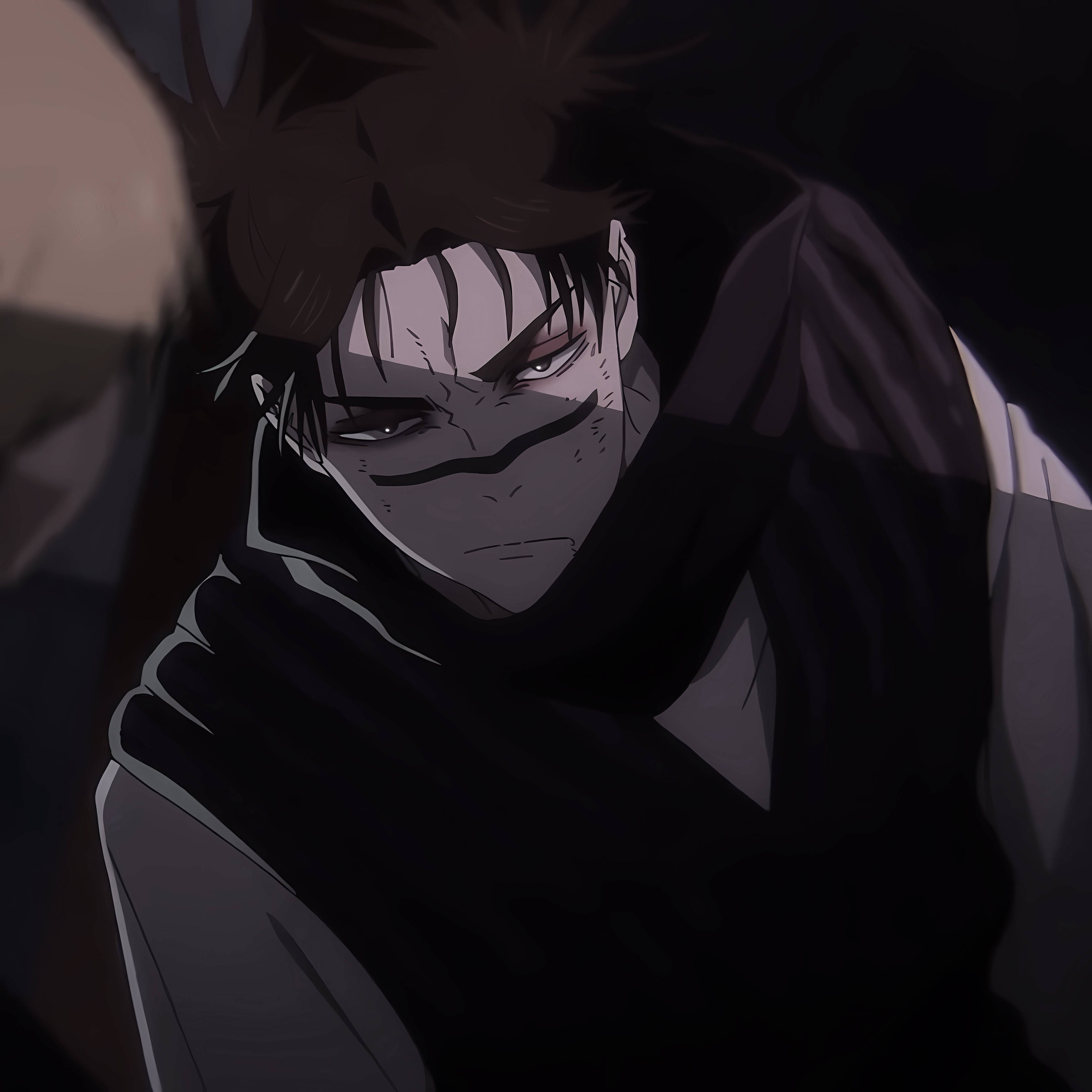
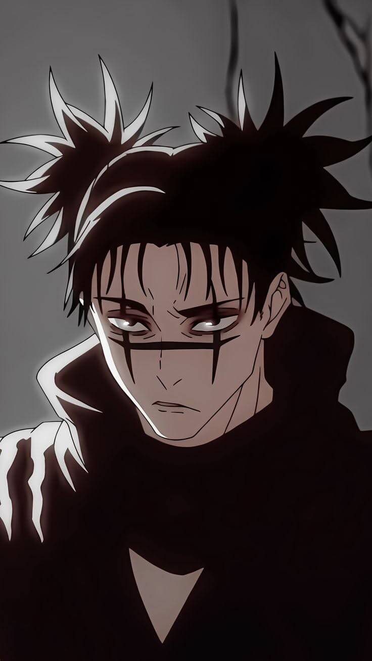
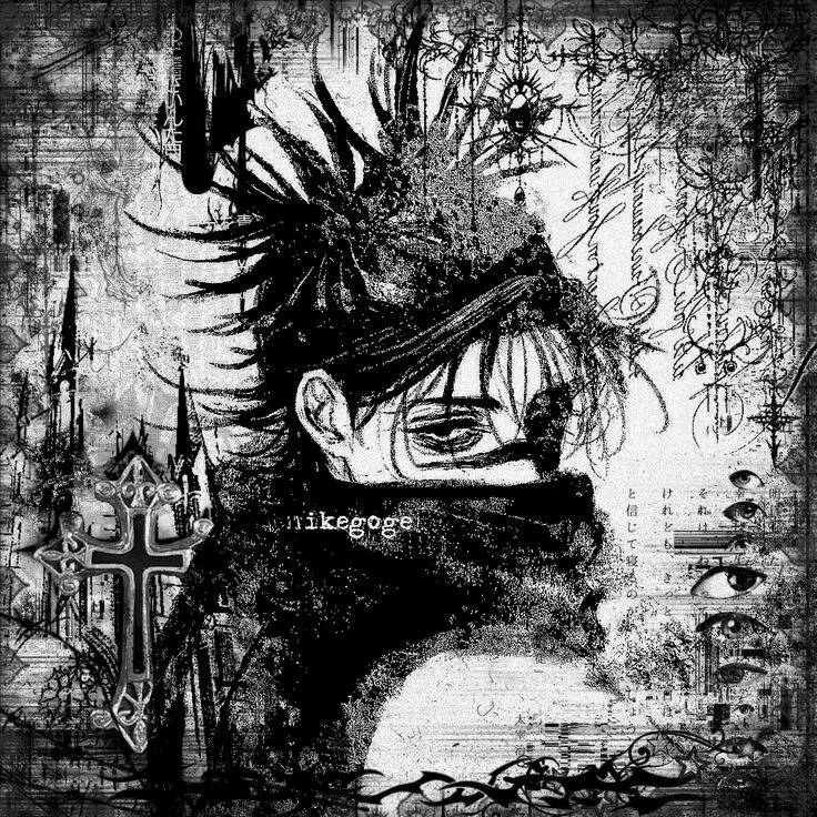
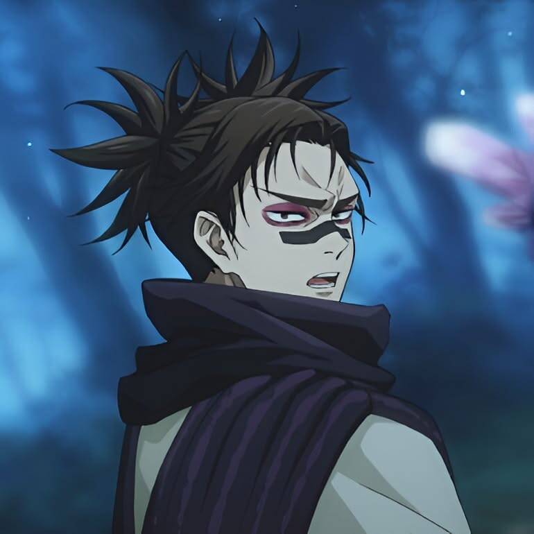
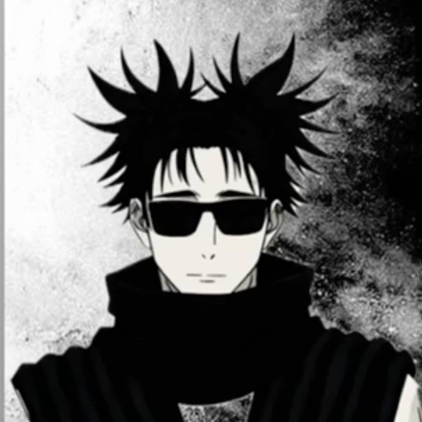
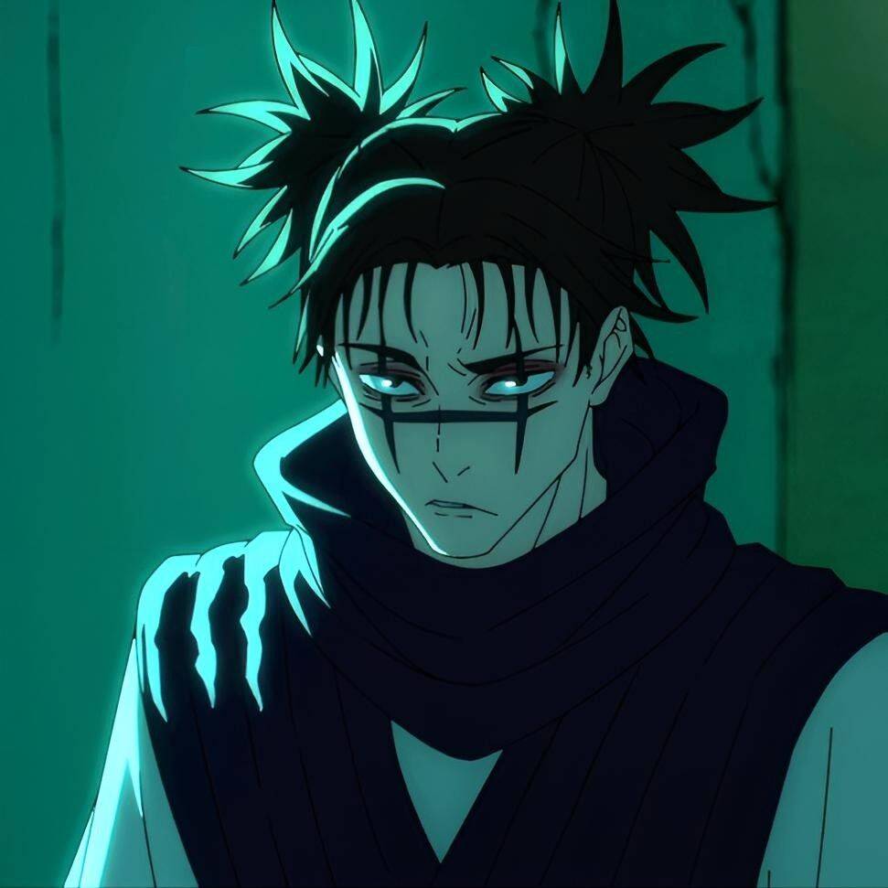
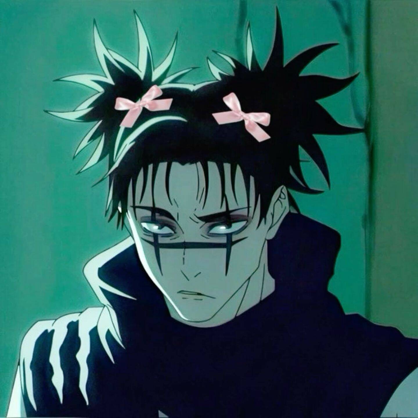
A dark-themed pfp isn't just a moodier filter over a normal picture — it's about picking frames where the shadows and lighting already carry the tone, not adding it after the fact. Someone reaching for this look usually wants their profile to read as serious or a little intense at a glance, before anyone even clicks through to a bio. One thing worth knowing: high-contrast, low-light images lose the most detail when compressed down to a small circular pfp, so favor a tight crop on the face and shoulders over a full-body shot — fine details in the background just disappear at that size anyway. Take a look at the set below to find one that fits.
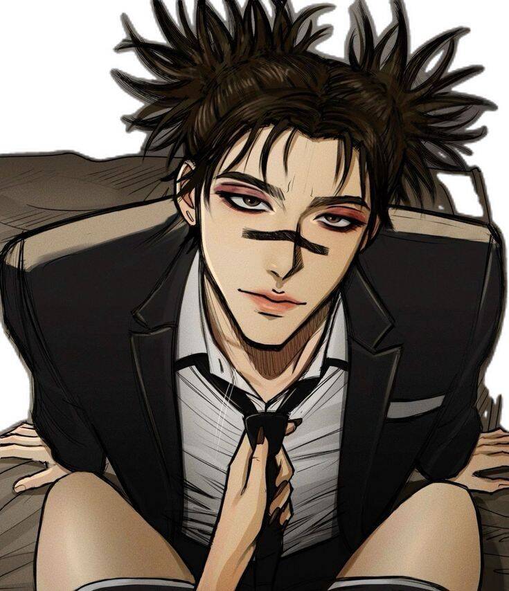
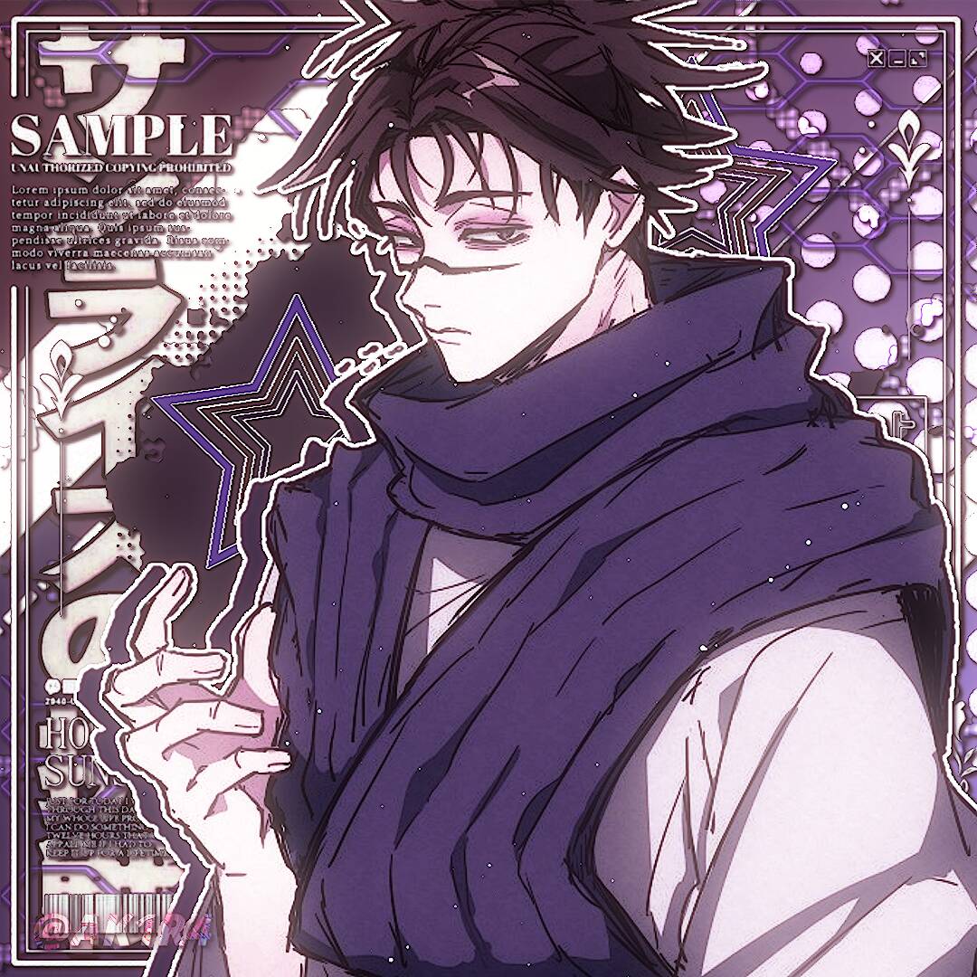
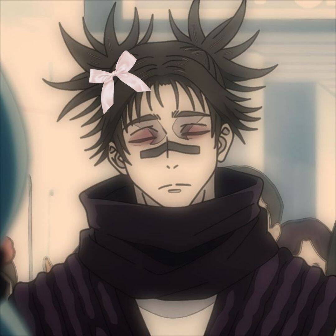
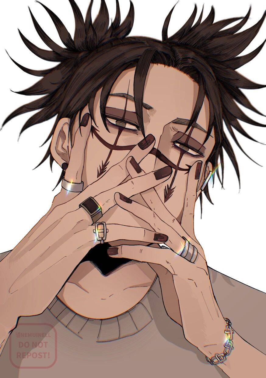
Aesthetic Anime Style
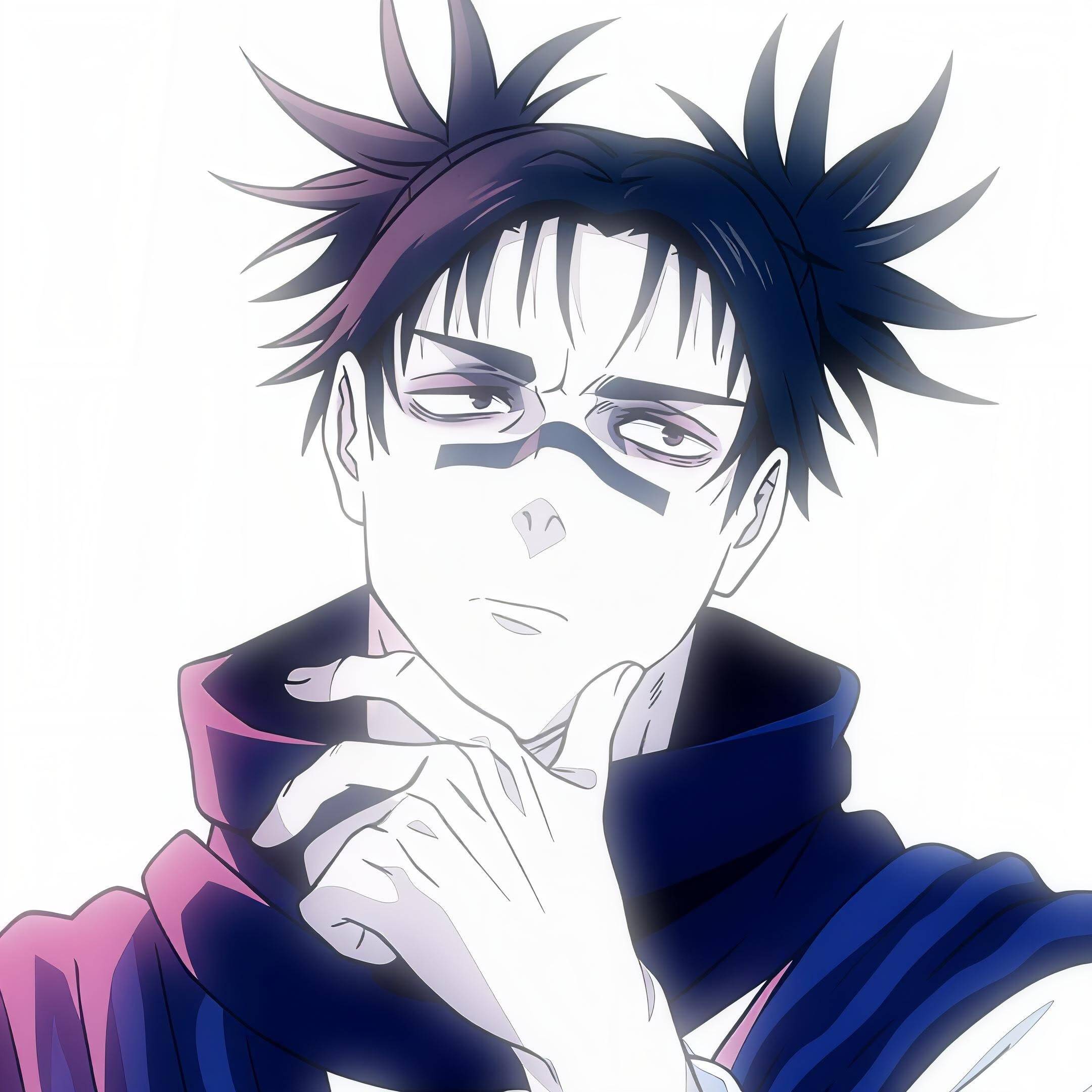
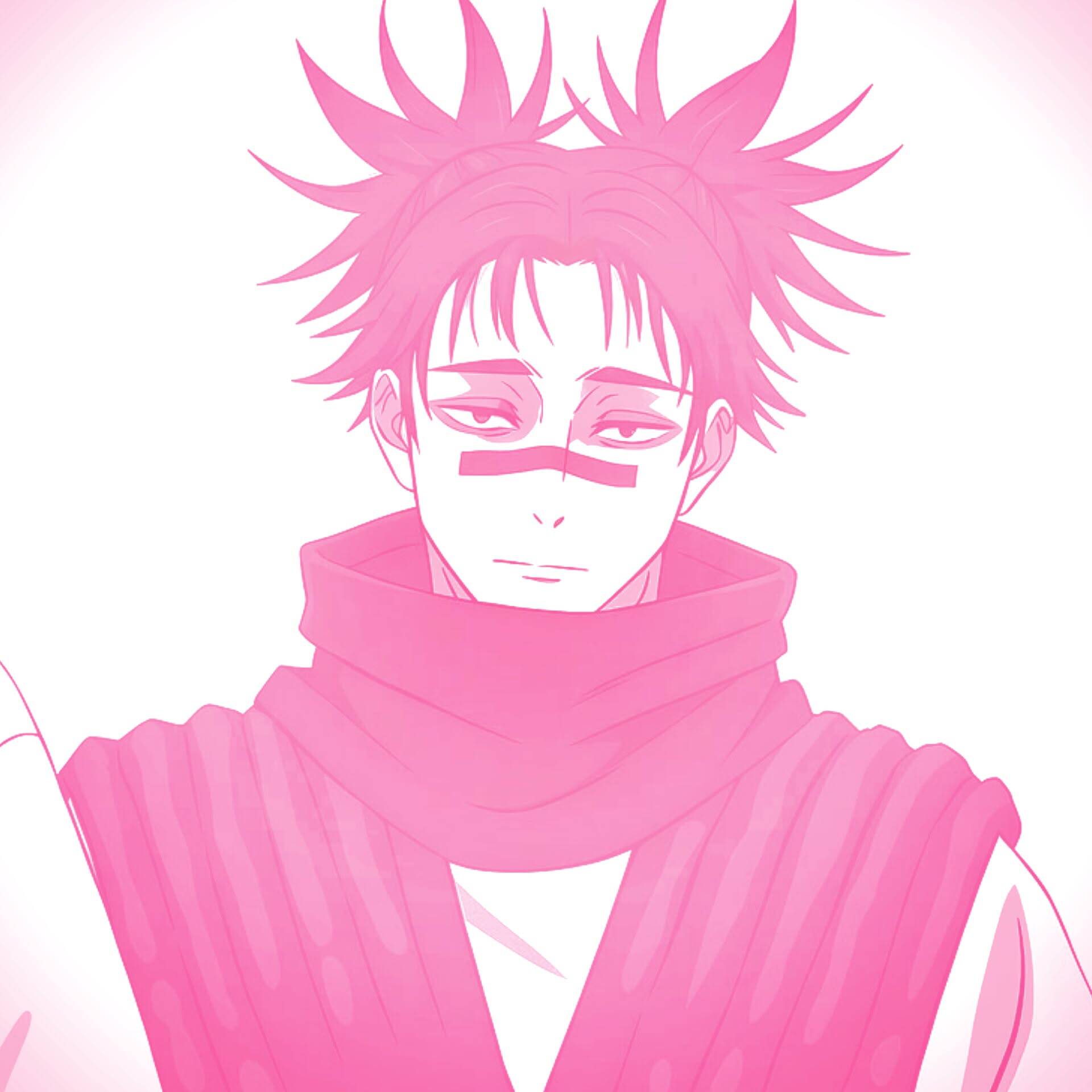
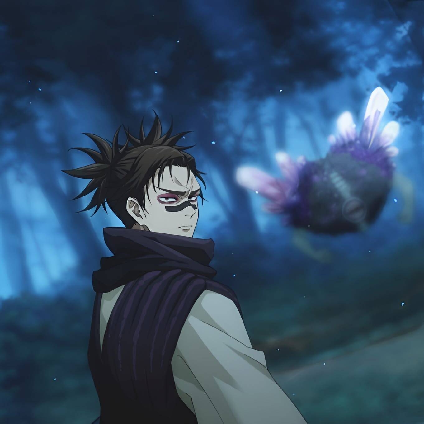
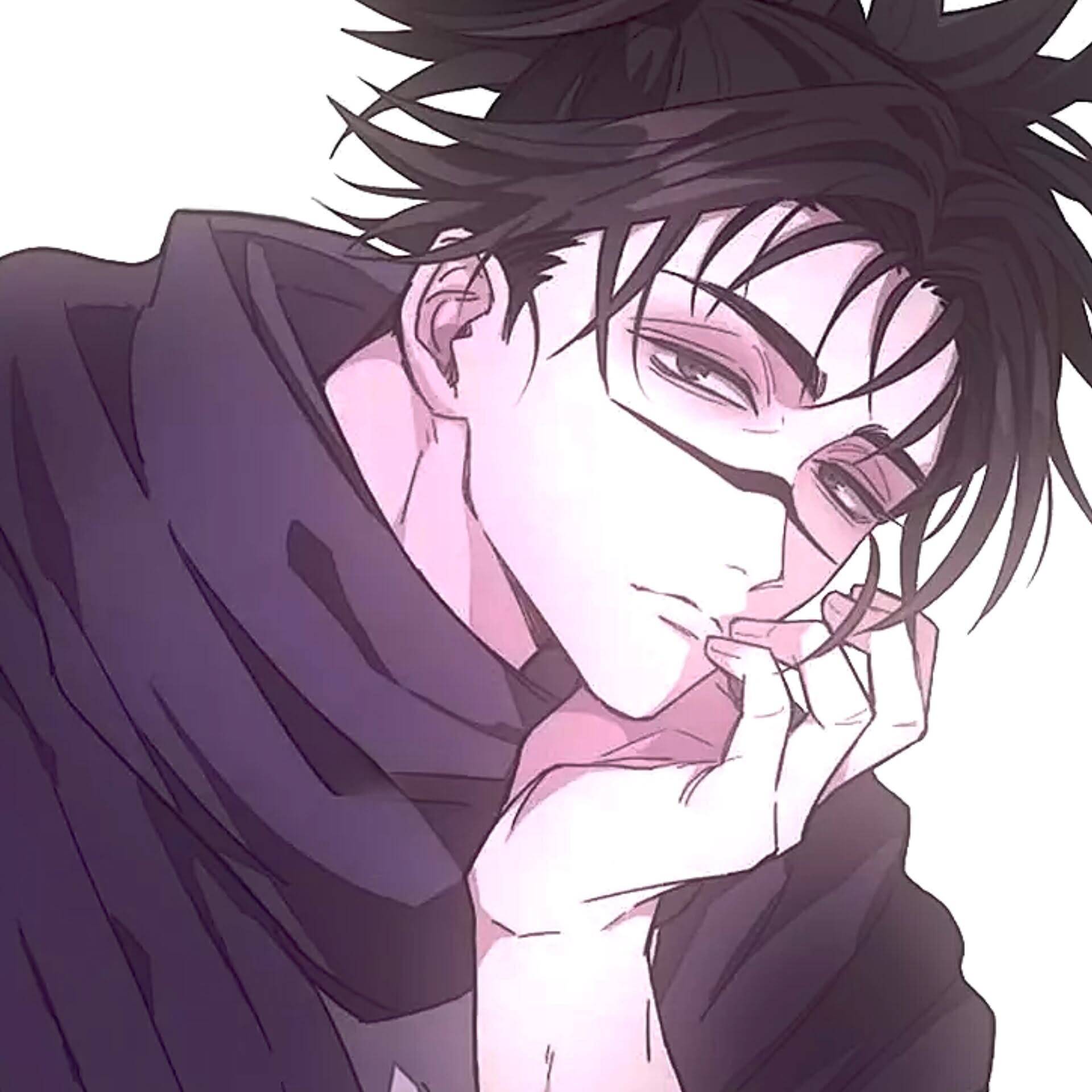
The plain "aesthetic anime style" tag covers a wider net than the dark or cute versions — it's the everyday option for someone who wants their pfp to look intentional without committing to one specific mood. Soft lighting, muted palettes, and a slightly dreamy edit are what tie these together more than the character's pose or scene. A practical detail: platforms crop pfps into circles differently, so an image with a bit of empty space near the edges survives that crop far better than one where the subject fills the entire frame corner to corner. Worth checking how a pick actually looks once cropped before locking it in.
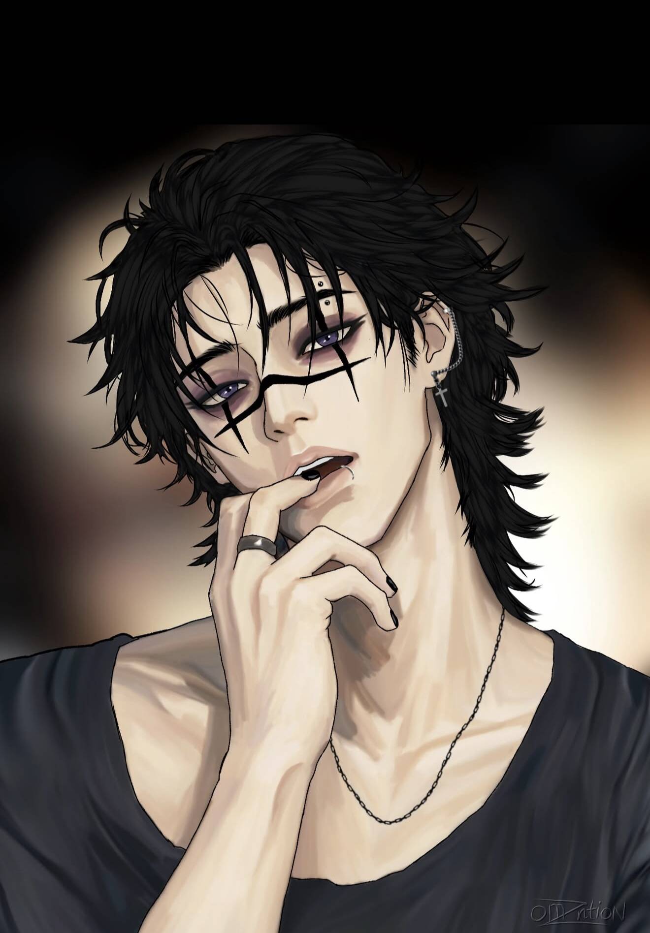
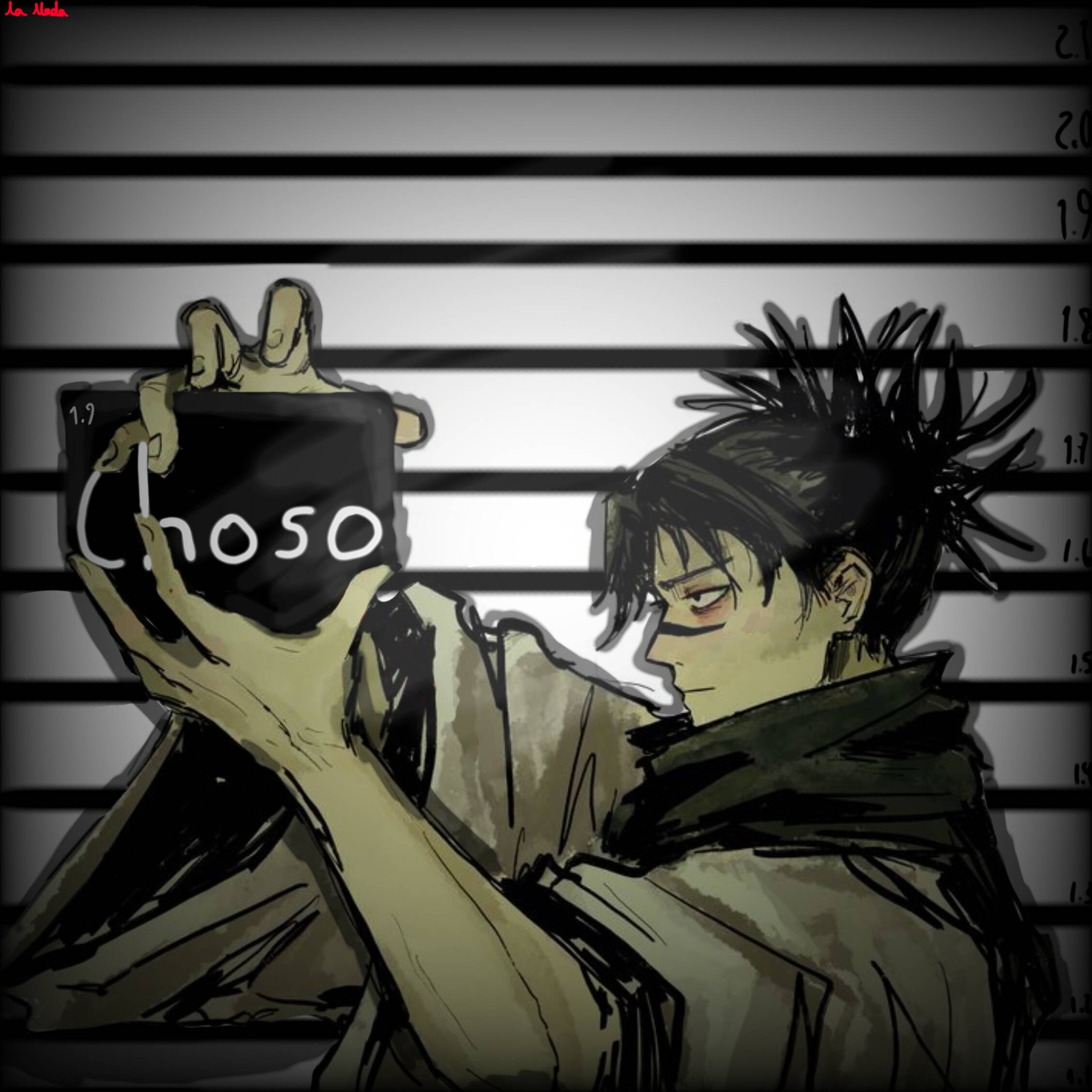
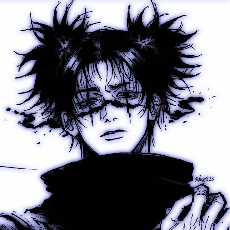
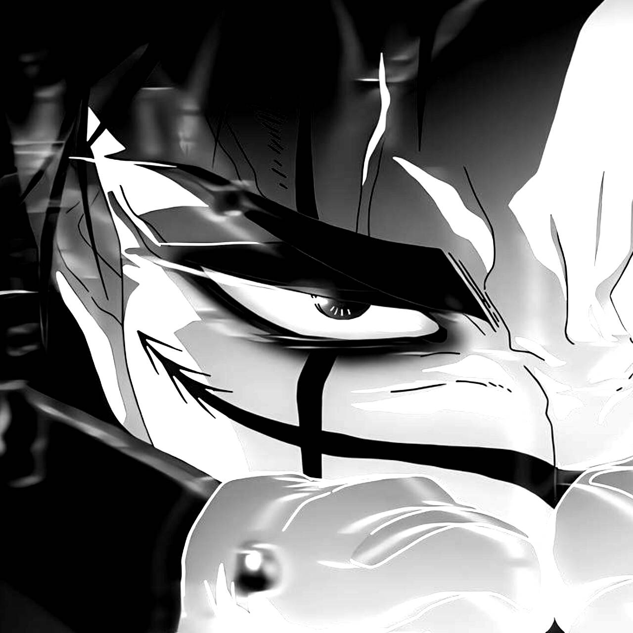
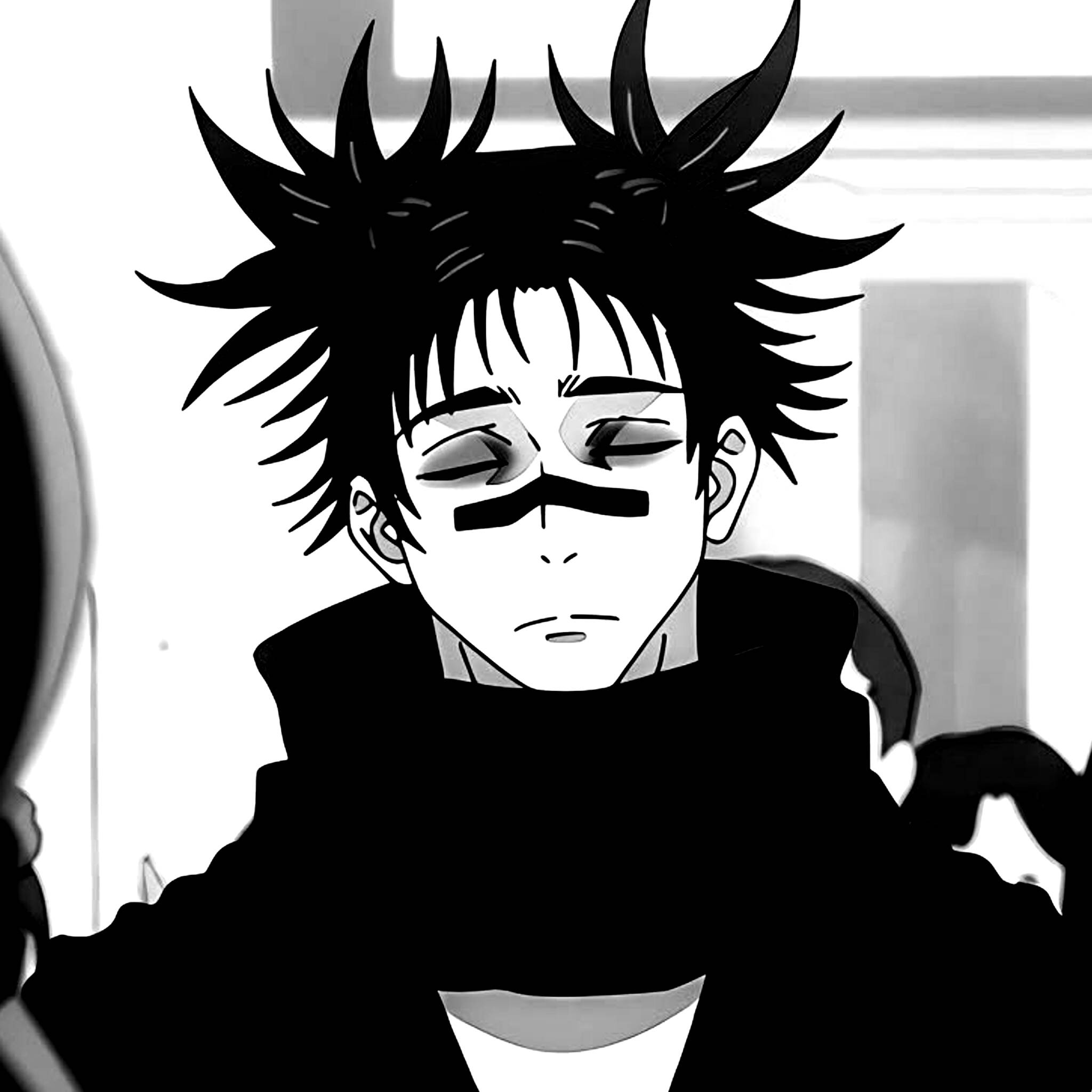
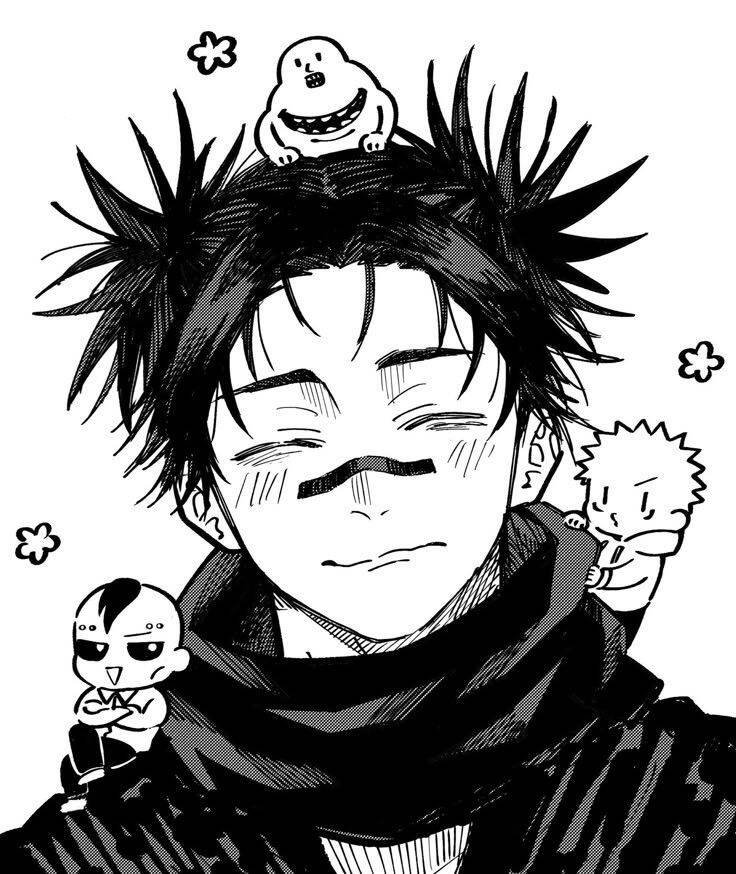
Black and White Choso pfp
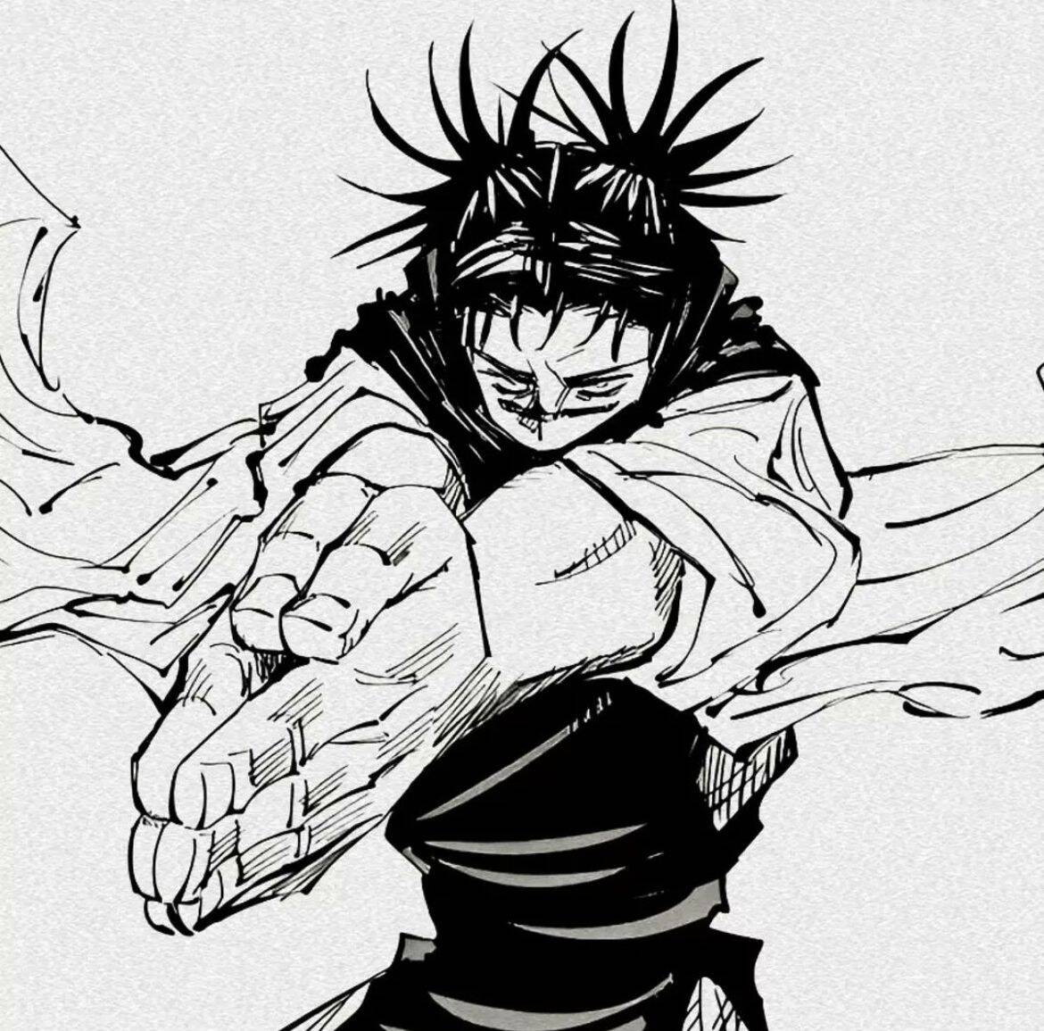
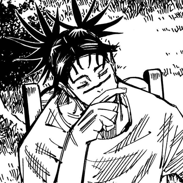
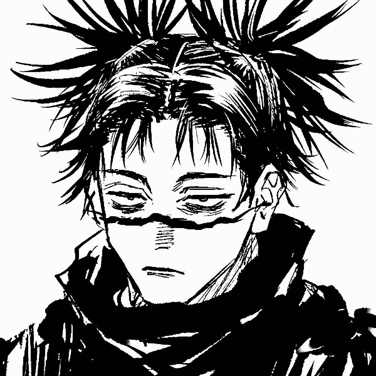
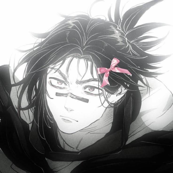
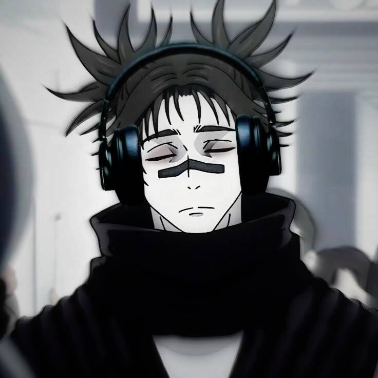
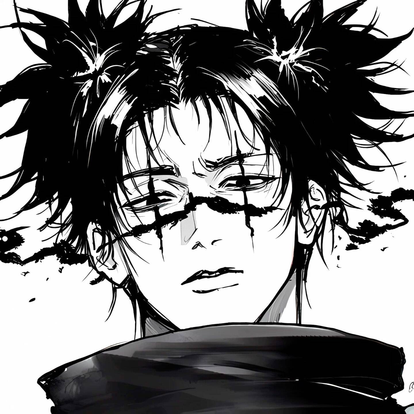
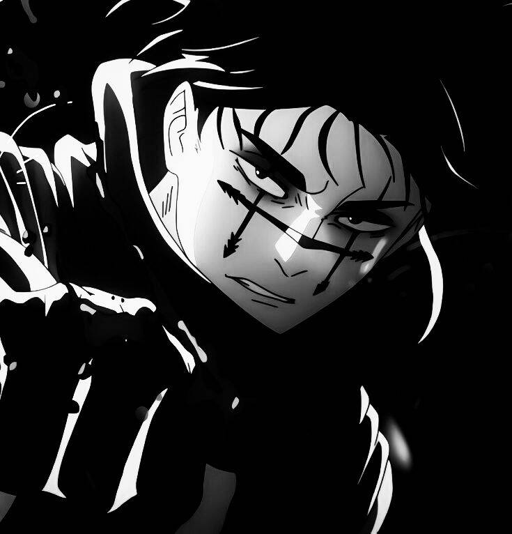
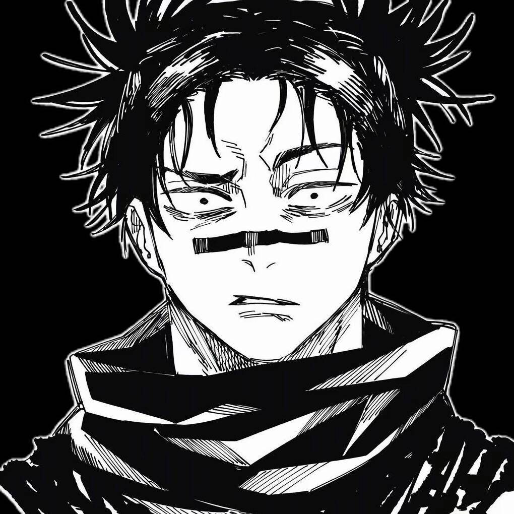
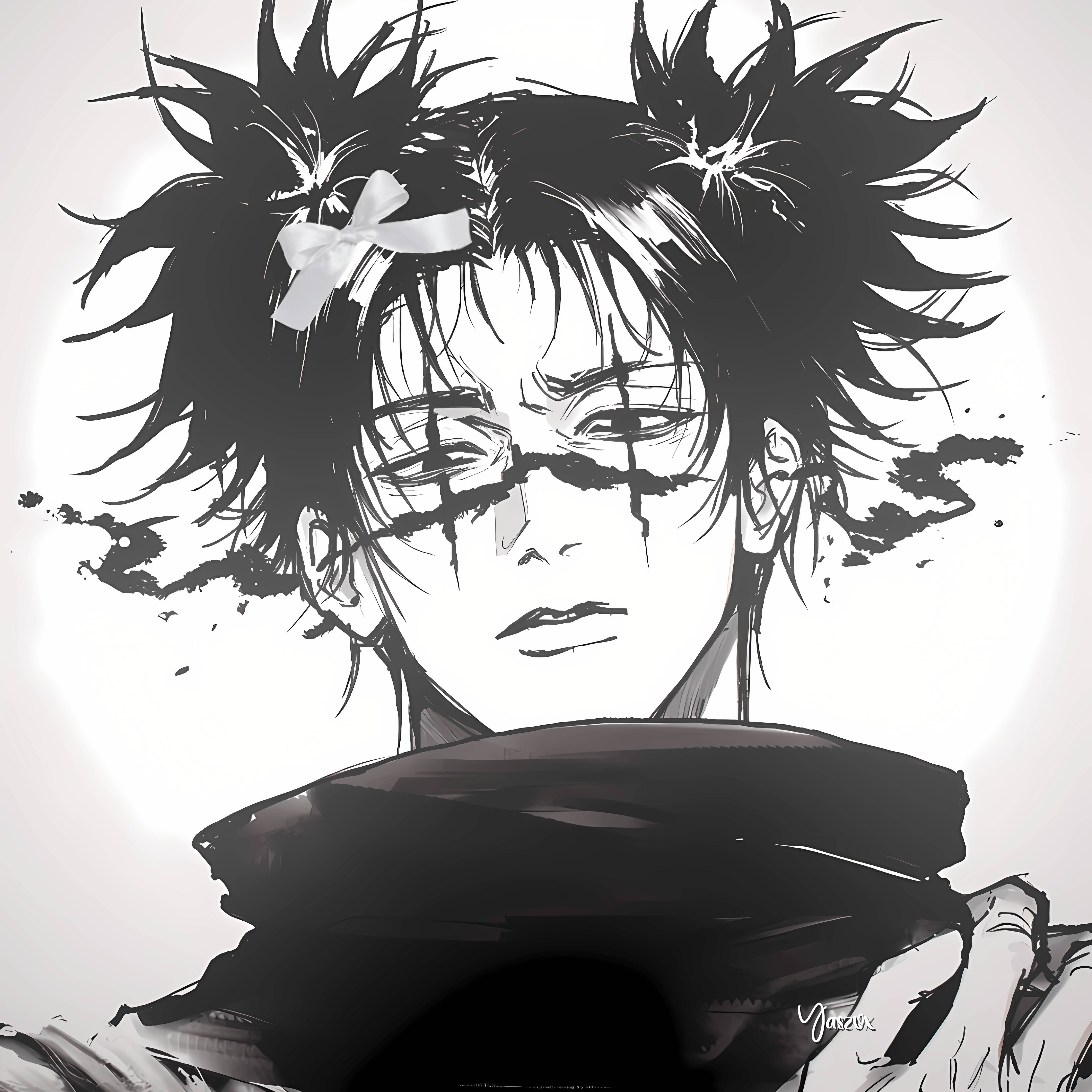
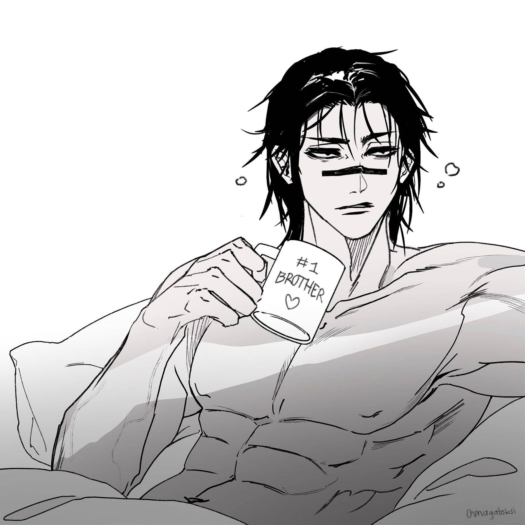
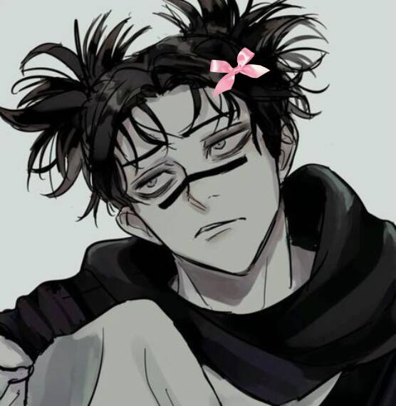
Switching to black and white is usually less about the character and more about matching a whole feed or theme — a monochrome pfp sits cleanly next to other grayscale posts and reads as more deliberate than a random colorful screenshot. It's a common pick for people curating a consistent visual identity across accounts, not just a single profile picture. One thing to watch for: converting an already low-contrast image to grayscale tends to flatten it further, so images with clear separation between light and dark areas to begin with hold up much better once the color is stripped out. That matters more than the pose or expression in the source image.
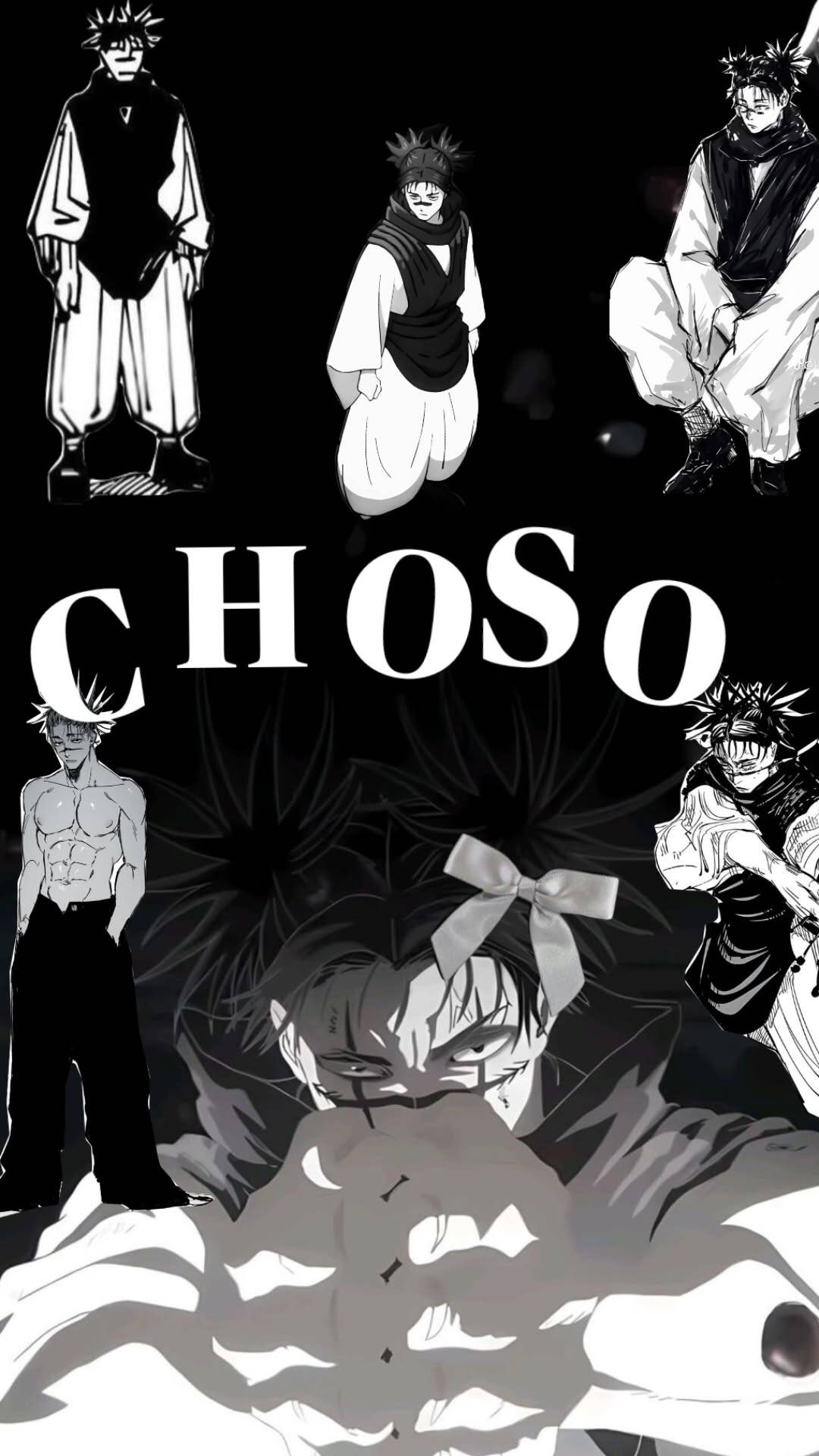
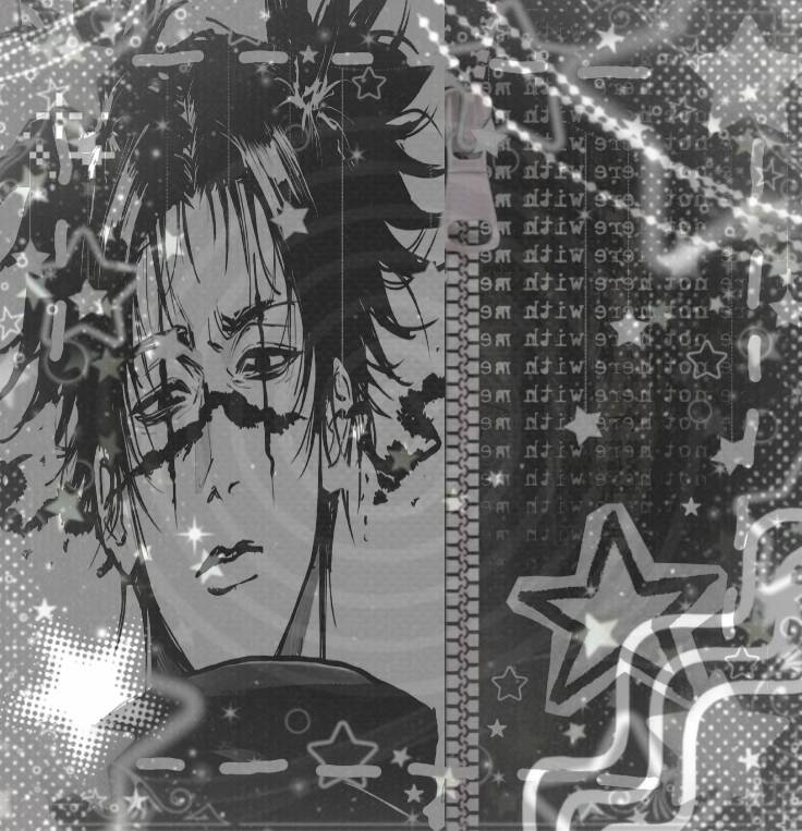
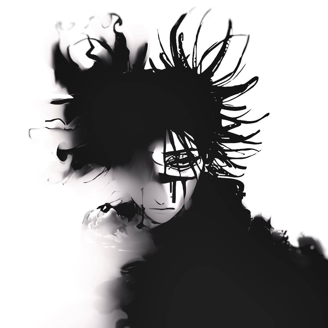
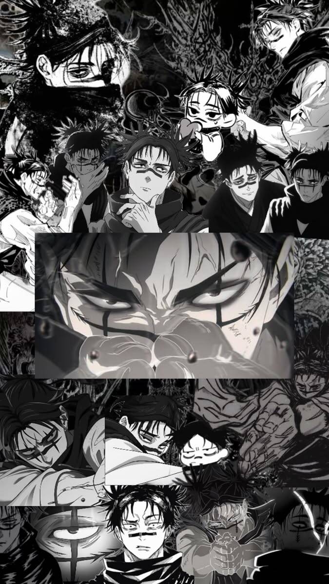
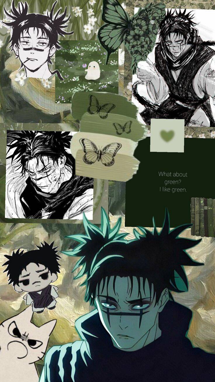
Anime Collage Style
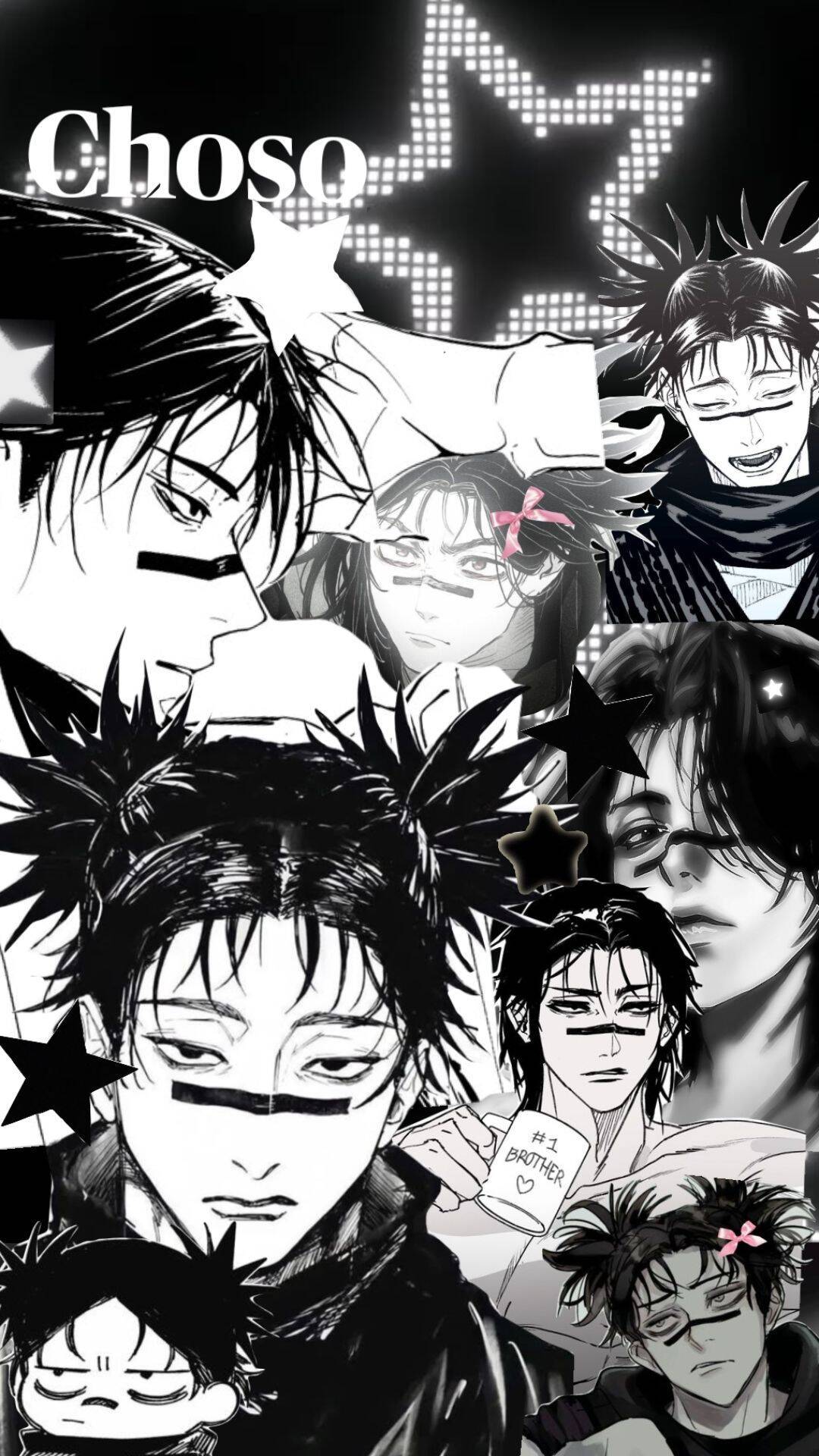
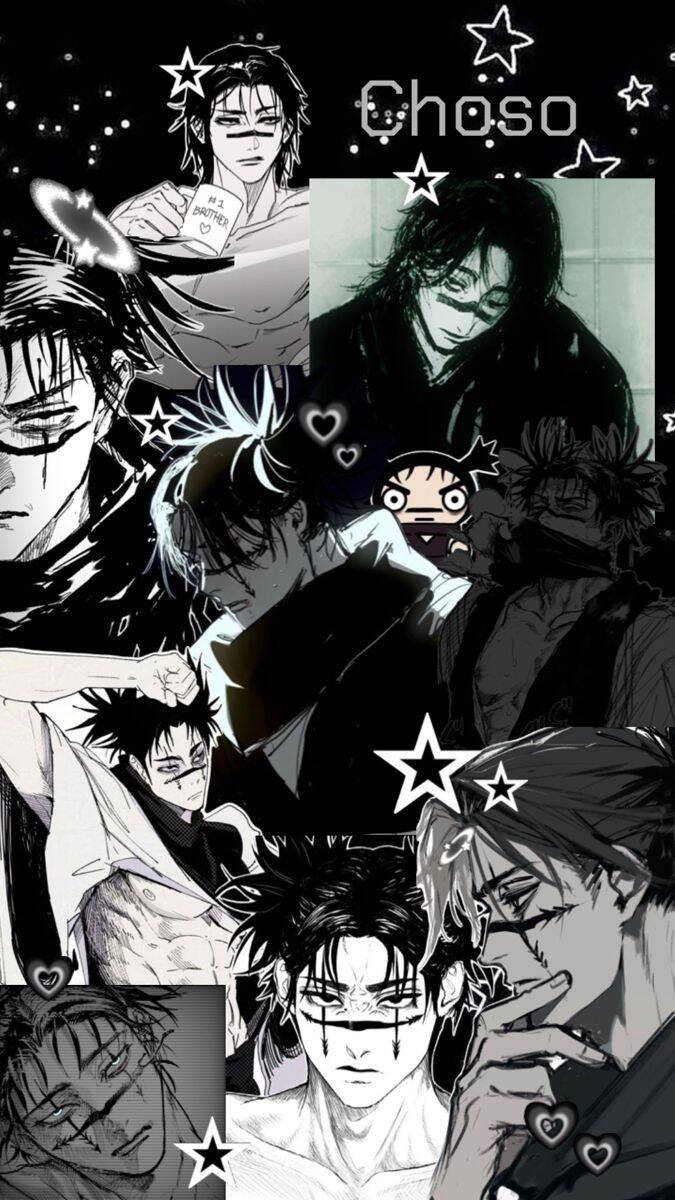
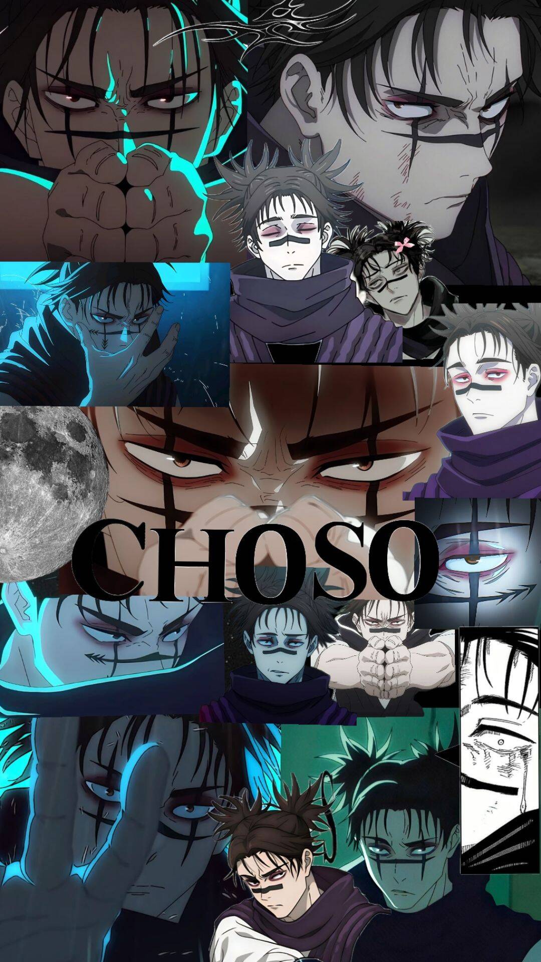
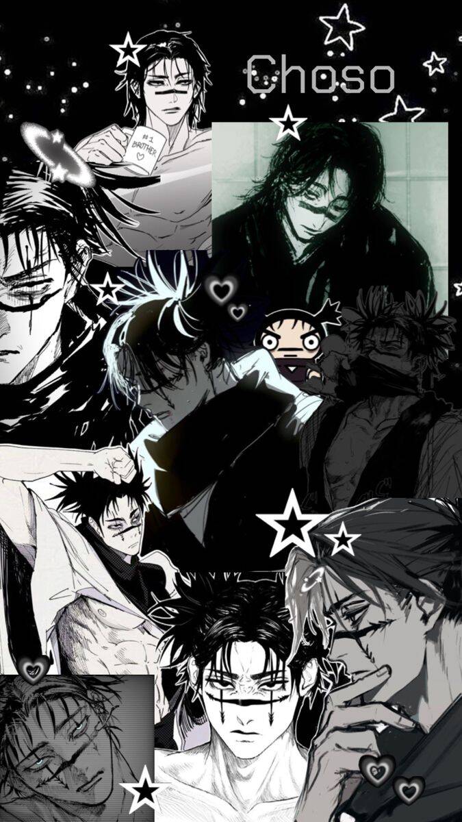
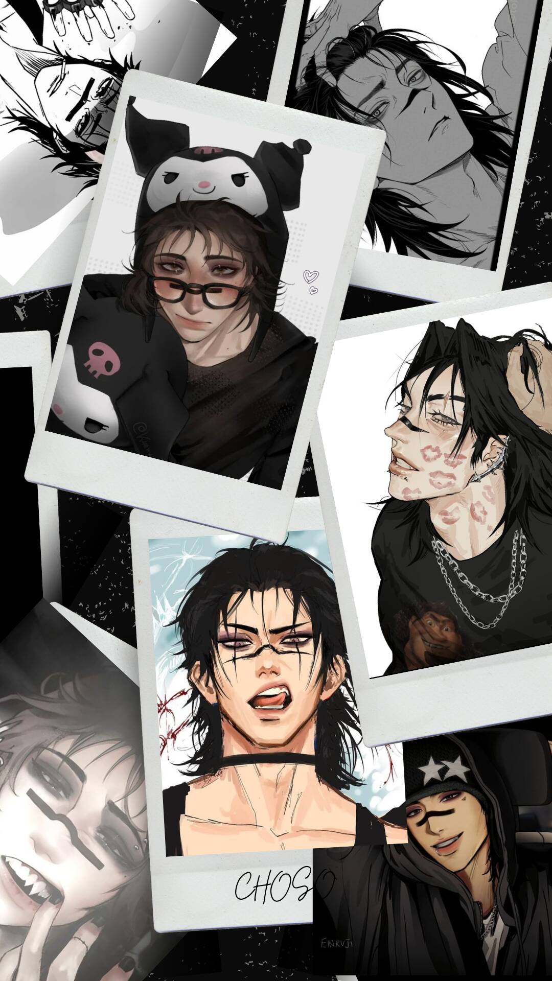
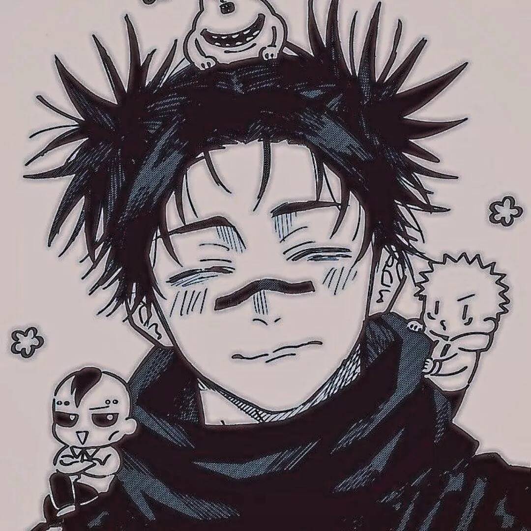
Collage-style pfps pack in multiple panels or poses instead of a single portrait, which is the appeal for people who want their profile to feel like a mini fan-edit rather than one static image. It reads busier and more expressive than a plain headshot, and it tends to stand out more in a feed full of single-image profiles. The tradeoff is scale: a layout built from several small panels loses almost all of its detail once shrunk down to the size most apps display for a profile circle. If a collage is the goal, one with a single dominant panel and smaller supporting pieces around the edges stays readable even at that tiny size, where a busier grid just turns to noise.
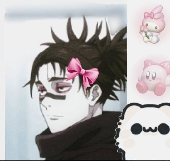
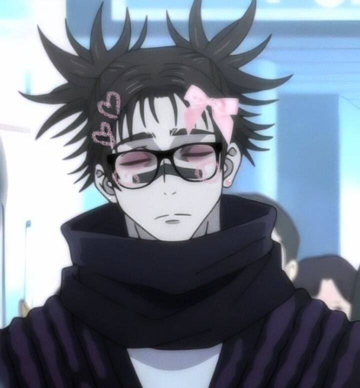
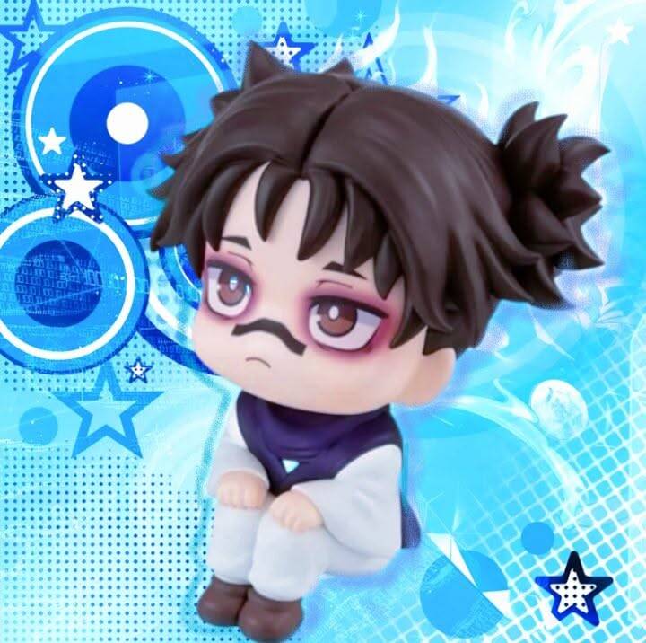
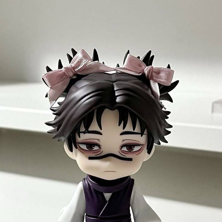
Cute & Soft Choso pfp
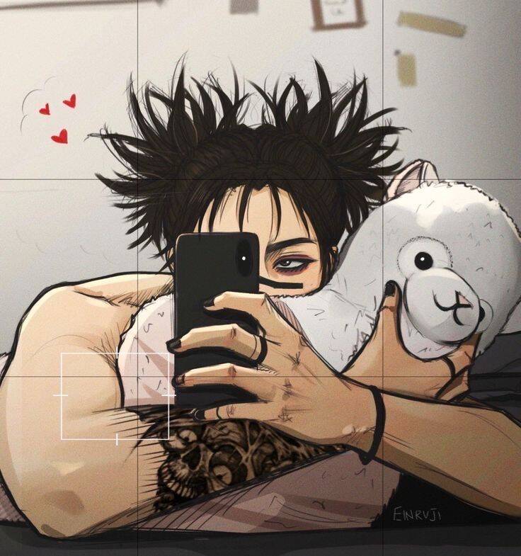
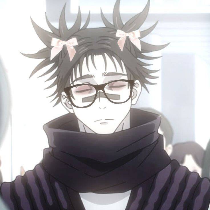
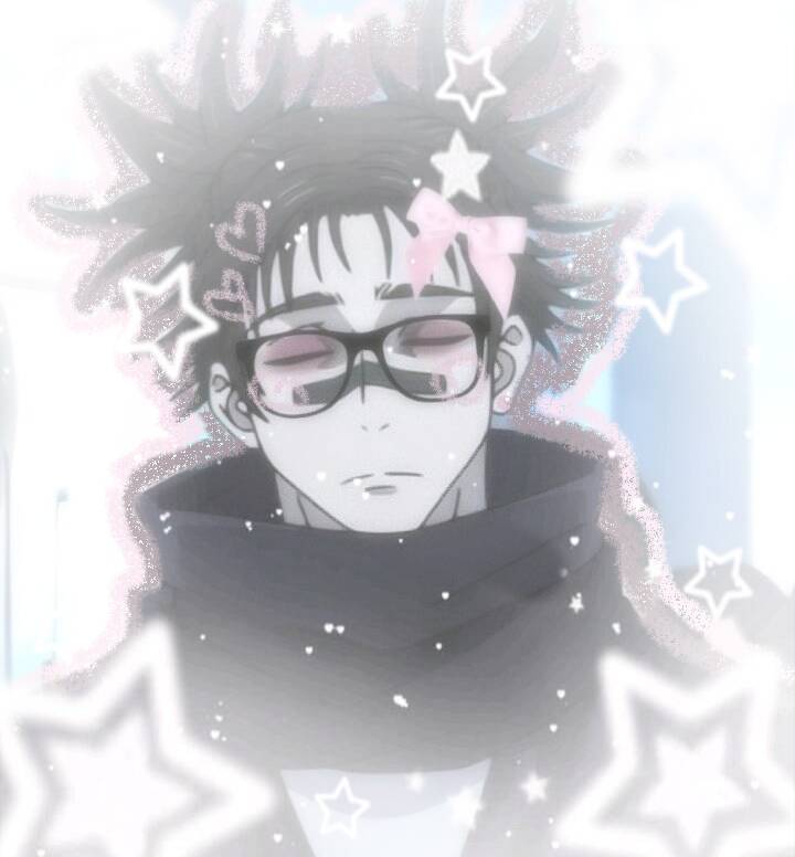
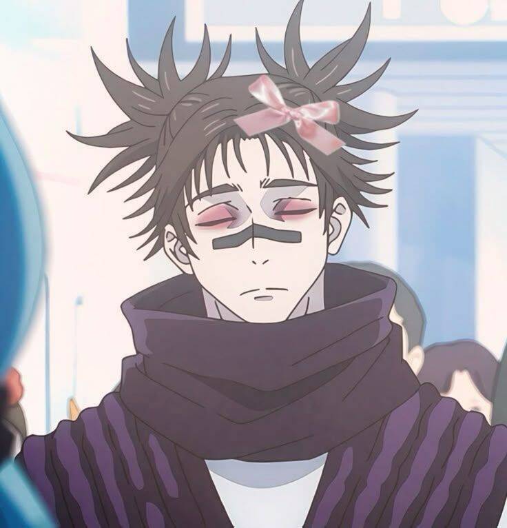
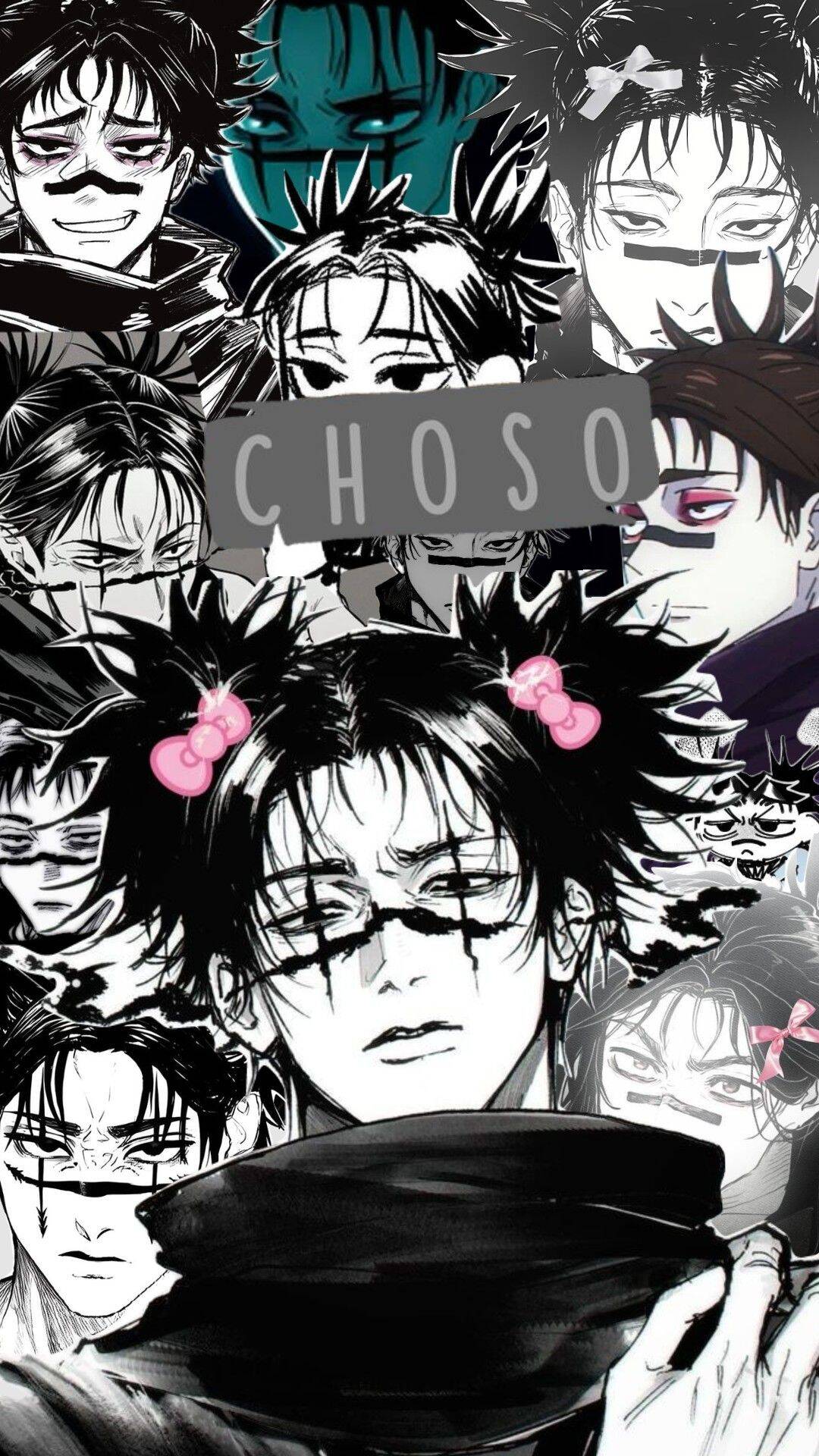
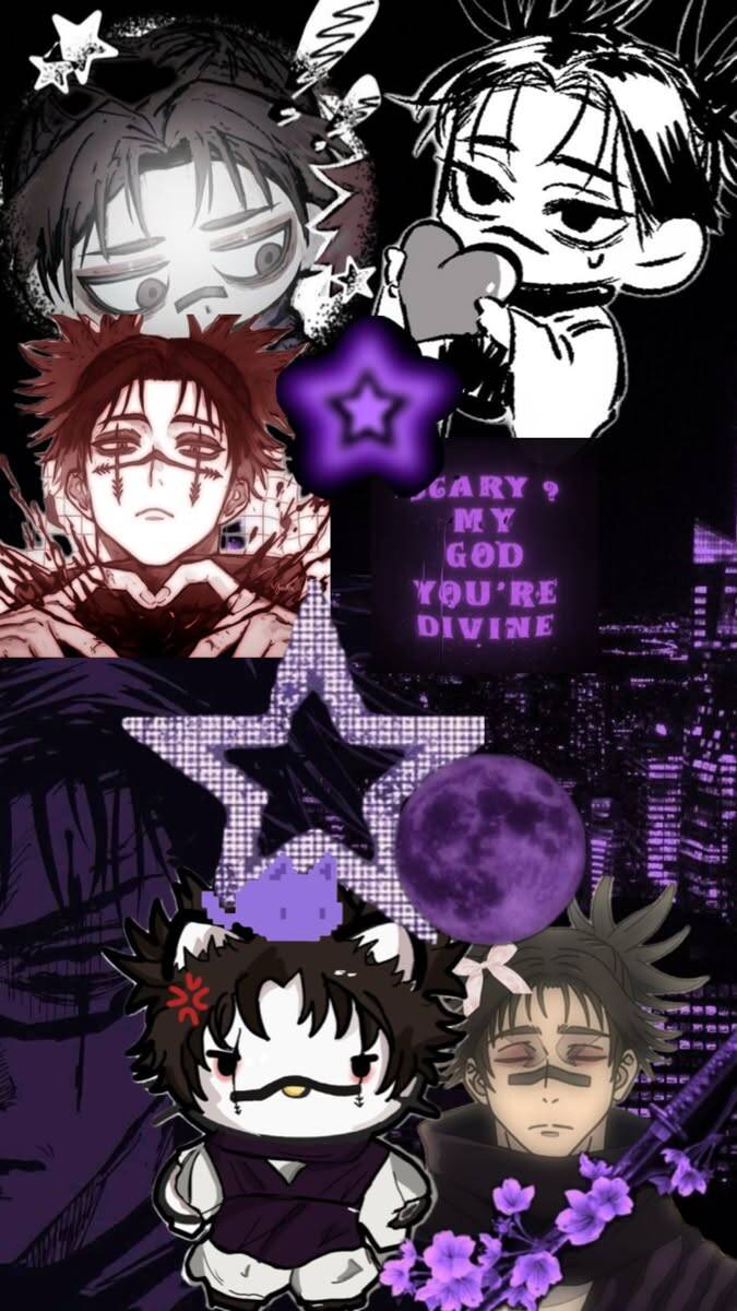
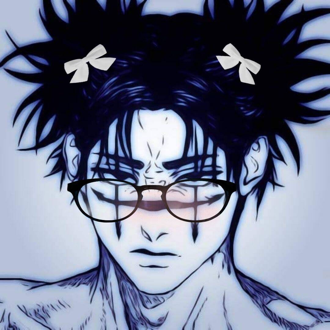
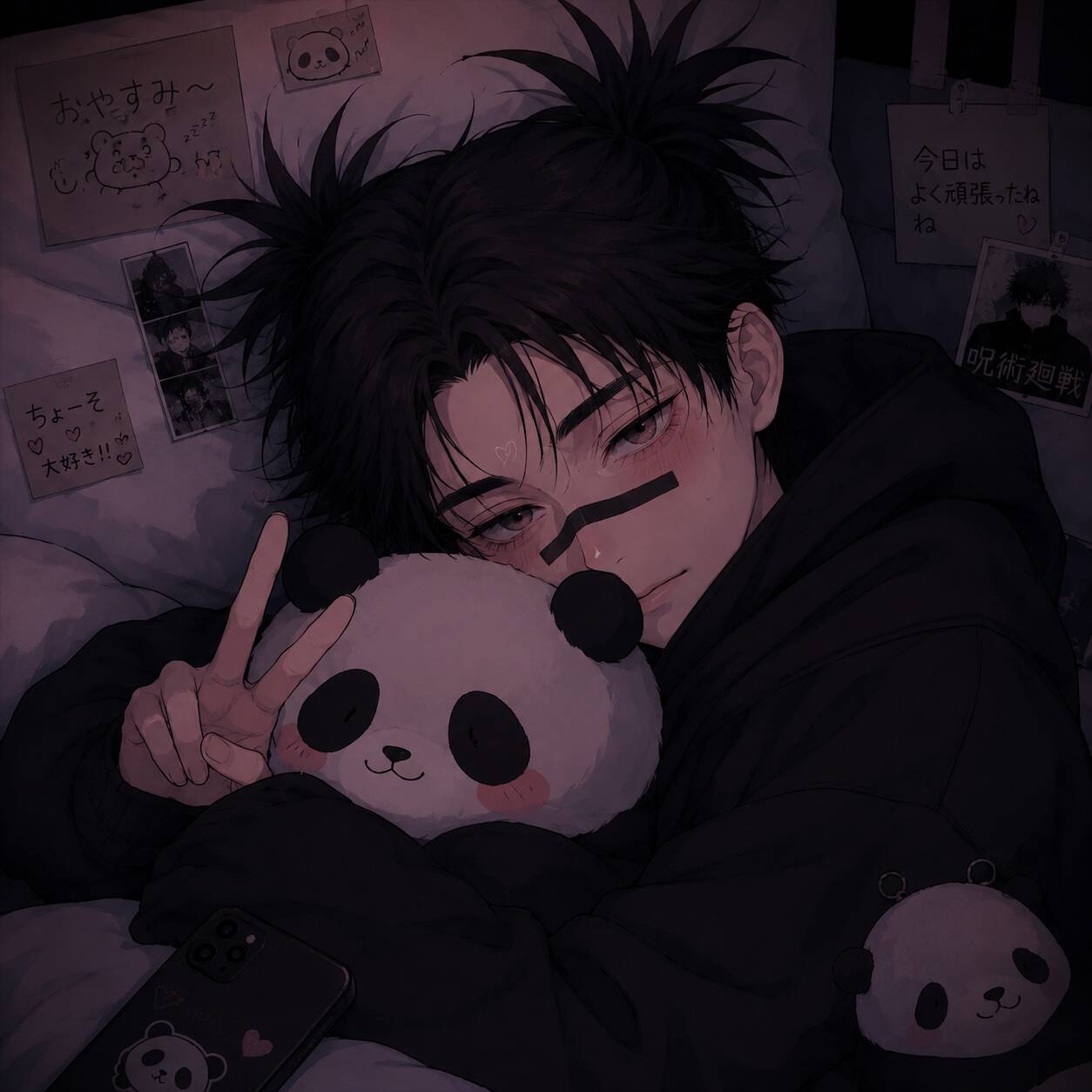
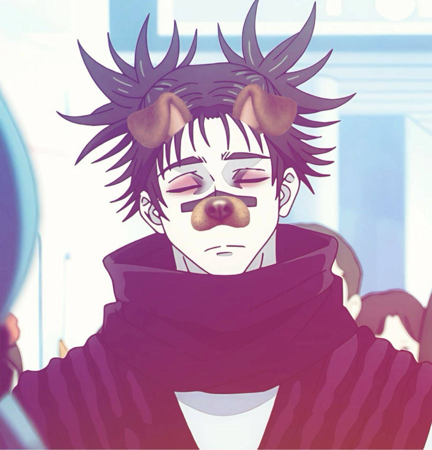
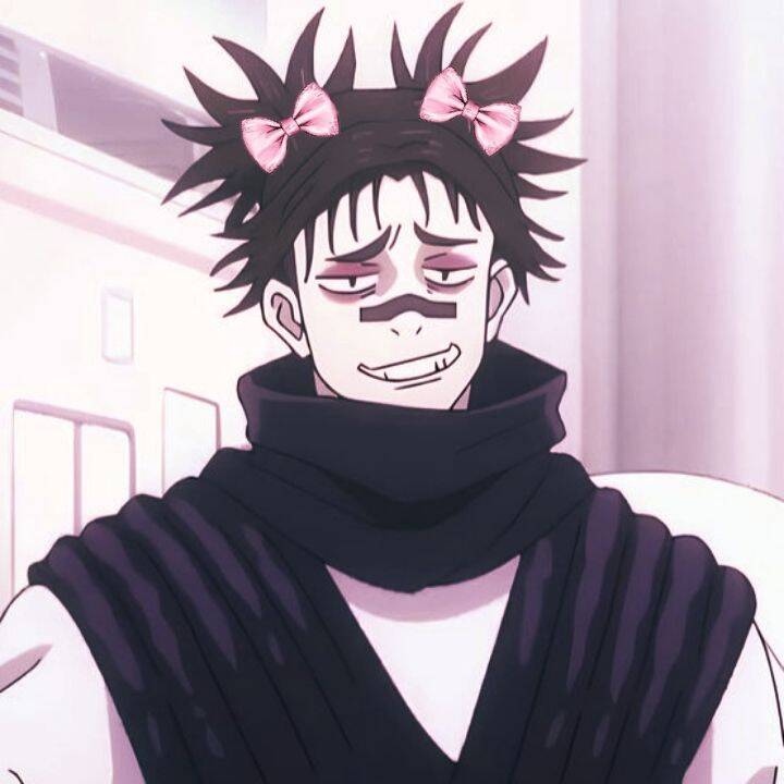
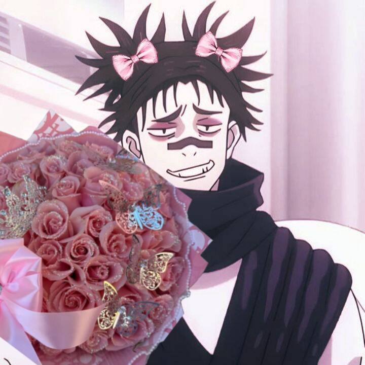
Cute and soft versions pull from a different side of the character entirely — chibi proportions, pastel color grading, small added details like bows or props — aimed at a lighter, friendlier profile feel rather than the intensity most of the source material leans into. It's a popular pick for anyone who wants their account to read as approachable first. Pastel and soft-toned images can wash out badly on dark-mode interfaces, where pale colors lose contrast against a black background. It's worth previewing a pick in both light and dark mode before settling on it, since the same image can look noticeably different depending on which mode the viewer has enabled.
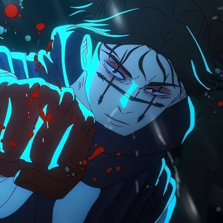
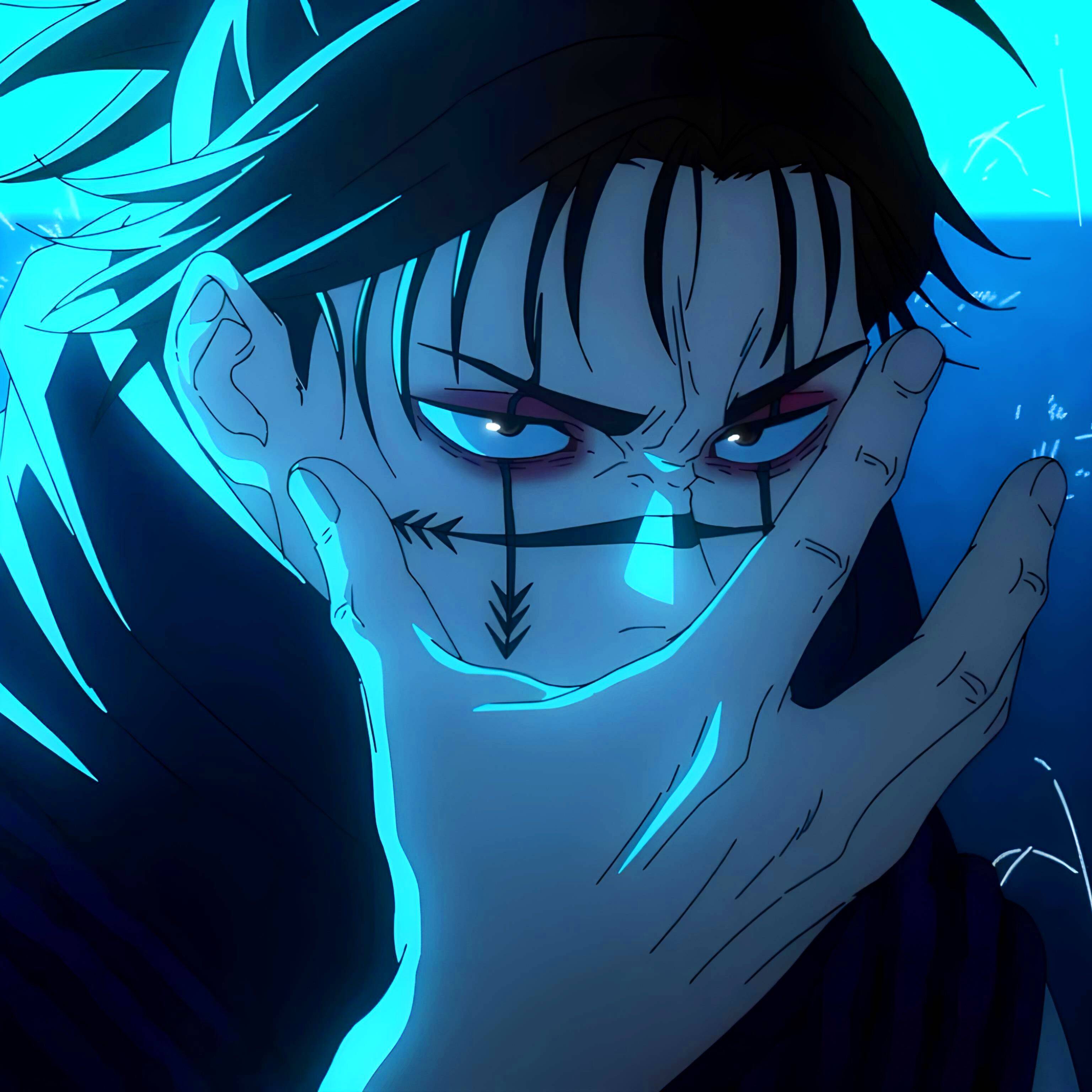
Blood Manipulation & Intense Expressions
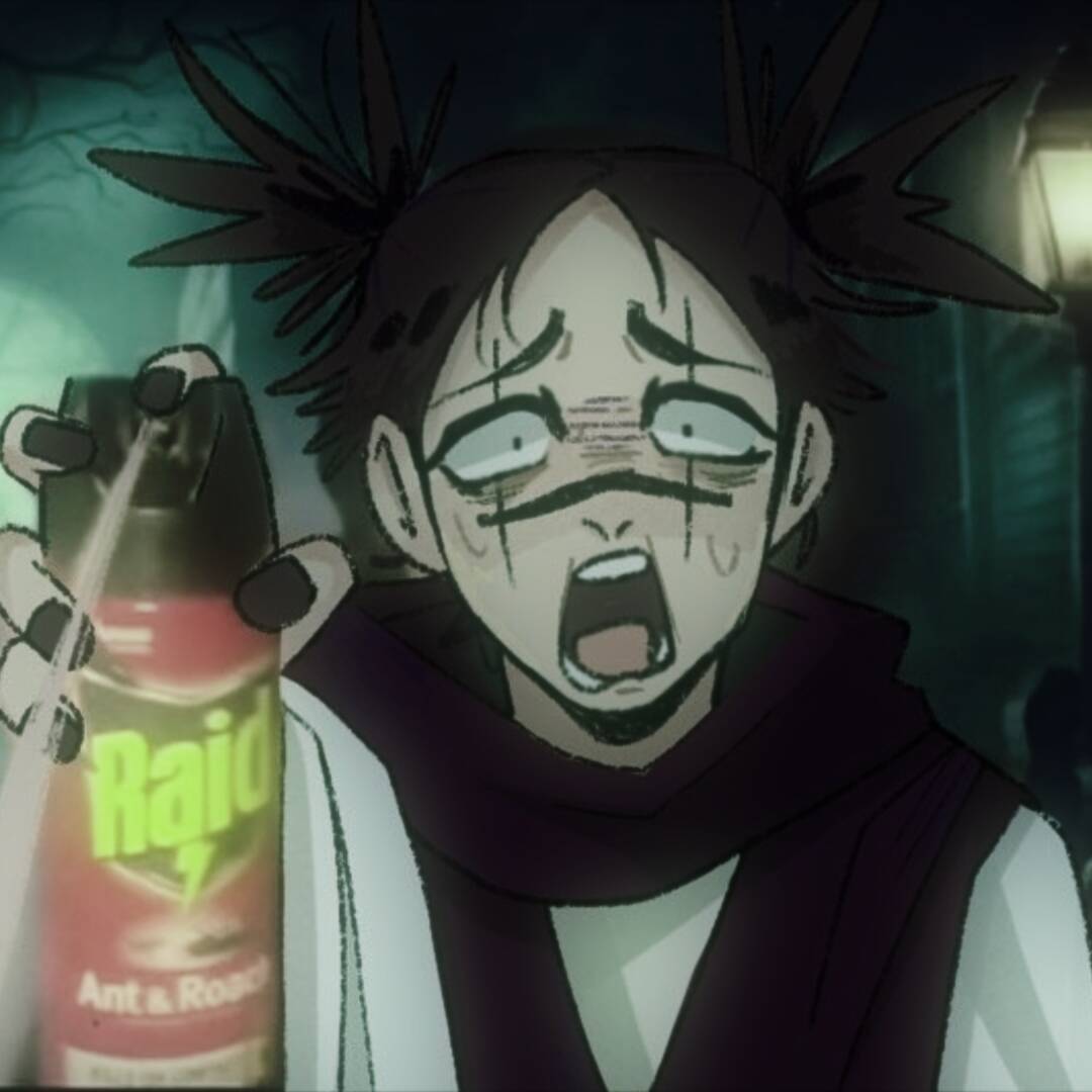
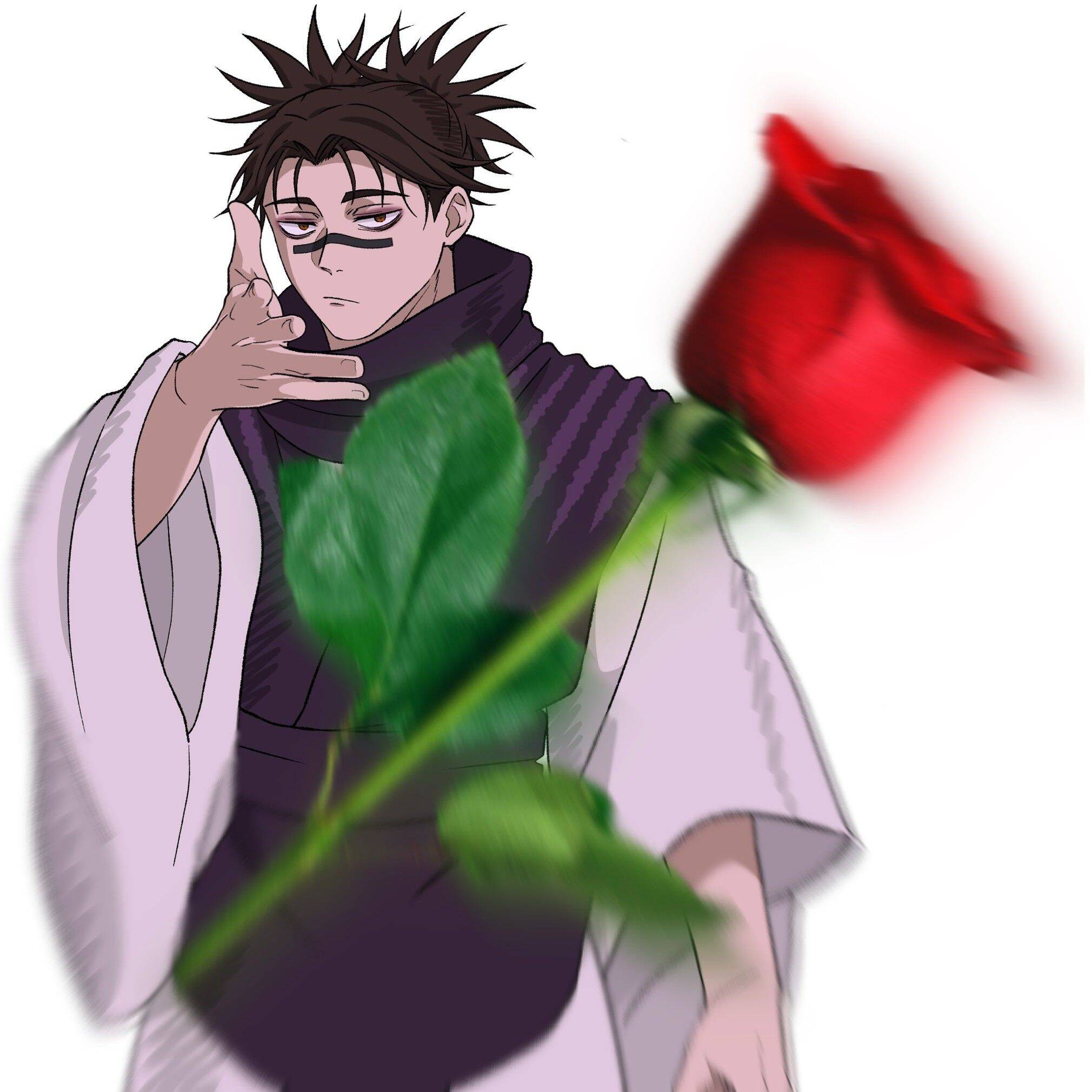
This section leans into Choso's fighting-focused side rather than a generic anime portrait — poses and expressions tied to his ability and combat moments, which suits someone who wants their pfp to signal deeper familiarity with the character instead of just a passing interest in the show. A small practical note: images built around sharp red tones and intense expressions can read as messy or hard to parse once shrunk to pfp size, since fine color detail is the first thing lost at that scale. A clearer, higher-contrast shot with a simple background usually holds up better than a busy action panel once it's sitting at a small size next to a username.