Blue PFP (Profile Pictures)
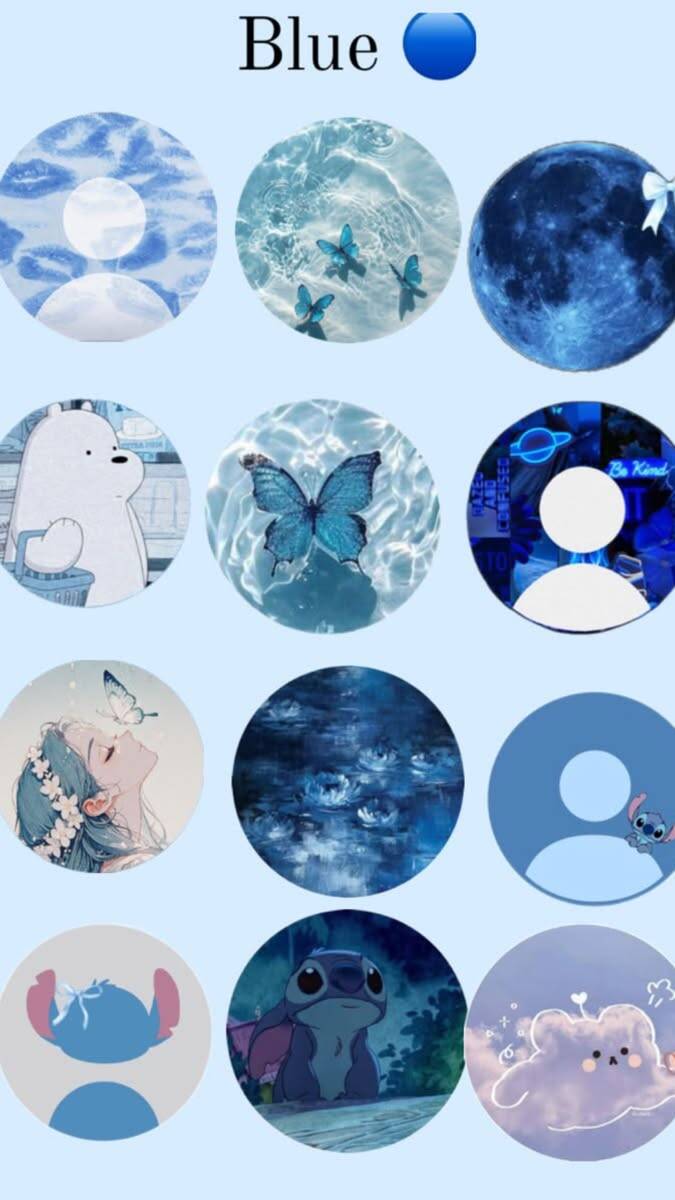
Blue pfps cover a much wider range than one single mood — this collection moves from dreamy anime portraits and cozy plush characters to moonlit skies, ocean scenes, soft floral touches, and playful, glitter-heavy styles. Whether you want a blue profile picture that feels calm and aesthetic, warm and gentle, or loud and full of energy, there's a set here built around that specific tone rather than just another generic blue-tinted photo.
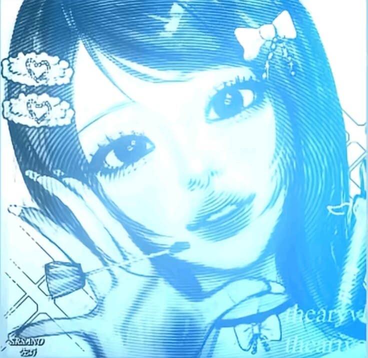
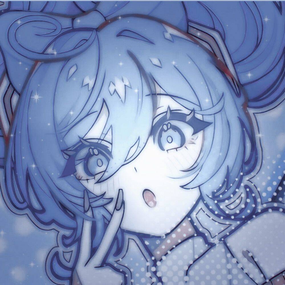
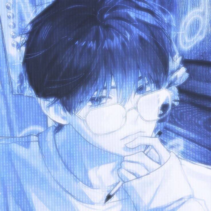
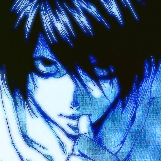
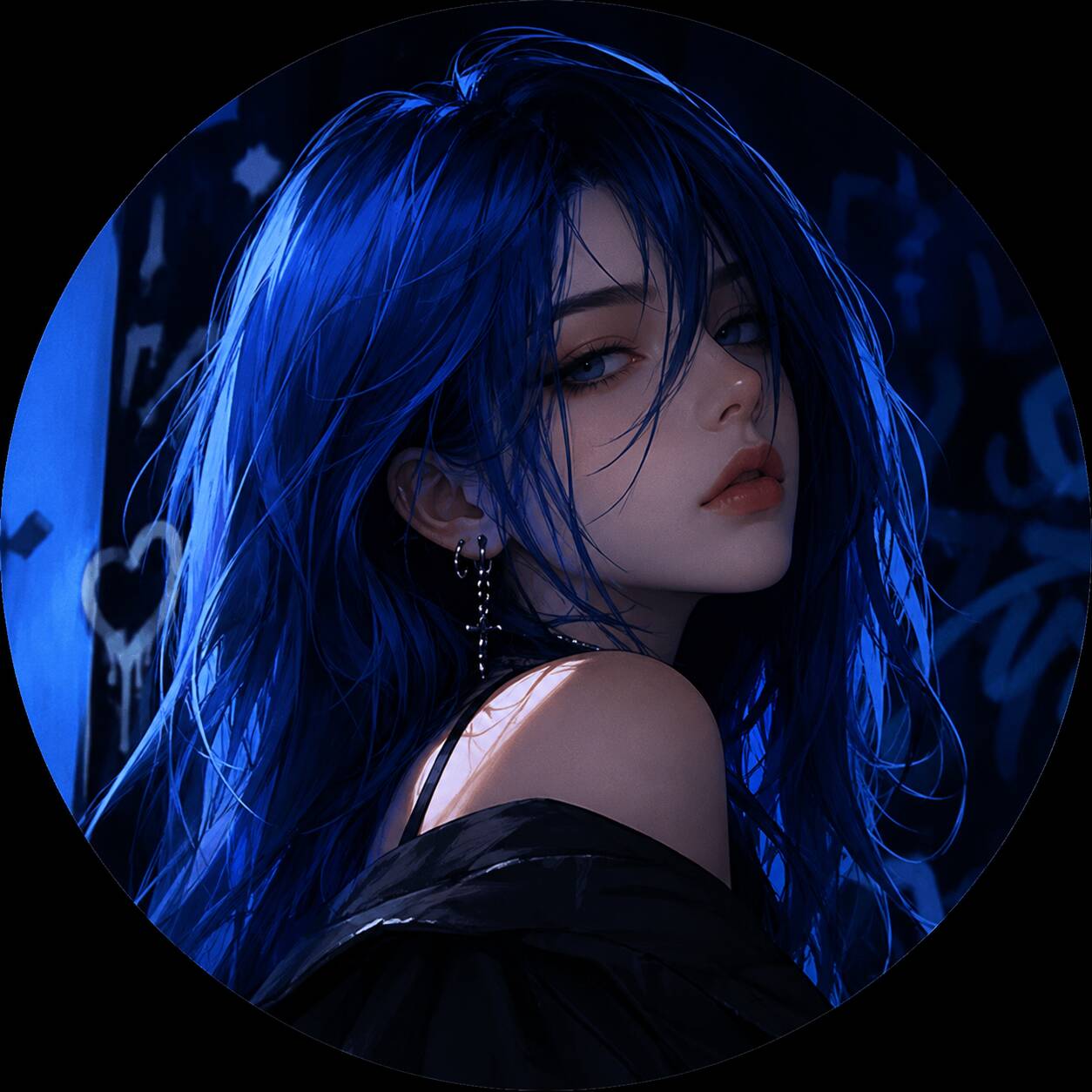
Aesthetic Anime Girl Blue PFPs
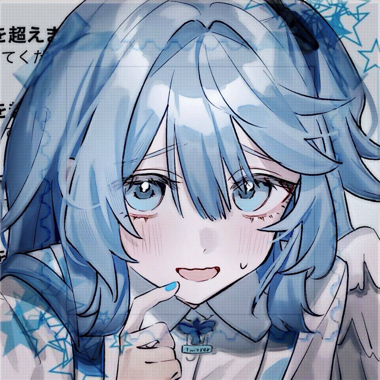
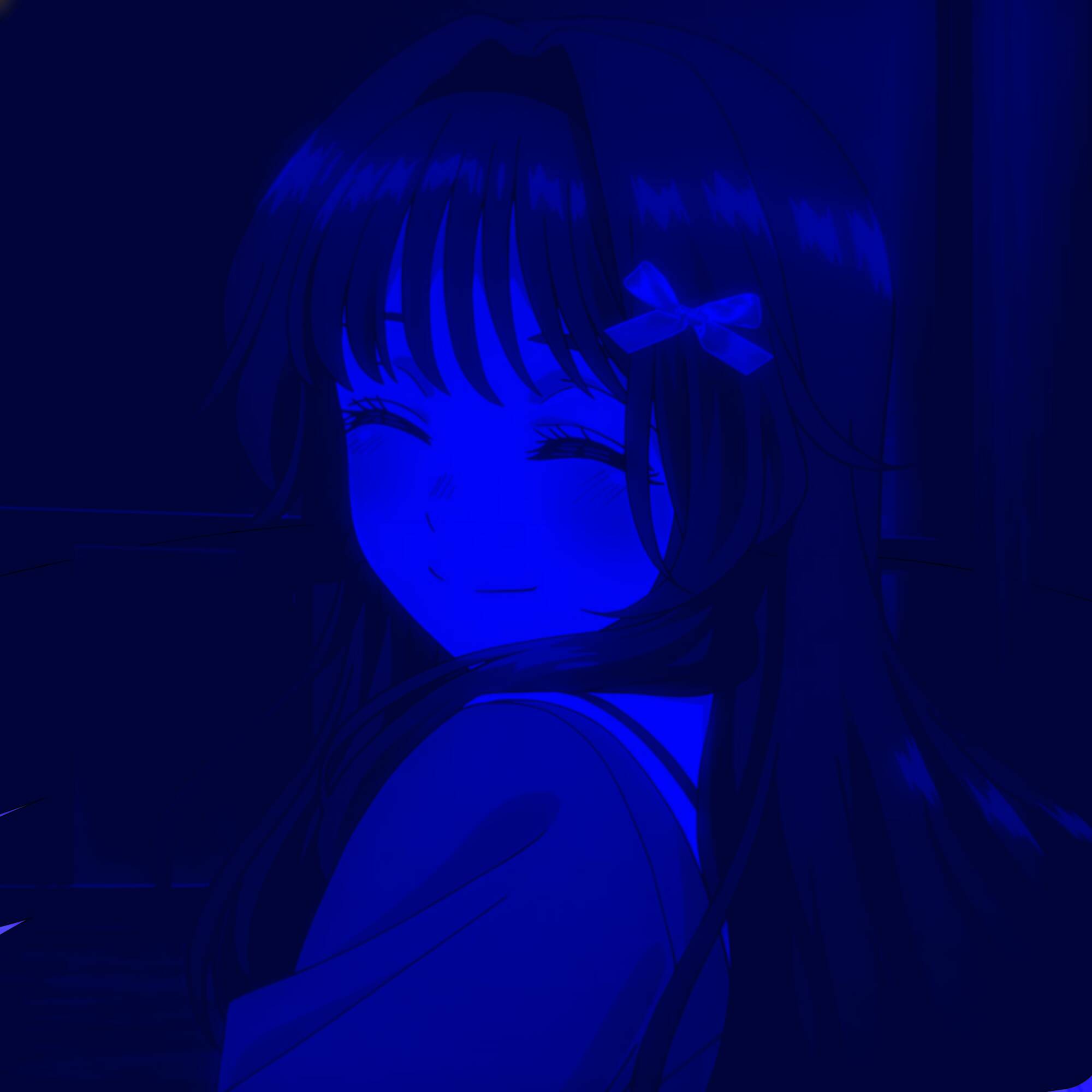
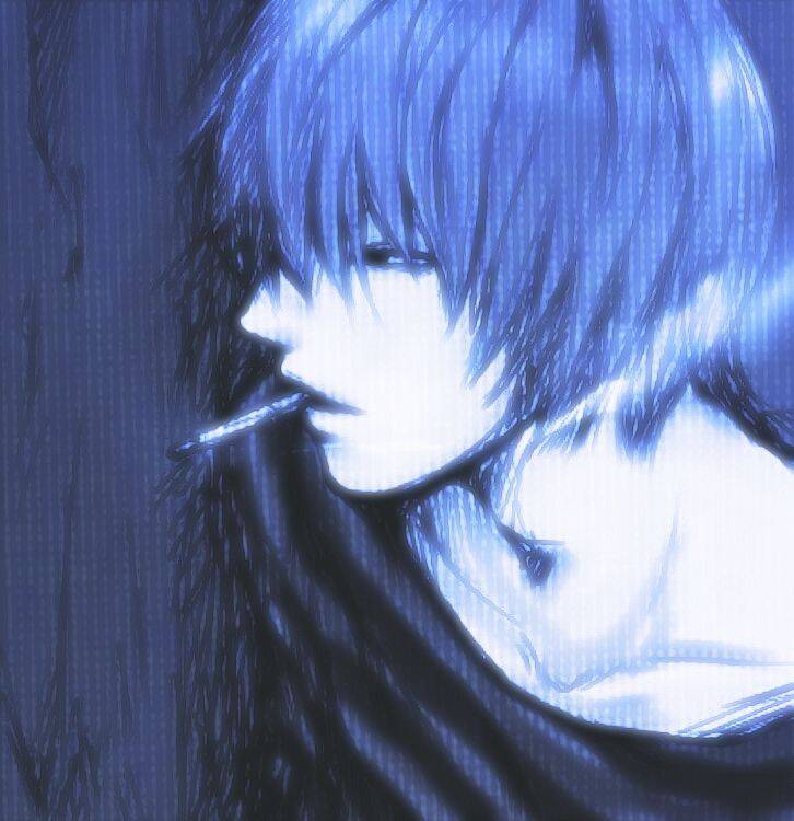
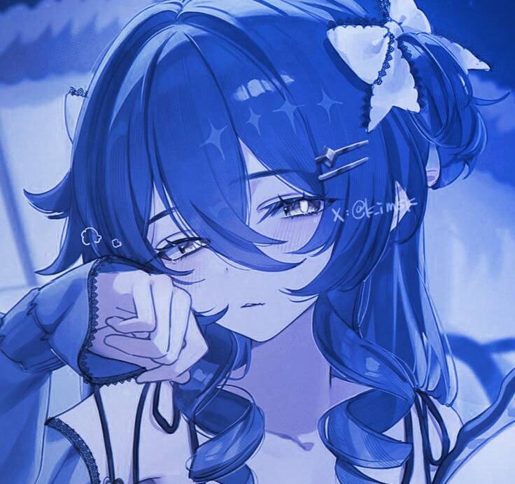
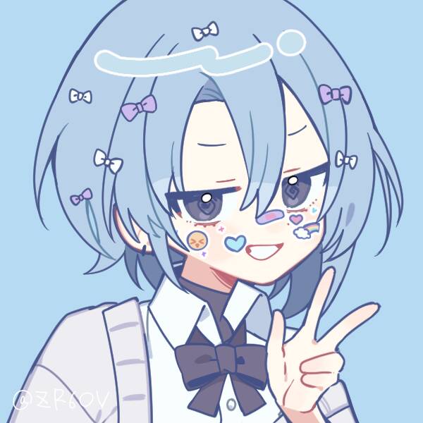
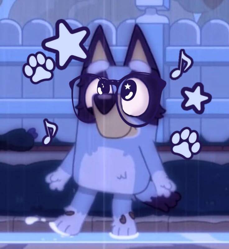
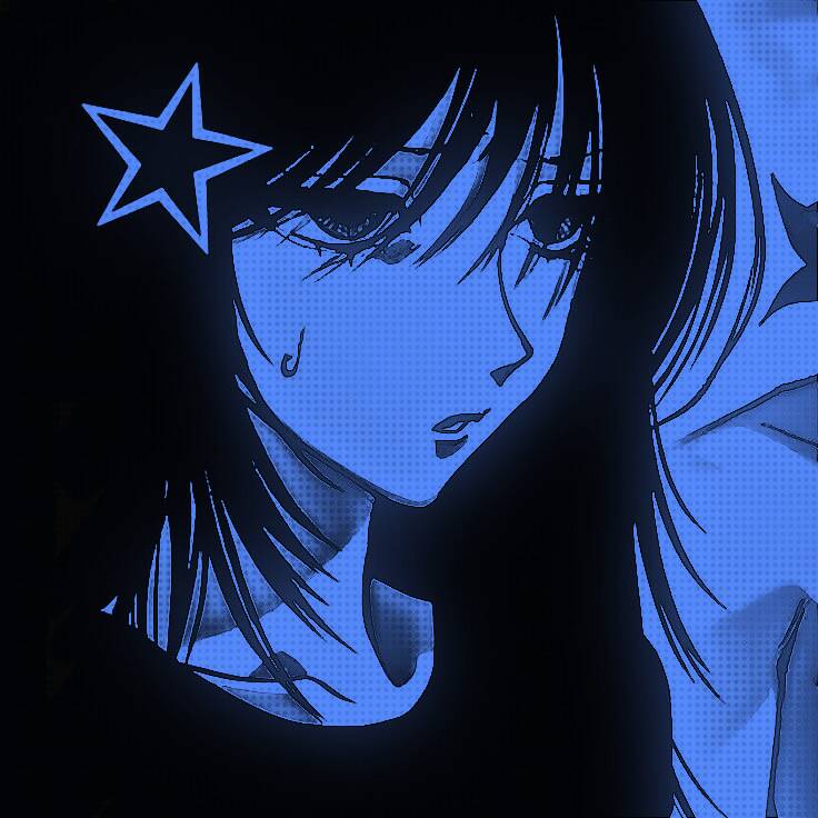
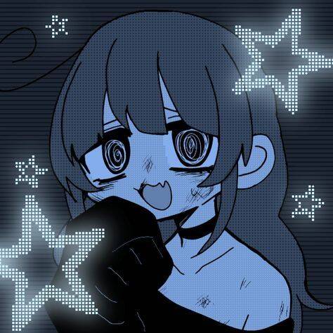
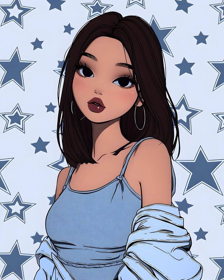
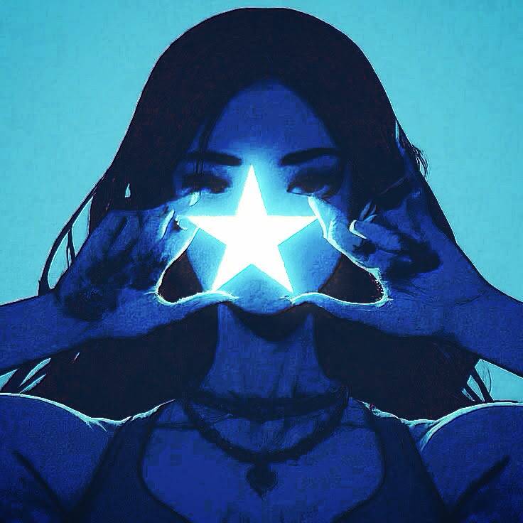
Blue anime-style portraits tend to attract people who want something moodier than a bright, colorful pfp without going full dark-and-edgy — blue sits in a middle ground that reads as calm, a little dreamy, and still visually striking against most app backgrounds. Hair or eye color carrying the theme, rather than the whole background being drenched in blue, usually looks more intentional than a picture that's just filtered blue after the fact. One thing worth paying attention to: contrast against your specific platform's background. A soft, pale blue portrait can wash out almost completely on apps with light-mode interfaces, so if you're mostly viewed on a white background, it's worth leaning toward a deeper or more saturated blue tone instead of a pastel one.

Cute Bear & Plush Character Blue PFPs
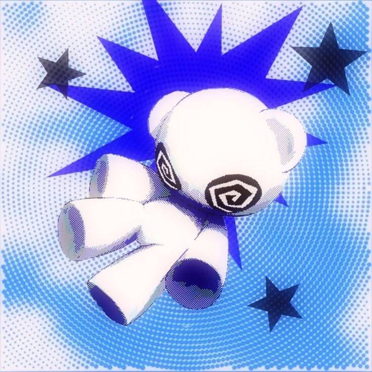
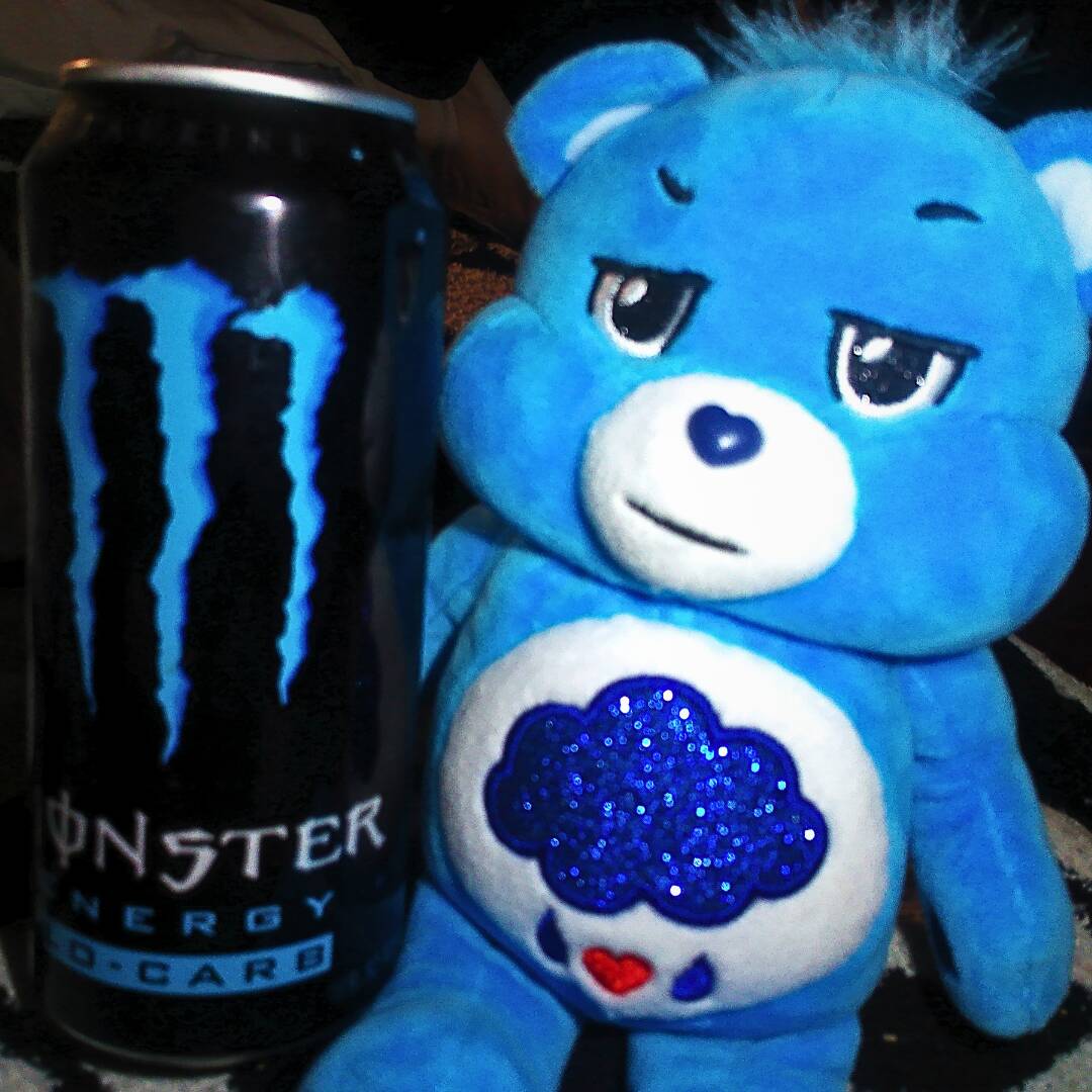
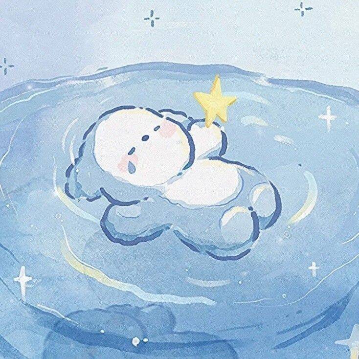
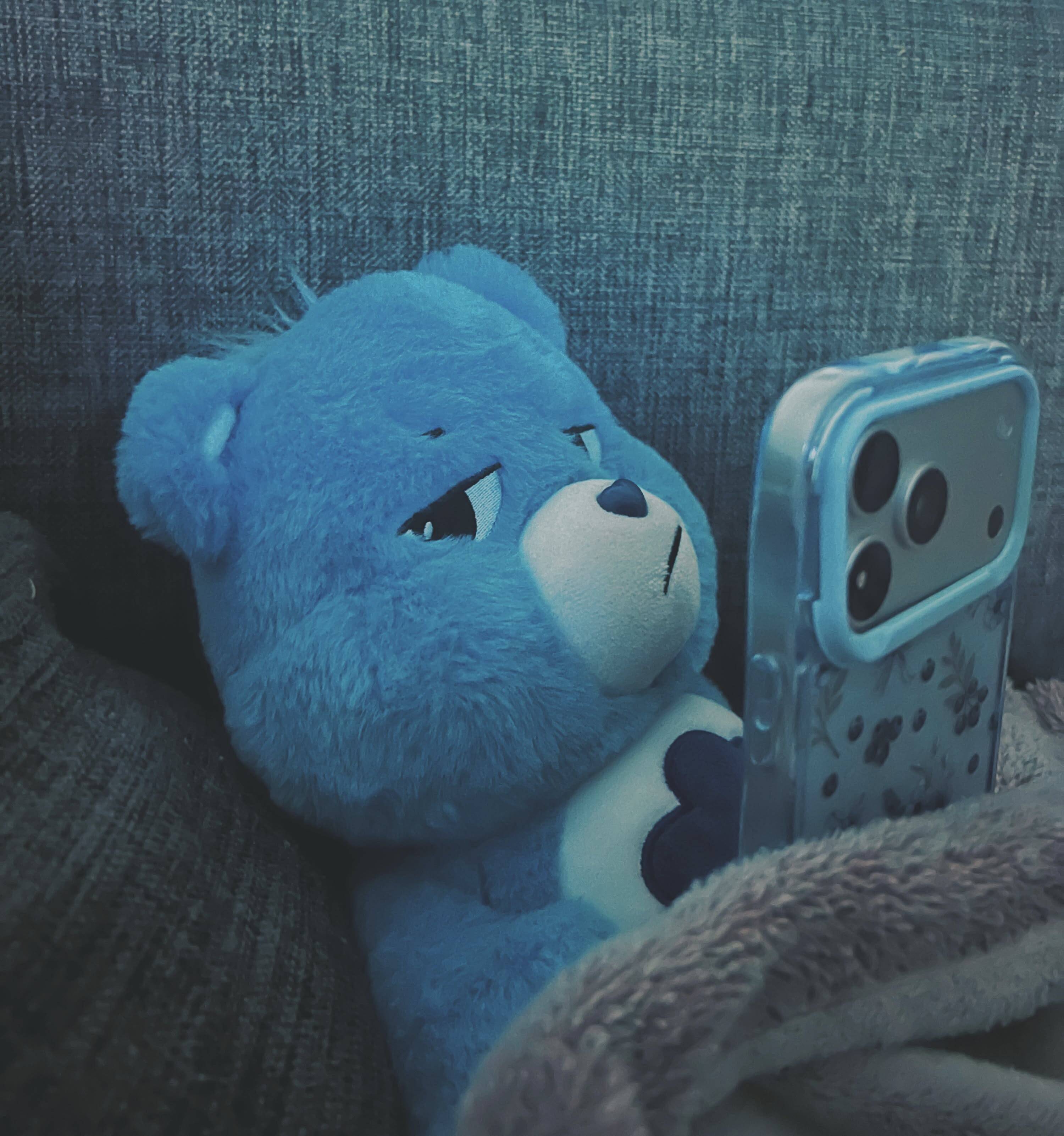
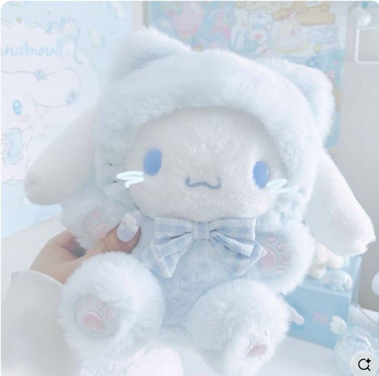
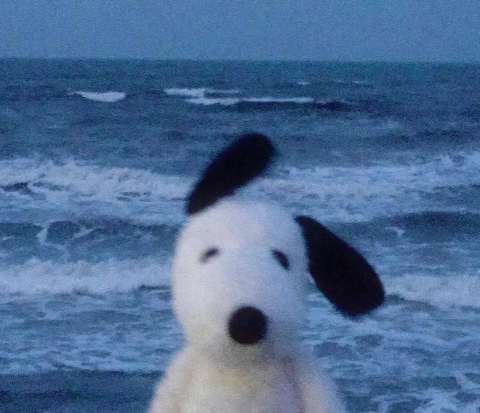
Plush-style characters in blue tend to soften a color that can otherwise read as cold or distant — a bear, penguin, or bunny rendered like a stuffed toy pulls the whole picture toward comforting rather than moody, even while keeping the same blue palette that shows up in edgier styles elsewhere in this collection. It's a way to get the color without the attitude that usually comes with it. Texture is doing more work than people expect in this category. A flat, cartoon-style bear reads as generic, but one with visible stitching, a slightly worn look, or soft shading that mimics actual fabric tends to feel more like a specific toy with its own history rather than a generic clipart character.




Moonlight & Starry Night Blue PFPs
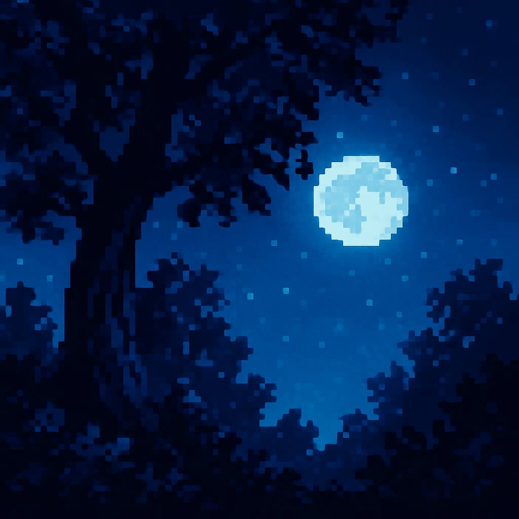
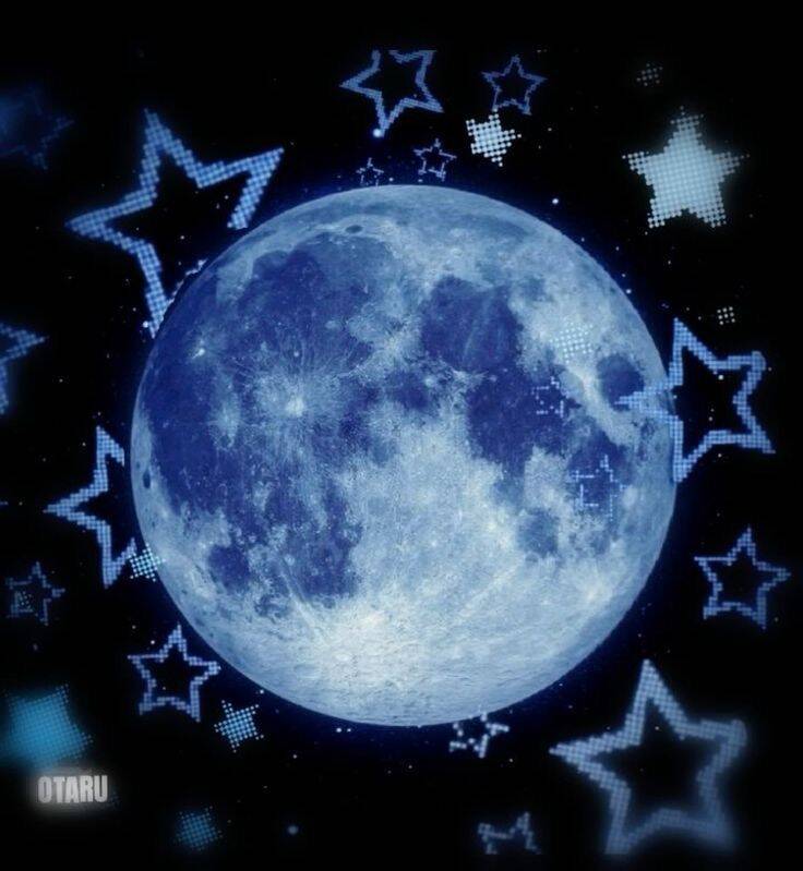
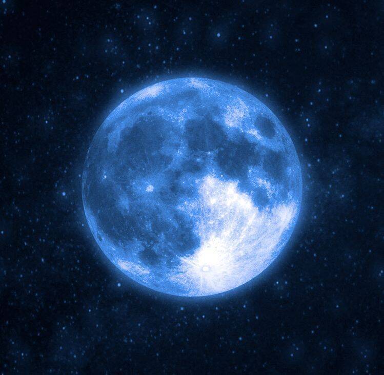
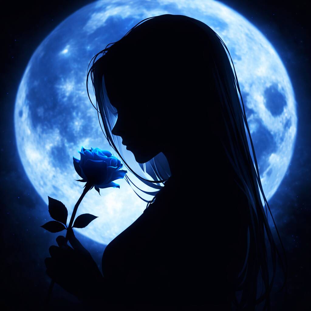
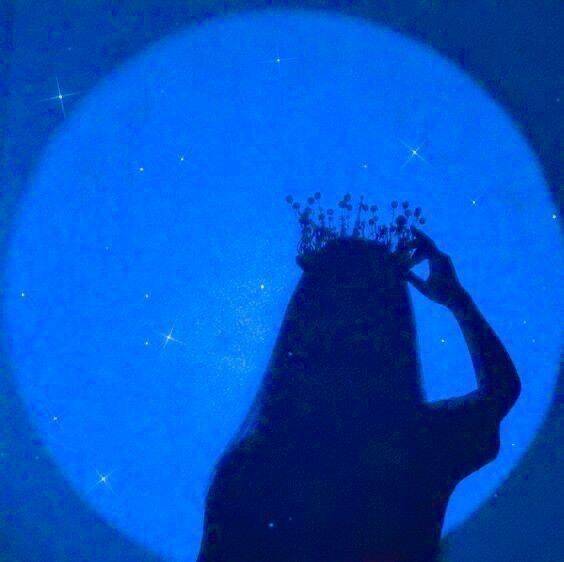
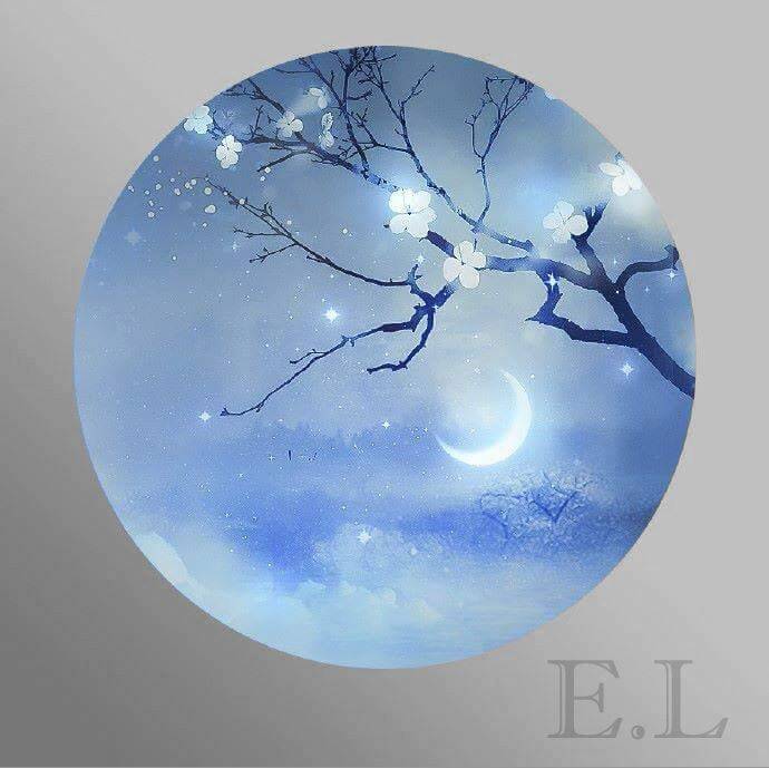
Night-sky imagery pairs naturally with blue because it doesn't need much color correction to look believable — unlike a lot of aesthetic edits that force an unnatural blue tint onto a normal photo, a moonlit scene is blue by nature, which tends to make this style feel less like a filter and more like an actual captured moment. Silhouettes do a lot of the heavy lifting here specifically. A detailed, fully lit subject against a starry background usually competes with the sky for attention, but a plain dark silhouette lets the stars and moon stay the visual focus, which is generally why the simplest compositions in this category tend to hold up best rather than the busiest ones.

Ocean & Water Aesthetic Blue PFPs
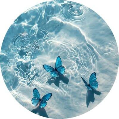
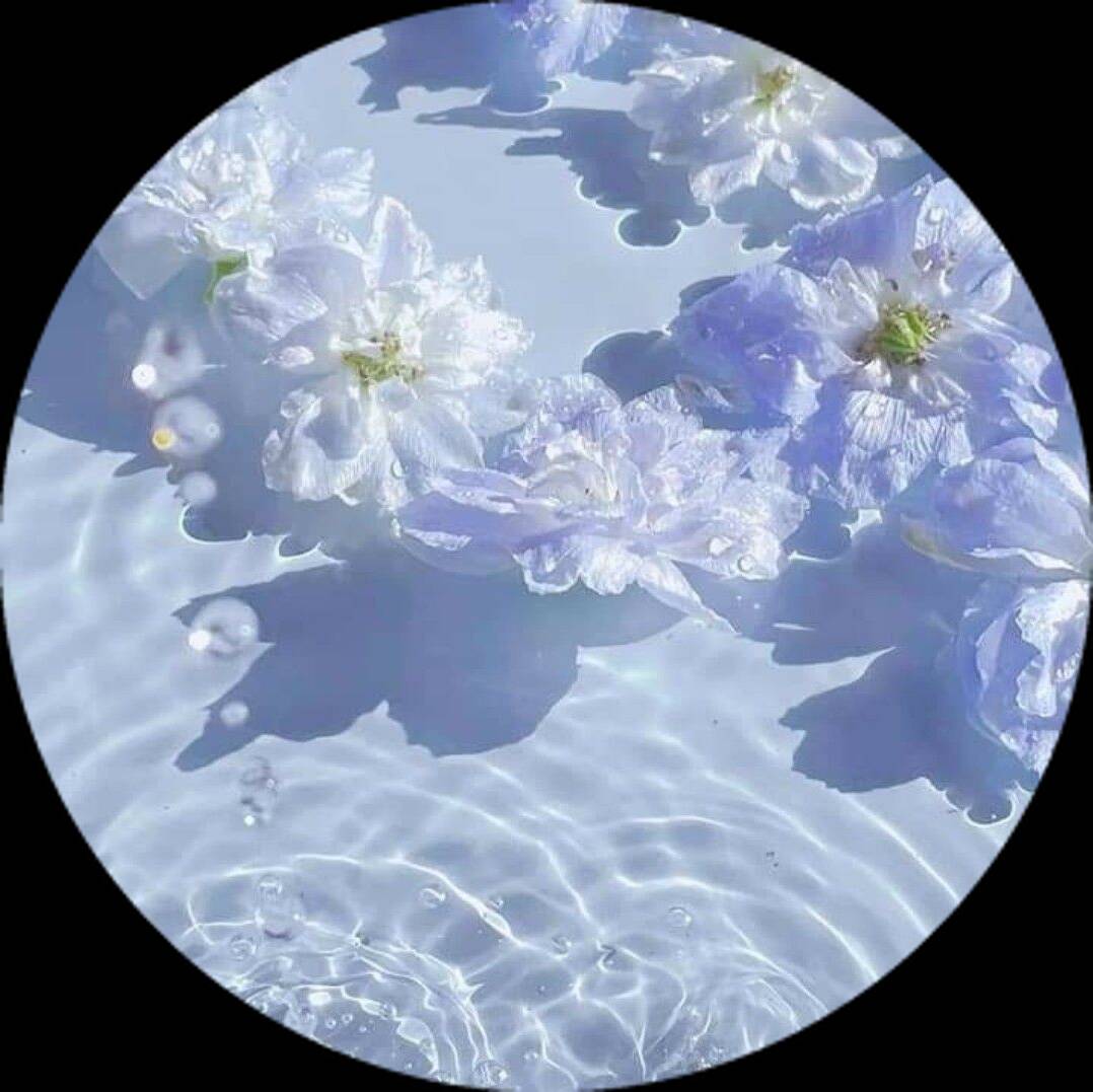
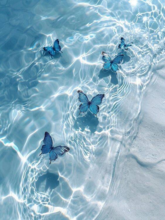
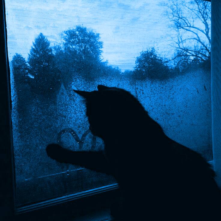
Water-themed pictures push blue toward something calmer and more natural than the neon or pastel versions elsewhere in this range — waves, marine life, or rain on a window all give the color a reason to be there, instead of blue just being applied as a stylistic choice on top of an unrelated image. Movement is worth paying attention to when picking between options here. A picture with swirling waves or visible ripples tends to feel more alive at profile-picture size than a flat, still body of water, even though both are technically static images — the suggestion of motion in the water itself does more to keep the picture interesting than color alone can.